Chelmsford Theatre
The ‘C’ campaign
The brief
Chelmsford Theatre, managed by Chelmsford City Council, is the city’s cultural hub. It hosts a diverse programme including theatre, comedy, live music, dance, talks, and an annual pantomime. Following recent refurbishment and rebranding, 2023 has been a key year in reconnecting with the local community.
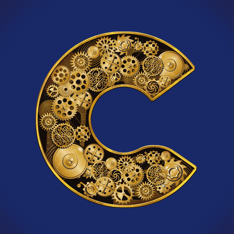
Following the rebrand, Chelmsford Theatre had developed a set of distinctive C-shaped icons that reflected the city and worked well across digital and print materials. The theatre asked The Graphic Design House to expand on this idea by creating additional C-shaped assets that could be used flexibly across campaigns, while remaining consistent with their existing brand style. The aim was to add variety and personality to these visuals, helping the theatre communicate more creatively across platforms and throughout the year.


Our approach
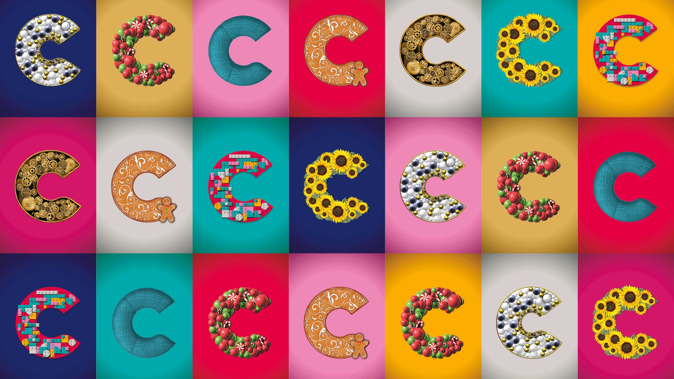
Expanding the 'C' concept
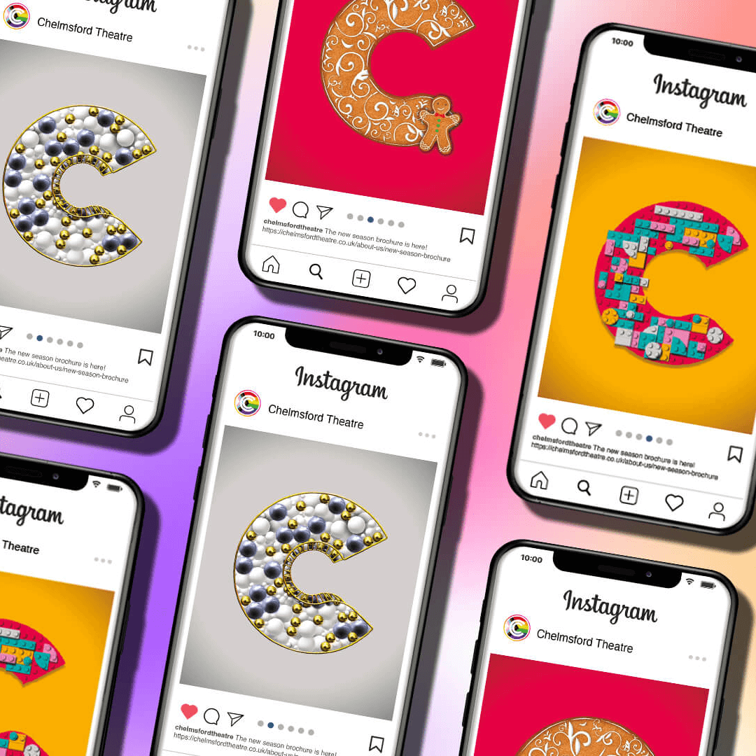
Built for print and digital
Developing new visuals
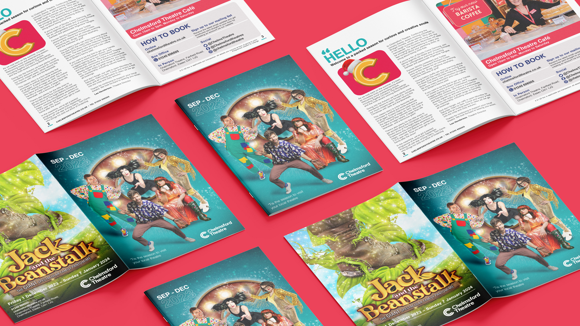
Redesigning the season brochure
“We commissioned TGDH to create a number of assets to complement our recent rebrand and logo. We wanted the assets to be striking, able to standalone and be recognisable among our existing recent creations. Tom and the team came up with some imaginative ideas that we hadn’t previously thought of and adapted well to our many requests as the project evolved. We’re excited to be able to use the new assets to promote our brand and theatre.”
Victoria Whitfield
Head of Marketing
Chelmsford Theatre

Results & next steps
The completed suite of C-shaped assets provided Chelmsford Theatre with a flexible, easy-to-use visual toolkit. The designs strengthened the theatre’s existing identity, offering greater variety for campaigns while maintaining consistency across all materials. The refreshed brochure design and supporting assets gave the team a cohesive set of tools for promoting future seasons both in print and online.
We are continuing to support Chelmsford Theatre in developing future materials and applying the C designs across new campaigns, ensuring their brand remains consistent, creative, and adaptable for evolving marketing needs.
Need help bringing your brand across print and digital?
Our work in action

Jersey Opera House
Supporting Jersey Opera House’s reopening with refined, digital-first brochures and programmes that balance heritage, renewal and clarity.
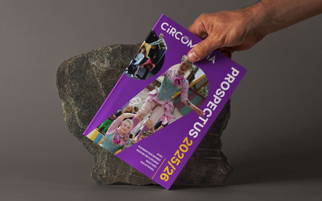
Circomedia
Discover how we refreshed Circomedia’s brand identity to better reflect their inclusive arts ethos and vibrant community spirit.
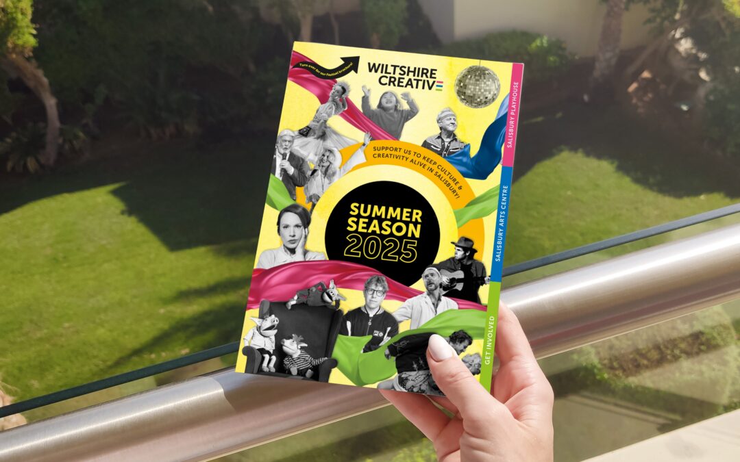
Wiltshire Creative
We partner with Wiltshire Creative to deliver bold, playful design across print and digital, bringing theatre and festivals to life.
Make every show unmissable
From seasonal brochures that captivate audiences to campaign materials that drive ticket sales, we help theatres connect with their audiences through thoughtful, story-driven design.
If you’re ready to enhance your communications and make every production shine, on page and online, let’s talk.