Williams brand refresh
A refreshed identity to match Williams’ ambitious expansion
The brief
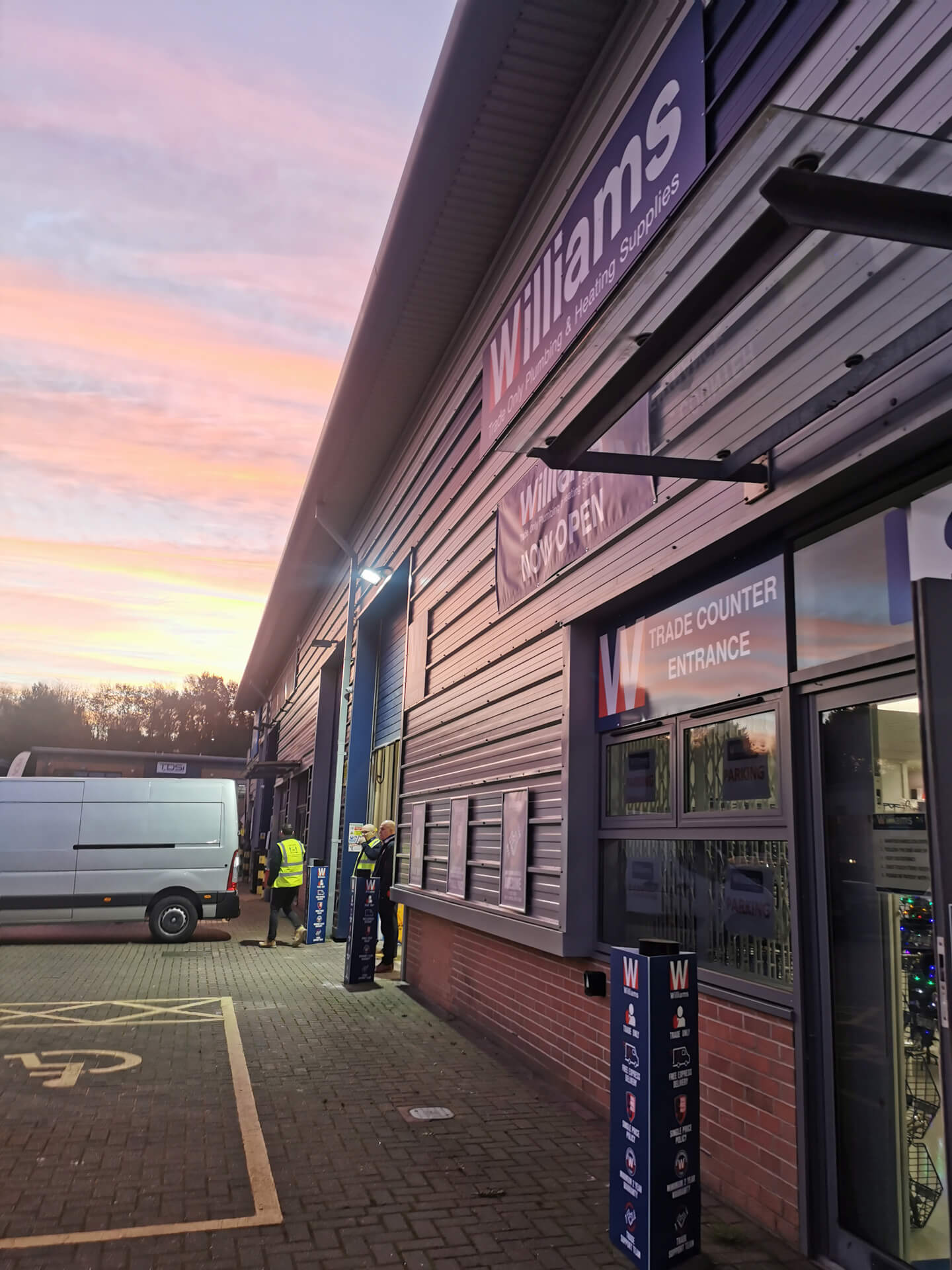
Williams & Co is an award-winning plumbing and heating merchant that supplies exclusively to the trade. With over 50 branches and fulfilment centres across England and a growing online presence, the company has built a reputation for reliability, efficiency, and exceptional service.
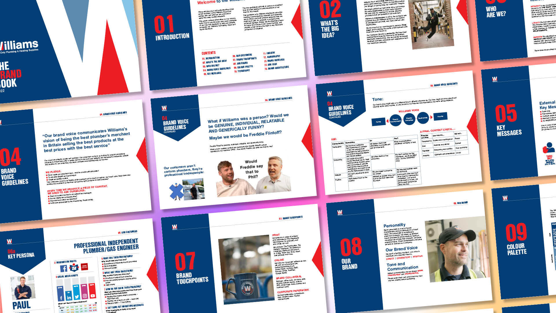
As the business continued to grow, the marketing team recognised the need to strengthen and unify their brand identity, ensuring it reflected their professional standards and ambitious ethos. The challenge was to bring consistency and clarity across all brand touchpoints, from logo and colour palette to catalogues, signage, and digital assets.


Our approach
Refreshing a trusted brand
A modernised colour palette
Logo evolution
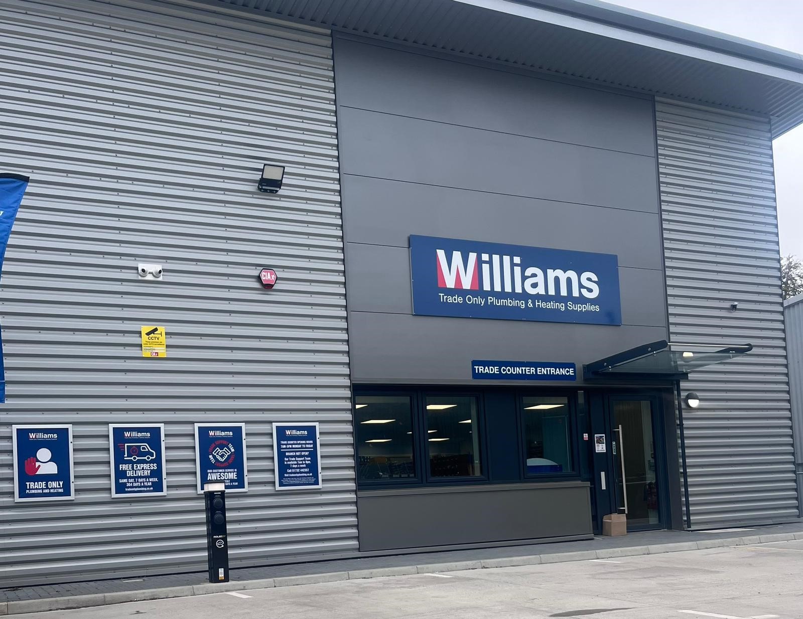
Consistency across touchpoints
“Working with TGDH as a partner for design, print and mail fulfilment means we have one team who look after us from start to finish for some of our bigger campaigns. Not only does this create efficiencies, it means we have a partner who ‘gets us’ and what we need.”
Alex Peacock
Senior Marketing Manager
Williams & Co

Results & next steps
The refreshed brand has given Williams & Co a stronger, more cohesive presence across every platform. The refined logo and colour palette have improved clarity and recognition, while the updated catalogue and collateral have enhanced usability and efficiency. Together, these updates have created a unified identity that reflects Williams & Co’s professionalism, ambition, and ongoing success.
We continue to support Williams & Co as they expand their operations across the UK — ensuring their brand identity remains strong, adaptable, and consistently applied across every branch, platform, and campaign.
Our work in action
Marathon Leisure
Reimagining Marathon Leisure’s 1,000+ page catalogue with a clear, flexible design system that brings consistency to complex supplier content.
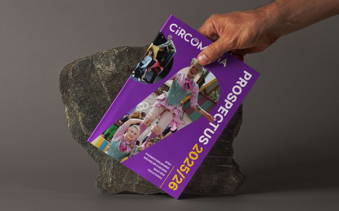
Circomedia
Discover how we refreshed Circomedia’s brand identity to better reflect their inclusive arts ethos and vibrant community spirit.
Redefine how the world sees you
From bold visual identities to cohesive client communications, we help organisations stand out through thoughtful, story-driven design.
If you’re ready to refresh your brand and connect with your audience with clarity and confidence, let’s talk.