Coffin Mew rebrand
Weaving a bold new identity
for a modern law firm
The brief
Coffin Mew is a progressive law firm with a bold, entrepreneurial approach that distinguishes it within the legal sector. Known for its energy and innovation, the firm advises individuals, entrepreneurs, SMEs, and corporates across a wide range of sectors.
When Coffin Mew approached The Graphic Design House, they were looking to evolve their brand following a merger, to reflect their forward-thinking culture, modern outlook, and continued commitment to delivering exceptional legal advice.
The brief was to create a brand identity that would reposition Coffin Mew as a contemporary, confident firm unafraid to challenge convention. The visual identity needed to reflect both professionalism and personality, giving them a distinctive presence in a traditionally conservative market.
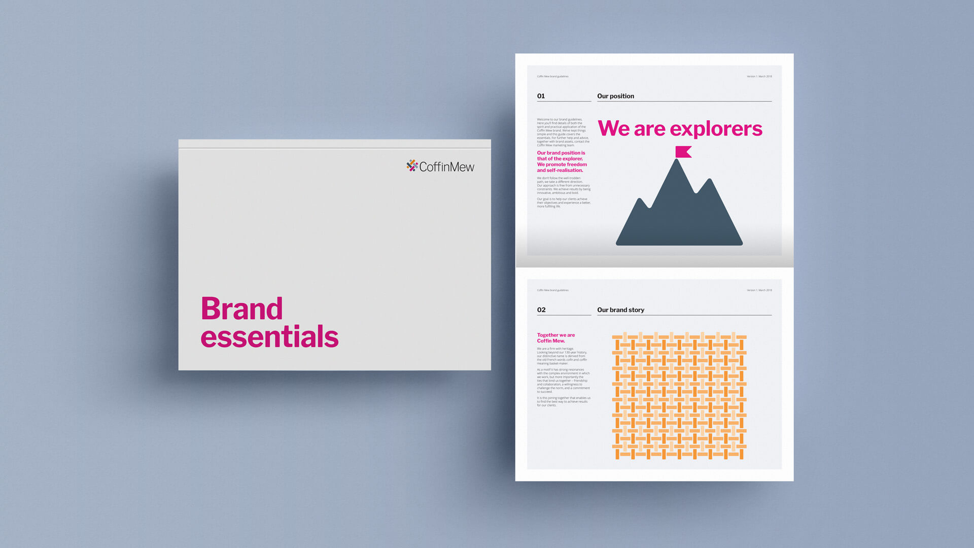
During the discovery process, we explored the origins of the firm’s name, Coffin, derived from the old French word meaning “weave.” This insight inspired the central creative concept: a visual representation of weaving, symbolising strength through connection, between the firm and its clients, and among its diverse areas of expertise.

Our approach
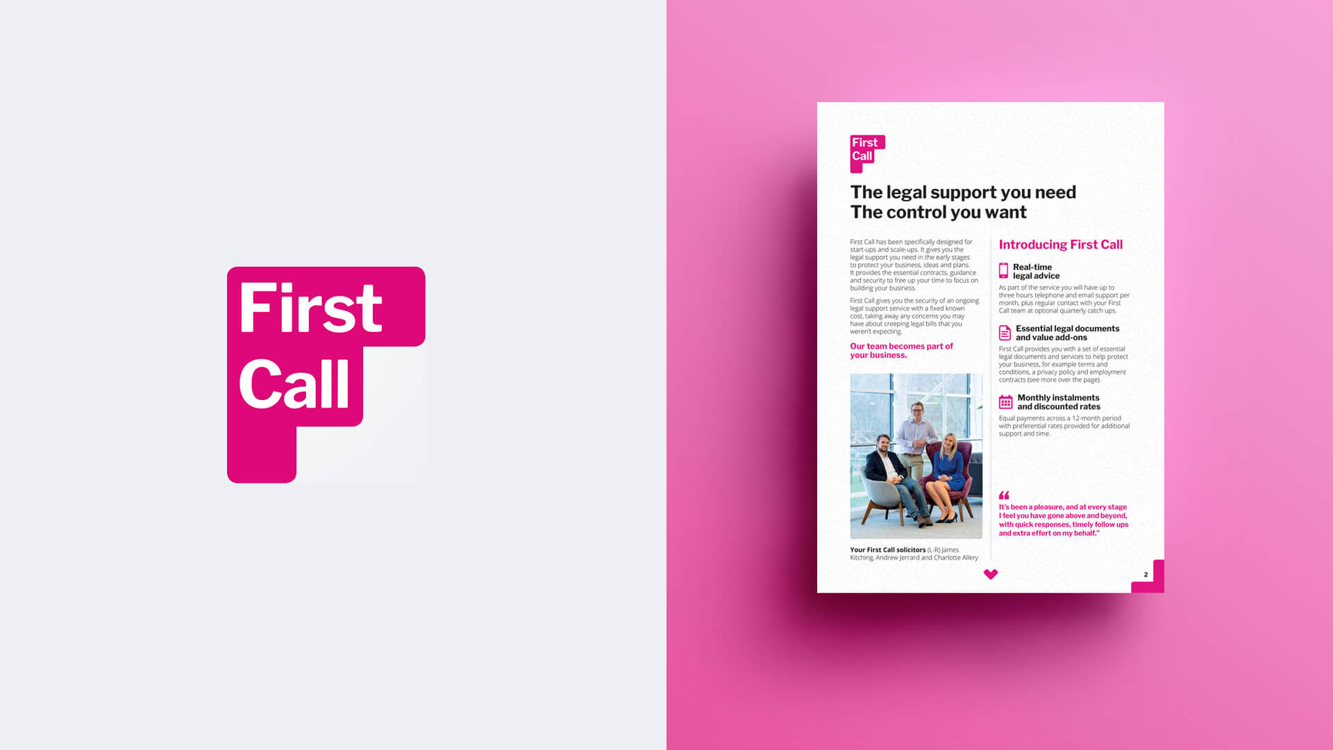
From exploring Coffin Mew’s strategic goals to developing a brand identity applied across every touchpoint, we focused on creating a distinctive, cohesive identity that reflects the firm’s modern, collaborative approach. Hover over the flip tiles below to explore each step of our process.
Building the brand framework
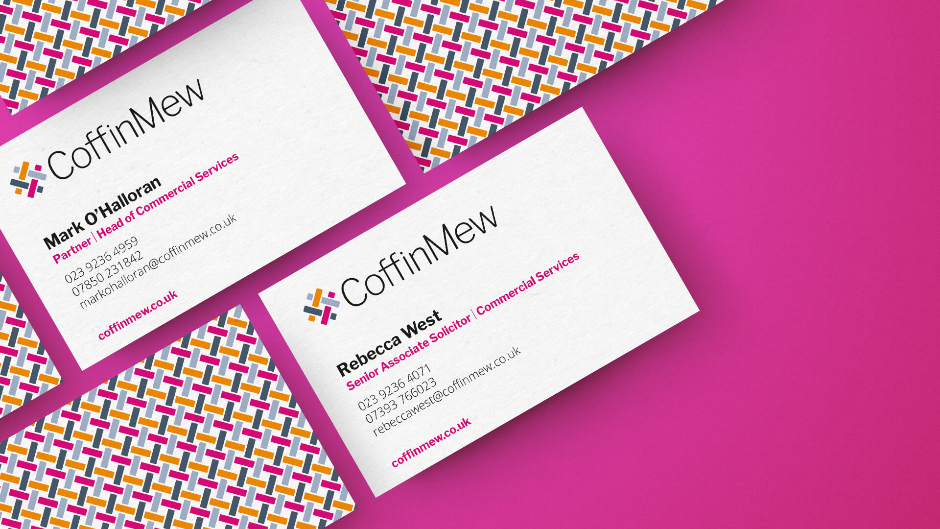
Rolling out the identity
The 'weave' identity
Visualising the vision


Results & next steps
The rebrand gave Coffin Mew a confident, distinctive identity that stood out in the legal marketplace. The “weave” concept became a powerful visual metaphor for the firm’s approach, connecting with clients and creating strength through partnership.
The work was recognised externally, with the rebrand shortlisted for a Design Week Award, reflecting its creativity and clarity. Coffin Mew’s new identity continues to underpin their marketing and communications, strengthening their reputation as a modern, dynamic firm.
The Graphic Design House continues to support Coffin Mew as their brand evolves, helping to maintain consistency across communications and apply the identity to new campaigns and materials as the firm grows.
Ready to refresh your brand or publication?
Our work in action
Crosfields School
A strategic rebrand for Crosfields School, uniting message and design around a confident promise to “Embrace every journey.”
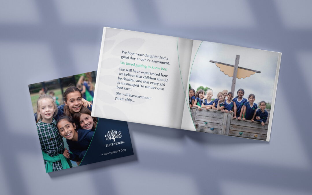
Bute House School
A considered evolution of Bute House’s identity, refining its iconic tree mark for clearer, more flexible use across modern communications.
Redefine how the world sees you
From bold visual identities to cohesive client communications, we help professional services stand out through thoughtful, story-driven design.
If you’re ready to refresh your brand and connect with your audience with clarity and confidence, let’s talk.