Treloar’s
Empowering stories through accessible design
The brief
Treloar’s is a charity that provides education, therapy, and care to physically disabled young people, helping them build independence and lead fulfilling lives. With 170 students from across the UK and Ireland and over 800 expert staff, their wraparound approach delivers exceptional support in a truly specialist environment.
Having built a trusted relationship through print and mailing projects, Treloar’s asked us to support them with design too. They needed materials that felt accessible, uplifting and on-brand, from their Annual Report to donor letters, helping tell real stories and connect with the supporters who make their work possible.

“With the help from the Graphic Design House we’ve managed to make some real savings on this campaign, compared to the previous mailing in March. Thank you for your support and advice. Amy has been amazing, so I’m really pleased to be working with her and Laura, and will have more campaigns to send her way in the future.”
Helen Moore
Marketing Manager
Treloar College
Our approach
Hover your mouse over the flip tiles below to learn how we delivered accessible, thoughtful design that brings Treloar’s stories to life.
Our approach
Tap the flip tiles below to learn how we delivered accessible, thoughtful design that brings Treloar’s stories to life.
Building on a strong brand
A brochure with two front pages
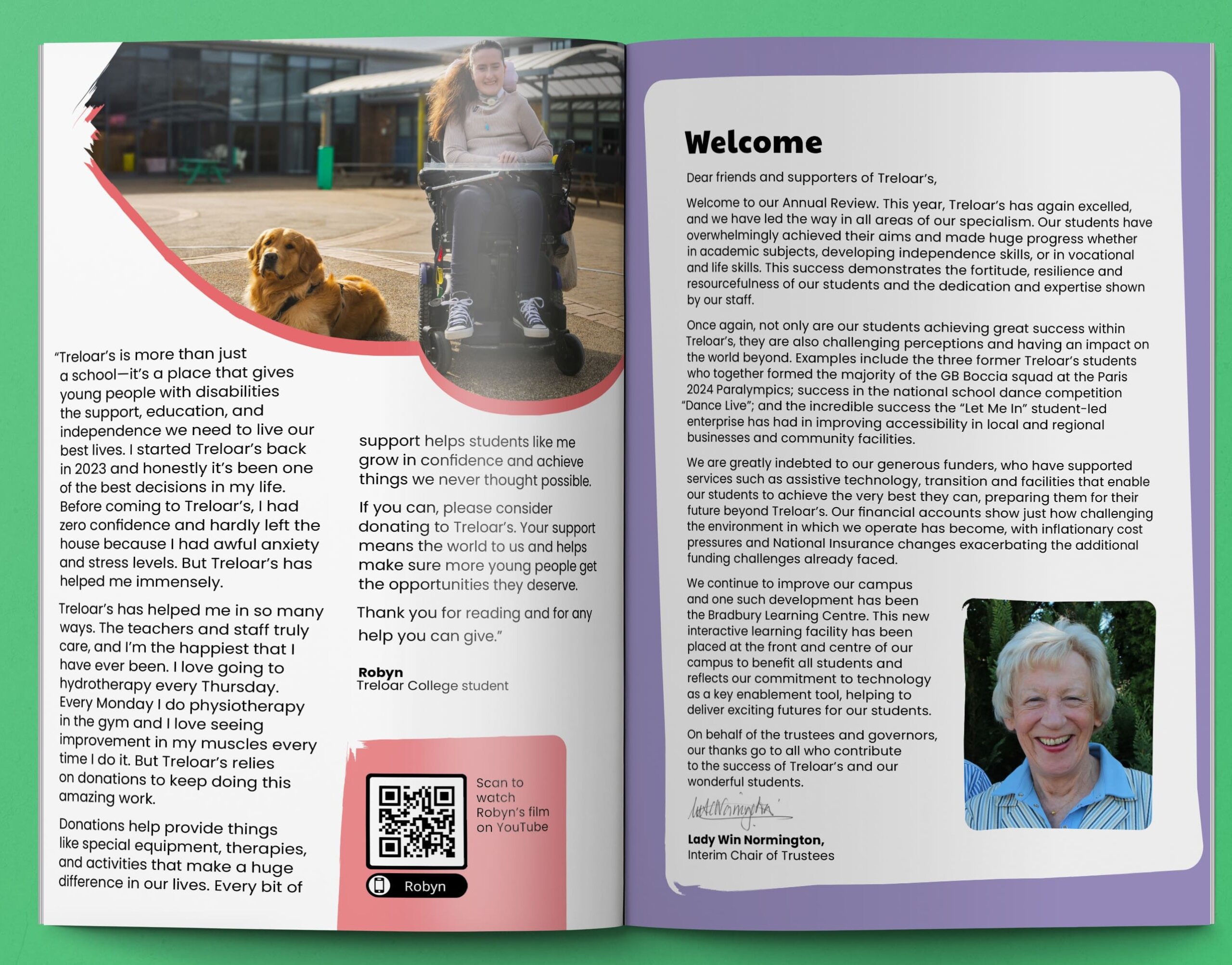
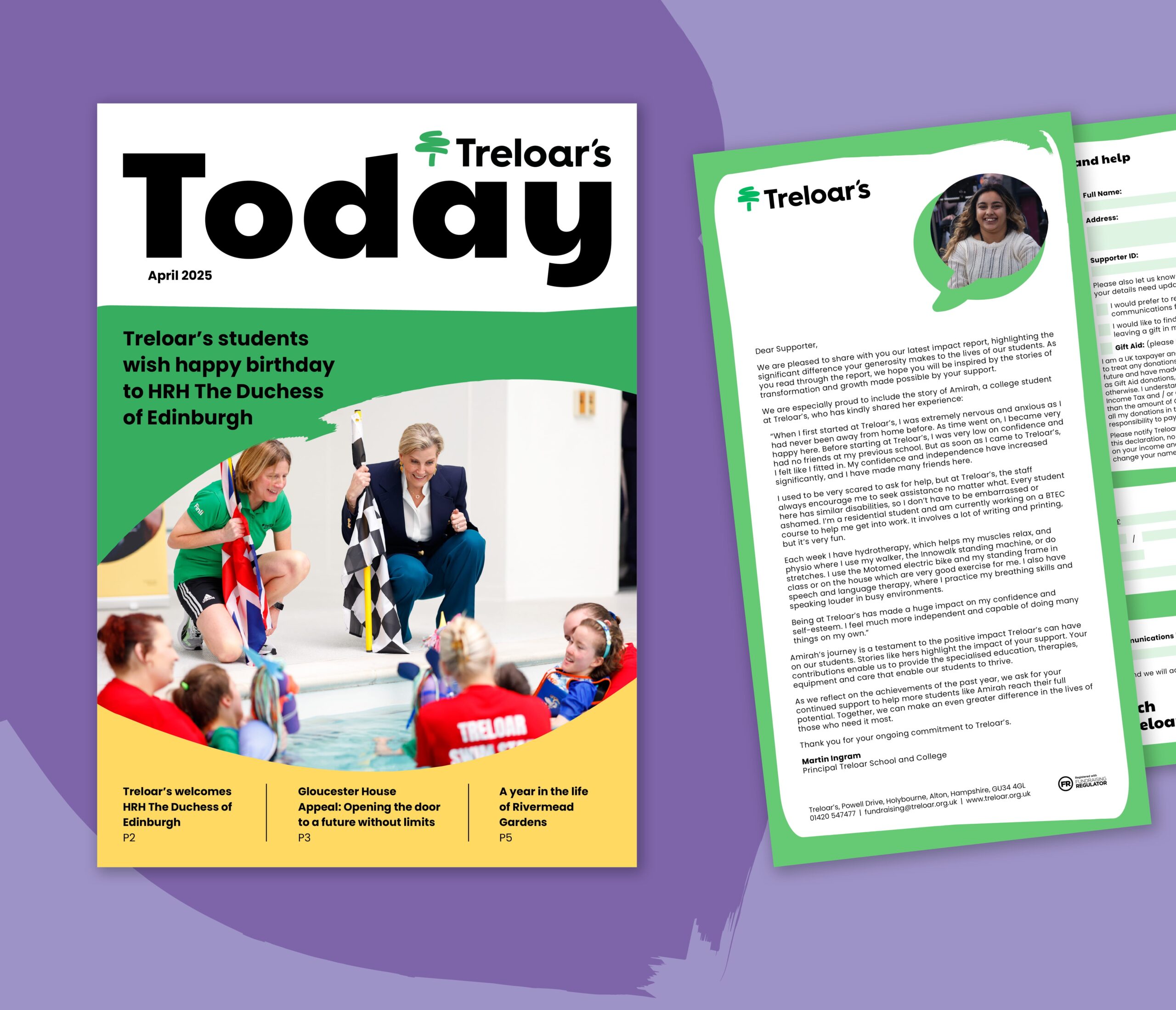
Telling real stories
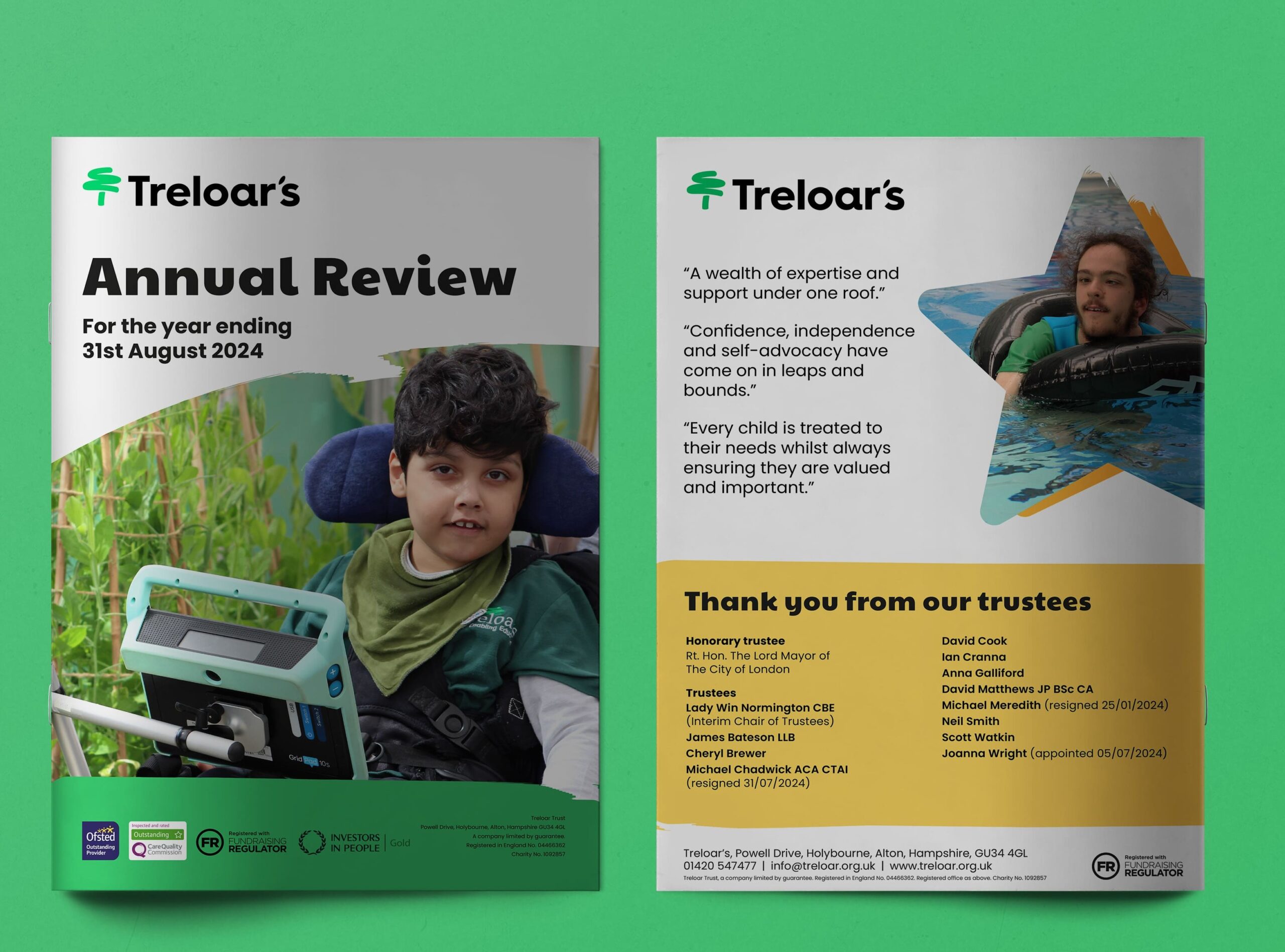
Annual report design
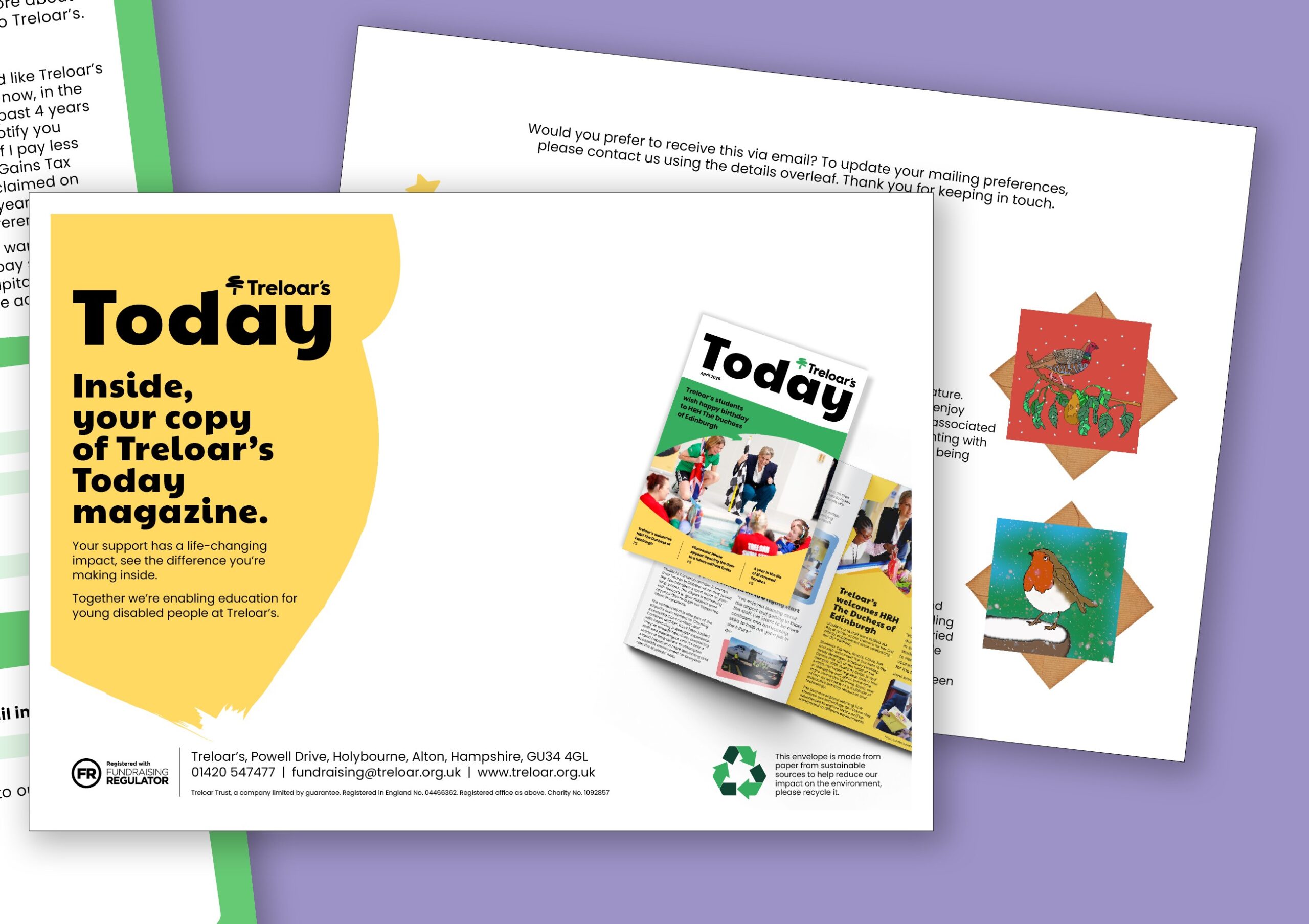
Accesible fundraising
")


Results & next steps
The Annual Report received positive feedback from the client and the recipients, praised for its clean design which follows accessibility standards and brings positivity and fun to the audience.
Our next steps focus on strengthening our partnership with Treloar’s and offering our support on other marketing or fundraising materials, including donation letters, reports and campaigns, that continue to champion the incredible stories of Treloar’s students and the impact of supporters.
Our work in action

Hampshire & Isle of Wight Air Ambulance
We partner with Hampshire & Isle of Wight Air Ambulance to deliver clear, human-focused design that strengthens fundraising, outreach and education, helping them inspire life-saving action across every channel.
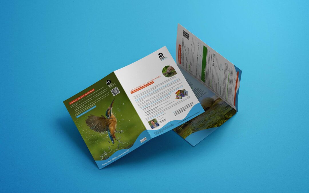
HMWT Mailing
End-to-end direct mail campaigns for HMWT, combining clear storytelling and consistent design to support fundraising and awareness in print.
Design that tells the story, clearly and creatively
If you want your reports, campaigns or communications to be accessible, uplifting, and genuinely engaging, we can help. From print to digital, we focus on designs that connect with people, celebrate real stories, and make every message easy to read and impossible to ignore.
Let’s create materials that do justice to the work you do.