Contents
Why brochure design and size matter
Standard brochure sizes explained
Types of bound brochures
Choosing the right brochure dimensions for your needs
Essential design principles for brochures
Common brochure design mistakes to avoid
Digital vs print brochures finding the balance
Follow us
Brochures are a versatile and effective marketing tool, offering a tangible way to showcase your products, services and brand personality. When it comes to creating a brochure that makes a real impact, design and size aspects can be just as important as the words you’re using to describe your product.
Dimensions, layout and design choices can all influence how your message is received and whether your brochure is kept, shared or set aside.
In this guide, we’ll explore what you need to know about brochure design and size, including:
- Why brochure dimensions, format and layout matter for brand perception and return on investment (ROI)
- The most common standard brochure sizes in the UK
- Creative brochure design tips and layout ideas
- How to choose the right paper size and fold for your campaign
- Common brochure design mistakes to avoid
Why brochure design and size matter
In our digital-first world, brochures remain one of the most effective direct marketing methods. They’re tactile, hold people’s attention and can often leave a longer-lasting impression than an online ad or email.
The design and size of a brochure play a crucial role in how it’s received. A well-structured layout and the right dimensions make information easy to absorb, as well as showcasing your professionalism and attention to detail. On the other hand, a poorly chosen size or cluttered design might feel cheap or overwhelming, which might damage perceptions of your brand.
Getting choices like these right can help you maximise your return on investment in print marketing.

Standard brochure sizes explained
When planning a brochure, the size you choose will directly affect both its visual impact and practical use. While there’s plenty of scope to experiment, certain standard brochure sizes are widely recognised and help keep costs manageable. The most common options in the UK are:
- A4 (210mm x 297mm): Ideal for company profiles, product catalogues and event brochures, offering plenty of space for text and imagery.
- A5 (148mm x 210mm): Compact, cost-effective and a good option for handouts or mailing campaigns.
- Square (148mm x 148mm or 210mm x 210mm): Eye-catching and modern, well suited to creative or high-end campaigns.
- DL (99mm x 210mm): Slim and versatile, often used for tri-fold leaflet brochures.
- A6 (105mm x 148mm): Pocket-sized and portable, great for quick reference or takeaway information.
A big advantage of working with The Graphic Design House and our partner Bishops Printers is access to a bespoke printing service. You’re not confined to predetermined dimensions, meaning you can explore creative options like throw-out front or back covers, or even adding a pocket to the inside back cover for promotional inserts. Throw-outs are particularly effective for maps, process diagrams or any content that benefits from extra visual space.
From a mailing perspective, size also impacts cost. To keep postage affordable, it’s best to stick to brochures no bigger than A5 (C5 envelope), as A4 (C4 envelope) formats will incur a large letter tariff.
Brochure sizes and uses compared
| Brochure size | Dimensions (mm) | Best used for |
| A4 | 210 x 297 | Detailed brochures, company profiles |
| A5 | 148 x 210 | Mailings, handouts, events |
| Square (small) | 148 x 148 | Creative campaigns, product launches |
| Square (large) | 210 x 210 | Showcase pieces, high-impact visuals |
| DL | 99 x 210 | Tri-fold summary leaflet brochures |
| A6 | 105 x 148 | Portable guides, giveaways |
Types of bound brochures
Once you’ve settled on a size, it’s important to think about how your brochure will be bound. The binding method affects not only the look and feel, but also how many pages you can include. In the UK, the most common brochure binding options are:
- Saddle stitched: Pages are folded and stapled along the spine. Ideal for smaller brochures, event guides or booklets with up to around 48 pages (depending on the paper stock used).
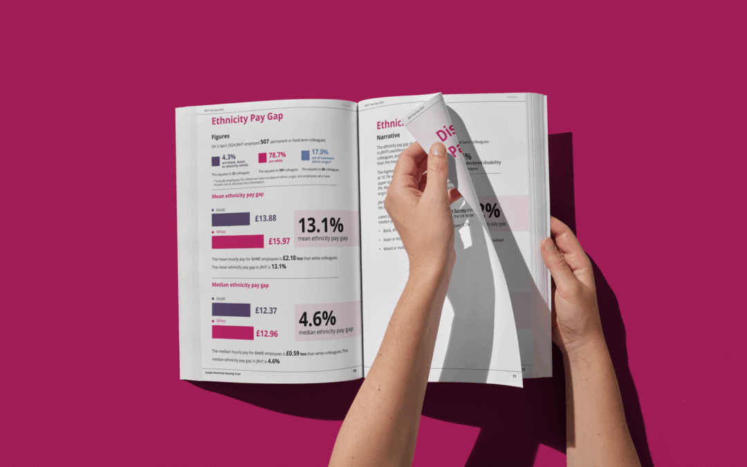
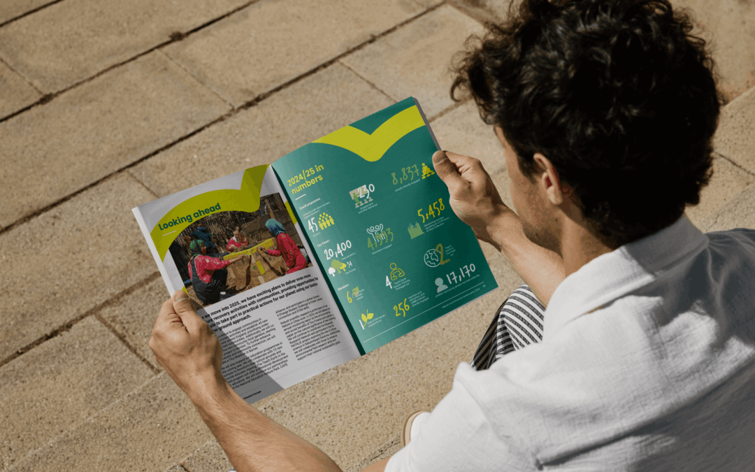
- Perfect bound: Pages are glued at the spine with a square edge, giving a more polished, book-like appearance. An attractive option for larger brochures, catalogues or annual reports.
- Wiro (spiral) bound: A practical option where pages are punched and held together with a wire coil. Useful for manuals, reference documents or materials that need to lie flat when open.
Each binding type has its own advantages and practical considerations. The right choice will depend on your content, page count and how you expect the brochure to be used.
Choosing the right brochure dimensions
for your needs
There’s no one-size-fits-all approach to brochures. The right dimensions and design will depend on the purpose of your campaign and your audience.
- Event brochures often need to be portable and easy to hand out, which makes A5 or DL formats a practical choice.
- Product brochures benefit from larger sizes like A4 or square formats, which give you the space for detailed descriptions and high-quality visuals.
- Company profiles or showcase pieces can make use of bespoke sizes and creative folds to stand out and make a strong impression on your audience.
Generally speaking, smaller sizes are cost-effective and convenient for mailing, while larger sizes can make more of an impression and support a premium brand image. Selecting brochure dimensions in line with your goals means you can strike a balance between practicality, cost and visual impact.
Explore fundraising ideas that work alongside print materials

Essential design principles for brochures
A well-designed brochure combines creativity with clear messages and selling points. Here are some key factors to bear in mind to ensure your next brochure hits the mark where design is concerned:
- Design for print, not screen: Don’t assume what works online will look just as good on paper. Adapting smartly for print will mean your brand feels coherent and professional, as well as being properly optimised for a tactile format.
- White space and readability: Resist the temptation to cram in too much content. Spacing helps guide the reader’s eye and makes the brochure more inviting.
- Typography best practices: It’s best to go for fonts that are easy to read at different sizes and limit yourself to two or three typefaces for consistency.
- Visual hierarchy and calls to action: Headings, subheadings, images and bold elements within the design are useful tools to guide attention to the most important information.
- Practical checklist before sending to print: Artwork requirements vary depending on how your brochure is bound. With perfect binding, for instance, you need to leave enough margin to ensure content isn’t sucked into the spine. With any format, additional artwork will be required for specialist finishes such as spot gloss UV varnish, foiling and embossing. Also, be sure to double-check spelling, grammar, contact details, image resolution and other vital elements of your brochure before printing.
- Consider investing in professional design support: Working with an experienced design partner like The Graphic Design House ensures your brochure is not only visually striking, but also practical, print-ready and won’t blow your budget.
By applying these principles, your brochure will have both creative appeal and professional polish, giving you a valuable asset to boost your marketing campaigns.
Common brochure design mistakes to avoid
Failing to match content with format
For example, saddle-stitched brochures must have a page count in multiples of four. If not, you risk blank pages and wasted paper. Perfect bound brochures don’t have this restriction.
Overcrowding text
There’s no need to fill every available space with copy. In fact, this can make the content hard to read, reducing the overall impact of your brochure.
Ignoring bleed and margins
Without correct setup, important details can get cut off, sucked into the spine or appear uneven.
Choosing the wrong paper stock
Thin or flimsy stock can feel unprofessional, reduce durability and impact the reader’s experience. Paper that’s too thin may cause show-through, making text hard to read and spoiling imagery. Perfect bound brochure covers need thicker stock than saddle-stitched – 200gsm as a minimum, or 250-300gsm for a premium feel.
Inconsistent fonts and styling
This can disrupt readability and make a brochure look unprofessional. Use character and paragraph styles to maintain consistency across headers, body text, captions and call-outs.
Insufficient planning
Failing to map content and page numbers in advance can lead to costly revisions. Using a flatplan to plan content placement and pagination before design begins saves time and will prevent layout issues.
Poor colour matching, alignment and finishing
Running imagery across cover and internal pages requires careful attention to paper type, colour matching and alignment. Mismatched stocks between cover and internal pages can cause colour inconsistencies and make images appear misaligned. Finishing techniques – such as lamination and matt/gloss coatings – should work in tandem with the design to enhance visual impact and durability.
Sidestepping these pitfalls can save you money, ensure a smoother print process and help you maintain a professional brand image.
Digital vs print brochures: finding the balance
Printed brochures create a tangible connection with your audience – something physical they can hold, keep and return to.
Digital brochures, on the other hand, go beyond static PDFs. Interactive flick books can simulate the page-turning experience of print while layering in hyperlinks, videos and pop-ups to engage readers in new ways. And QR codes printed within physical brochures are a powerful bridge between the two, linking directly to online content, calls to action or product listings.
Digital formats can help reduce print costs and support sustainability goals, while print delivers impact and memorability that’s hard to match online. In practice, the most effective campaigns often use both, combining the authority of print with the flexibility and reach of digital.
At The Graphic Design House, we design for both worlds. Whether you need a brochure that makes an impression in the hand, on screen, or both, we’ll help you create one that delivers results.
More insights
How to design an annual report that engages and inspires
Learn how to design an annual report with better layouts, branding and visuals using practical expert tips from The Graphic Design House.
Types of impact reports every organisation should know
Explore the different types of impact reports and how the right design approach improves clarity, credibility and engagement
Impact report design that turns data into meaningful brand stories
Learn how impact report design transforms ESG data into clear, engaging brand stories by improving clarity, trust and stakeholder engagement.
Make your brochures
work harder
From bold, memorable print to interactive digital formats, we help brands create campaigns that capture attention and drive results. If you want a UK design agency that gets your audience, and gets it right, let’s talk.