The Henley College
The client
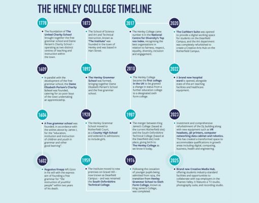
The Henley College is a long-standing client, with ongoing work focused on consistency, refinement and evolution rather than wholesale reinvention. Across multiple touchpoints, the aim has been to ensure the college’s visual identity remains confident, contemporary and unmistakably Henley.
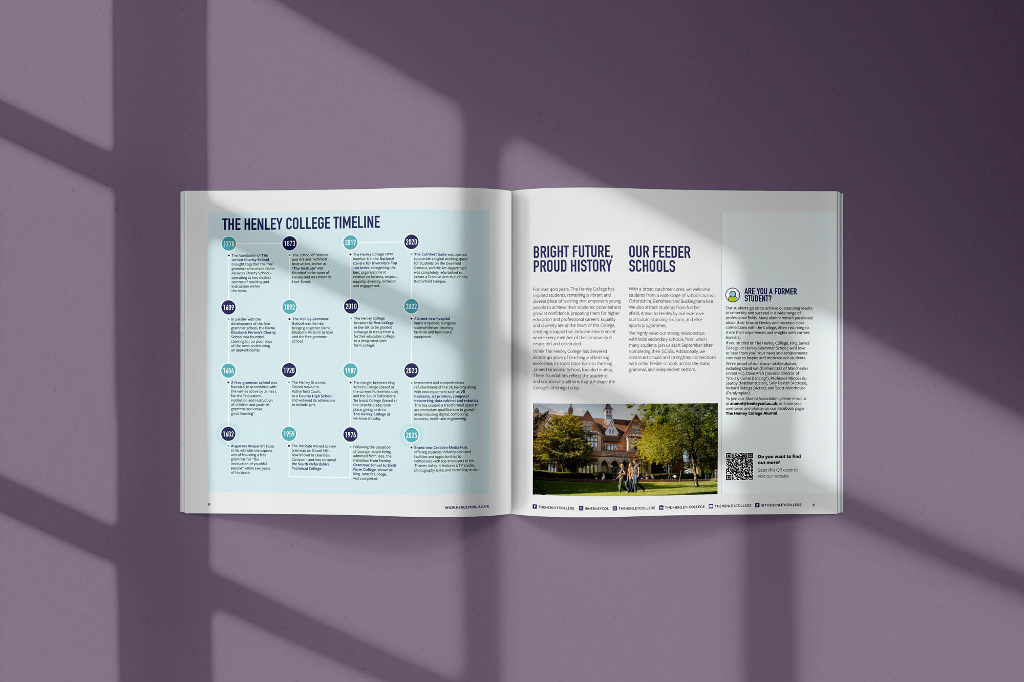
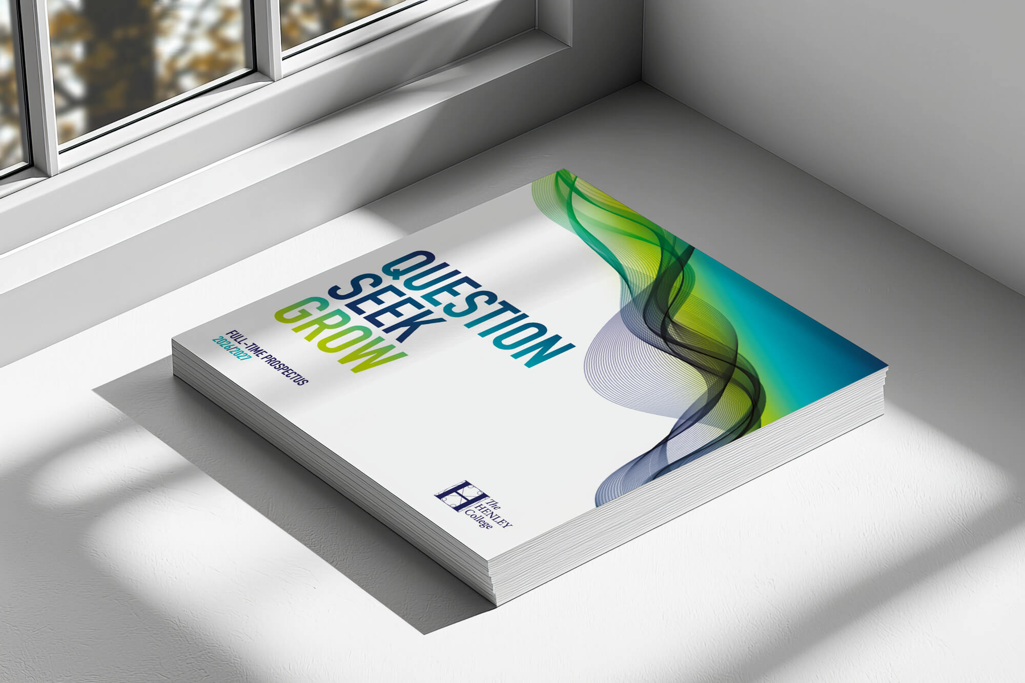
The prospectus plays a central role in this system. It is one of the most tangible expressions of the Henley brand, and often the first meaningful interaction prospective students have with the college.
The brief
The brief was to continue evolving Henley College’s prospectus year on year, keeping it fresh and relevant while maintaining strong recognition and ownership. Rather than redesigning from scratch each cycle, the work needed to build on an established visual language and strengthen consistency across the wider brand ecosystem.
This included maintaining Henley’s distinct square format, showcasing the college’s identity clearly, and exploring refinements through layout, print detail and finishing.


Our approach
We structured the project around evolving an established identity system, refining the prospectus annually while maintaining consistency across the wider Henley brand.
Anchoring the brand

Wave-led visual language
Evolving, not rebuilding
Print & craft
“It’s always a pleasure working with everyone at The Graphic Design House. The team is incredibly professional, supportive and collaborative, and we’re genuinely delighted with the finished work. It’s been a joy seeing it all come together.”
Rhian Mason
Head of Marketing & Communication
The Henley College

Results
The prospectus now sits confidently within a wider, coherent visual system, not as a standalone piece, but as a cornerstone of the Henley identity. Through consistency, refinement and attention to detail, it continues to feel current while remaining instantly recognisable.
Each annual evolution strengthens the framework further, allowing Henley to maintain long-term brand clarity while still introducing considered updates through design and print craft. The most recent edition also includes a perforated throw-out slip at the back of the prospectus, designed to house essential information such as open day details, QR codes, social links and contact information, a functional element that can be removed, kept to hand or used as a bookmark.
It’s not about shouting louder, it’s about being recognised instantly. Want to work with an agency who takes care of your organisations brand?
Our work in action
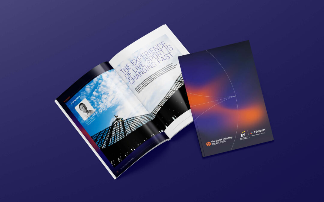
Sport Industry Group
A new design concept for the 2026 Sport Industry Report, aligning print and digital formats with bold layouts, gradients and data clarity.
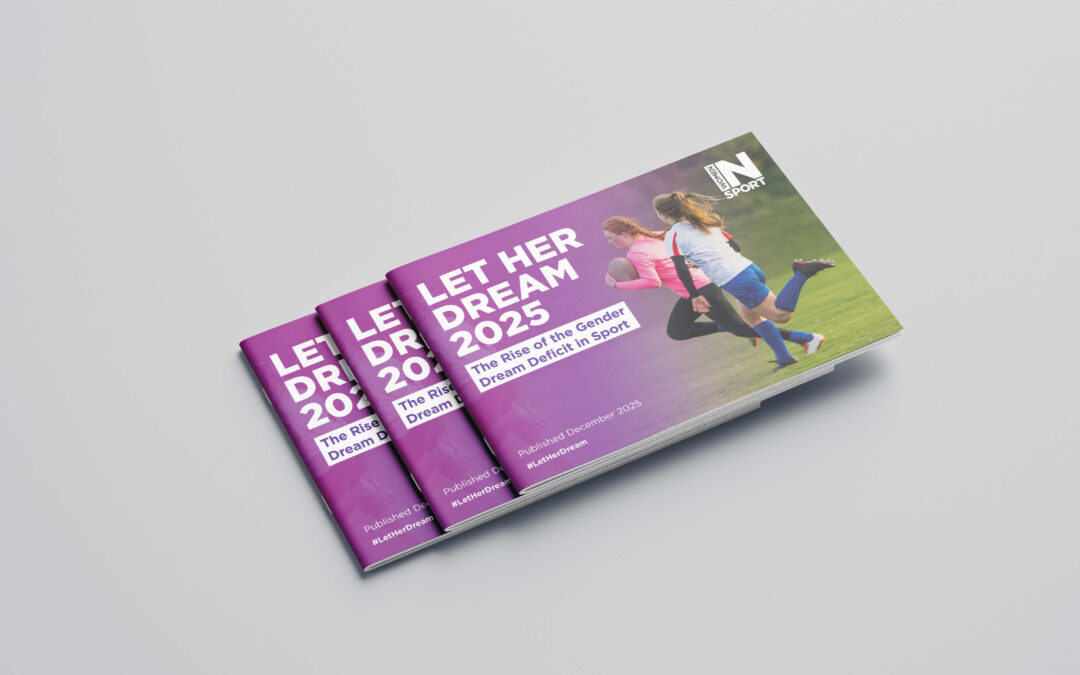
Women in Sport
Designing a clear, engaging research report for Women in Sport, translating complex data into accessible, brand-led storytelling.
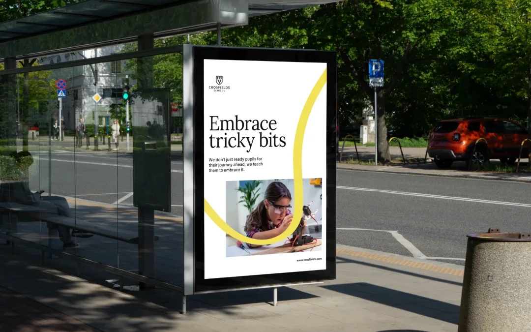
Crosfields School
A strategic rebrand for Crosfields School, uniting message and design around a confident promise to “Embrace every journey.”
Keep your brand moving forward
If your organisation needs year-on-year design support that builds recognition while keeping things fresh, we can help. From prospectuses and admissions materials to wider brand systems, we refine what’s already working, strengthening consistency, improving detail and delivering design that feels current, confident and unmistakably you.
Let’s evolve your next edition with purpose and craft.