London Park School
The client
London Park School (LPS) is a small group of co-educational senior schools in Clapham and Mayfair, with a sixth form near Victoria. They also operate a hybrid model in Clapham, combining online and in-person learning days. LPS is part of the Dukes Education family.
The brief
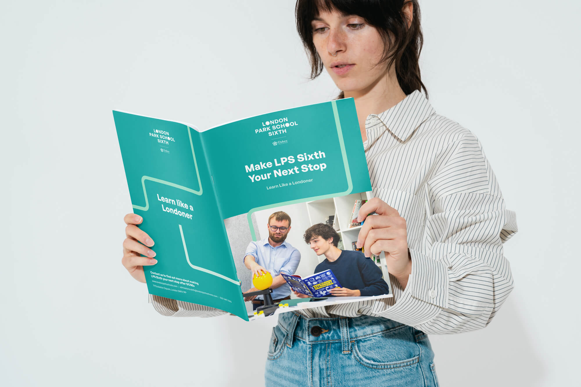
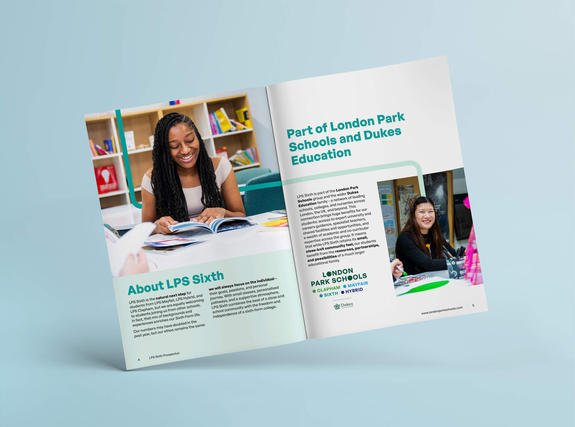
LPS approached us with an existing prospectus and individual school handbooks that had previously been produced in-house. The brief was to redesign these into a cohesive and consistent suite of publications that felt unified as a group, while still allowing each school’s individual character to come through.
")

Our approach
We structured the redesign around a consistent visual system that unified the full suite, using existing brand elements to create flow, clarity and a stronger sense of journey across each publication.
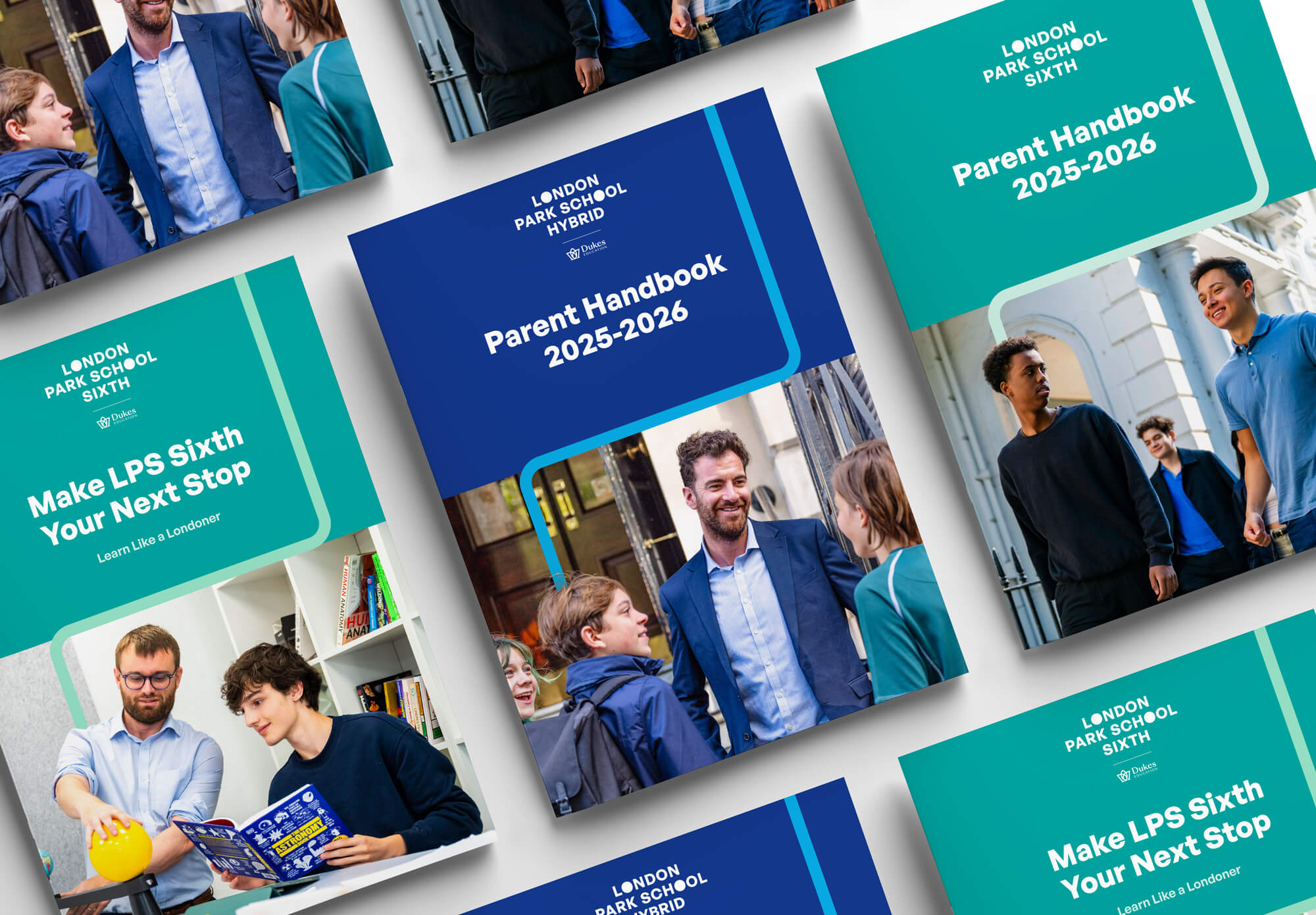
Unifying the suite
Colour for distinction
Journey-led structure
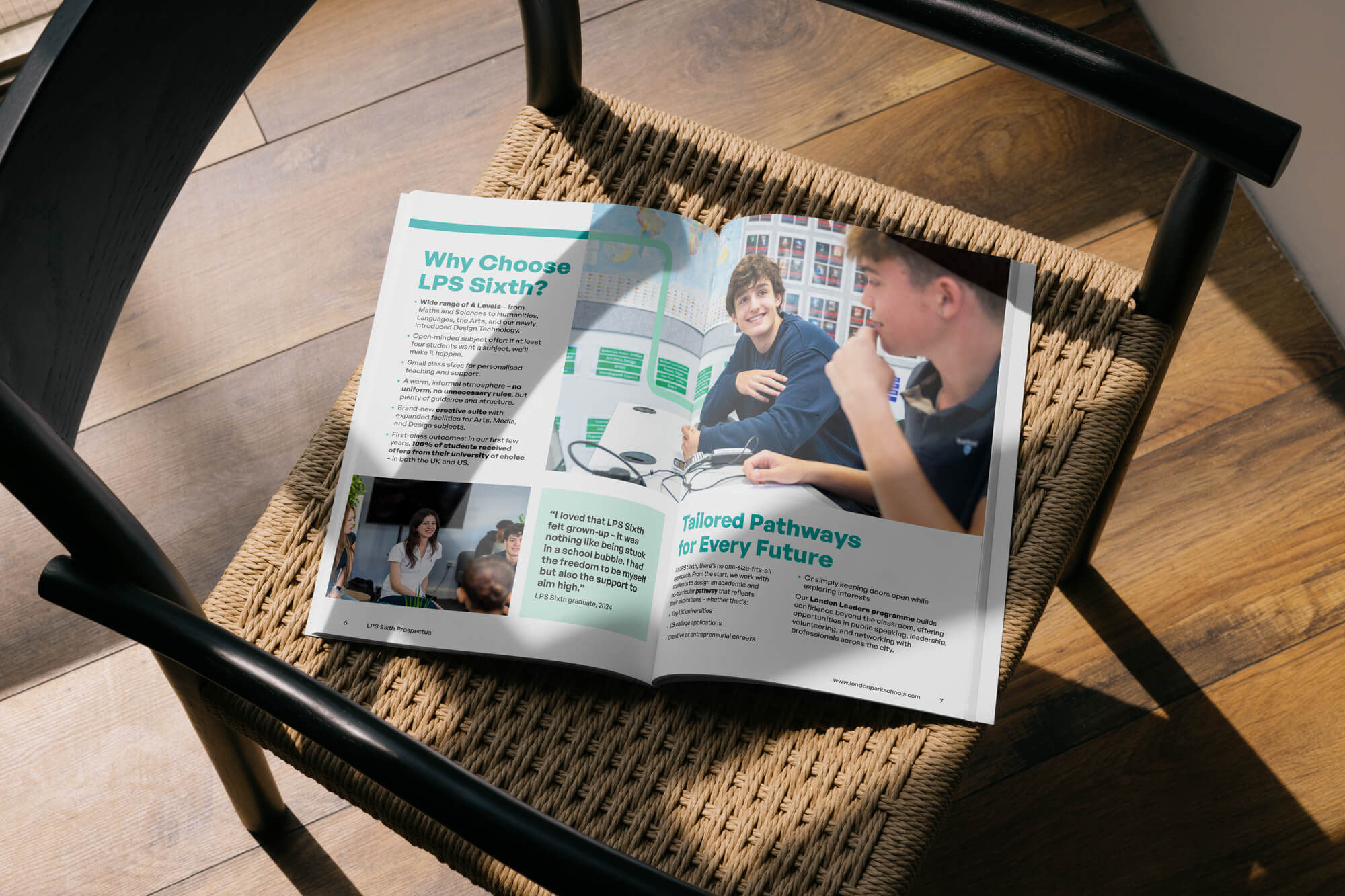
Bringing it to life
Results
Our work in action
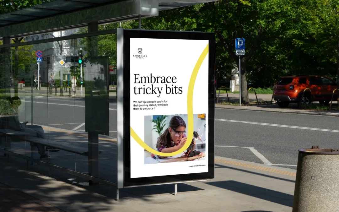
Crosfields School
A strategic rebrand for Crosfields School, uniting message and design around a confident promise to “Embrace every journey.”
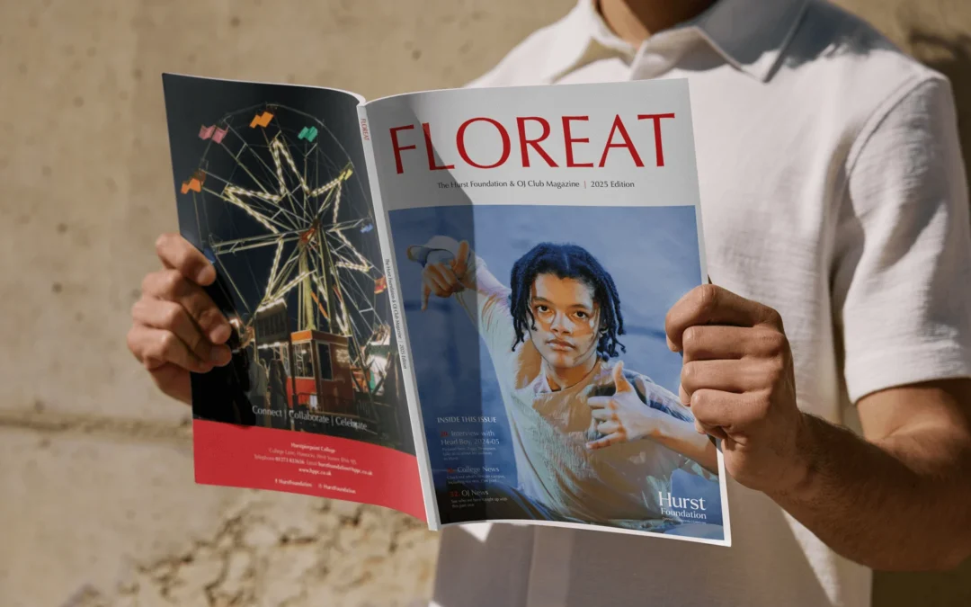
Hurst Foundation
A refreshed annual magazine for The Hurst Foundation, delivering a confident, editorial-led design that engages alumni and community.
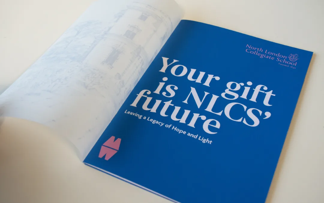
North London Collegiate School
Creative and digital support for North London Collegiate School, from magazine design to campaign materials connecting students, alumni and supporters.
Unify your publication as a suite
If your organisation produces multiple documents across different sites or audiences, we can help you bring them together into a cohesive system. From prospectuses and handbooks to wider admissions materials, we create consistent layouts and design language that strengthen the parent journey, while still giving each school space to feel distinct.
Let’s build a suite that feels connected, confident and easy to navigate.