School prospectus design that reflects your identity
Contents
Types of school prospectus design
Core design principles for an effective school prospectus
Structuring a school prospectus
Examples of effective school prospectus design
How The Graphic Design House designs school prospectuses
Follow us
Your school prospectus design is often a family’s first real introduction to your institution. Before they visit, speak to staff or see your school in action, they are already forming opinions based on how your school presents itself.
That’s why it should never be treated as a last-minute project.
A well-designed prospectus is a strategic asset that shapes perception, builds trust and guides parents through the information they care about most. From visual storytelling and layout clarity to photography style and typography, every design decision influences how credible, confident and welcoming your school feels.
Types of school prospectus design
Different prospectuses serve different purposes, which means the design approach needs to change depending on the audience and the decisions being made.
A strong prospectus is not only visually consistent, but also built around how parents (and students) actually absorb information, from first impression through to final choice.
Whole-school prospectus
A whole-school prospectus is usually the flagship piece. It introduces your ethos, community and the wider story behind your school.
Design should feel broad and confident, with a strong visual identity throughout. Consistent colours, typography and photography style create cohesion and professionalism, helping families understand what your school stands for, not just what it offers. Because it covers a lot of ground, clear structure and well-paced sections are essential to stop it from feeling overcrowded.
Admissions-focused prospectus
Admissions prospectuses are built to help parents with decision-making. They are often comparing options and looking for reassurance, clarity and key information quickly.
This is where hierarchy and signposting matter most. Design should make content easy to scan, using clear headings, structured layouts and pull-out details that guide families naturally. The focus is on helping parents find what they need, from admissions steps and pastoral care to curriculum structure and day-to-day school life.
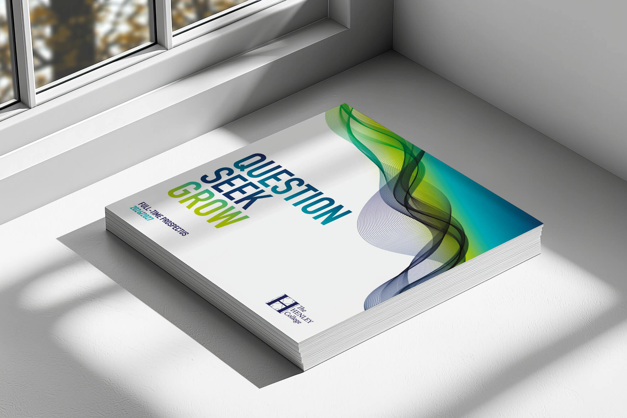
Sixth form or senior school prospectus
These prospectuses require a more mature design language, as students play a bigger role in the decision. This also means that the design needs to feel aspirational and future-focused.
Cleaner layouts, refined typography and purposeful imagery help reinforce progression, independence and outcomes. The goal is to create a prospectus that feels confident, ambitious and aligned with the next stage of a student’s journey.

Primary prospectus
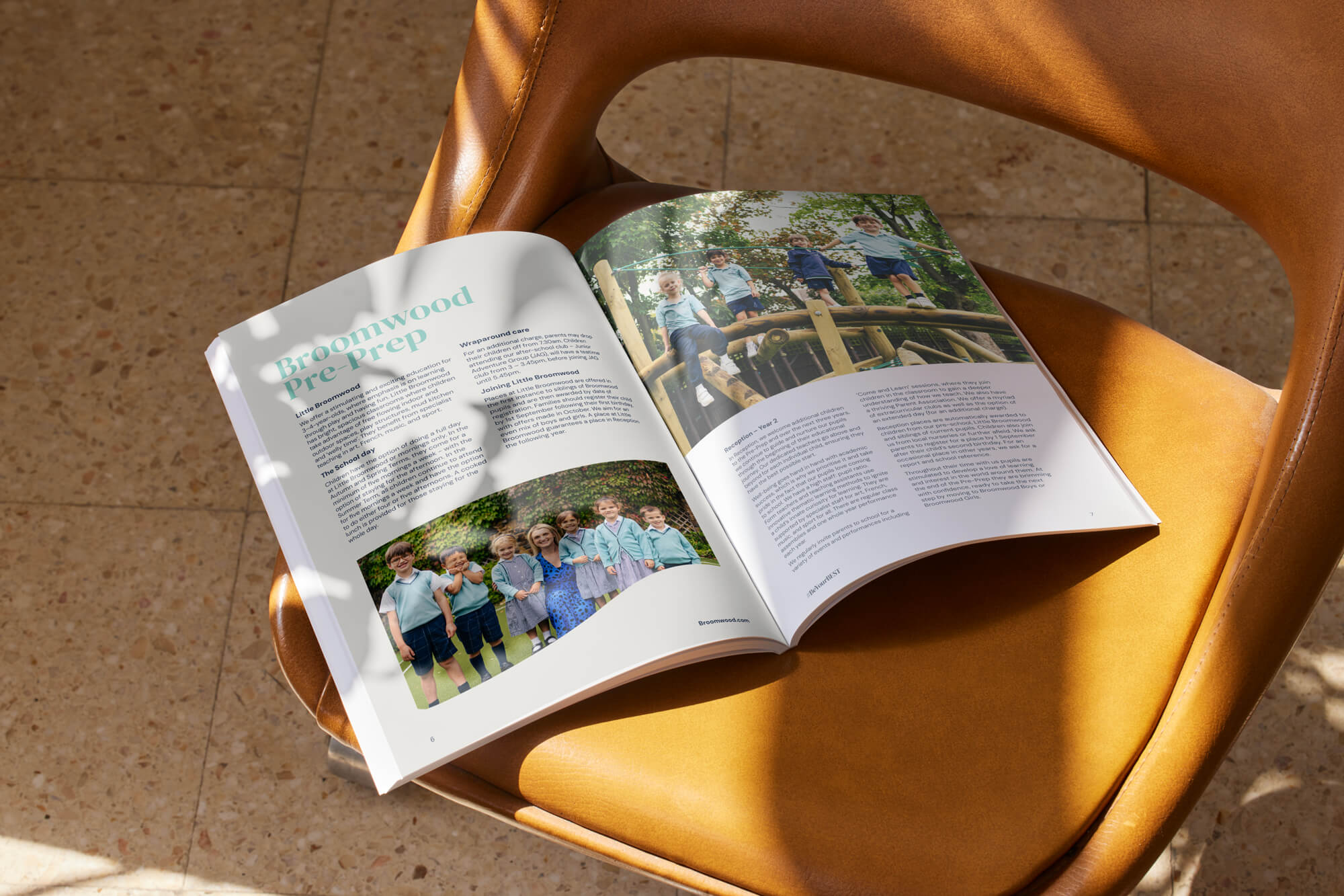
Early years and primary prospectuses are more emotionally led, as parents are choosing care and environment as much as education.
The design should feel warm and reassuring, using softer colour palettes, friendly typography and imagery that highlights relationships, play and exploration. These prospectuses work best when they are visual-led, with plenty of breathing space and just enough text to support trust and clarity.
Core design principles for an effective school prospectus
No matter the type of prospectus, strong design is rooted in a few core principles that ensure your content feels clear, credible and easy to engage with:
- Clear visual hierarchy: Parents rarely read a prospectus from start to finish in one sitting. Strong hierarchy using headings, subheadings, callouts and spacing makes key information easy to scan, digest and return to.
- Consistent branding throughout: Every page should feel unmistakably like your school. Consistent logo placement, colour palette, typography and graphic styling build recognition and reinforce trust.
- Typography designed for readability: Font choice, spacing and contrast should support effortless reading. Typography also shapes tone, helping your prospectus feel modern, traditional, creative or academic depending on your school’s identity.
- A balanced use of imagery and content: Photography brings your school to life, but it needs to sit alongside structured text. The strongest prospectuses use imagery to support the message, not compete with it.
- Accessibility built into the design: Schools should consider accessibility from the outset. This includes minimum readable font sizes, solid backgrounds behind text and colour combinations that meet AAA standards. Digital versions should include alt text, along with clear contents pages, page markers and navigation tools.
- A strong grid system for structure and consistency: An effective grid keeps layouts clean and consistent, making the prospectus easier to follow while still allowing enough flexibility for impactful design moments.
Structuring a school prospectus through design
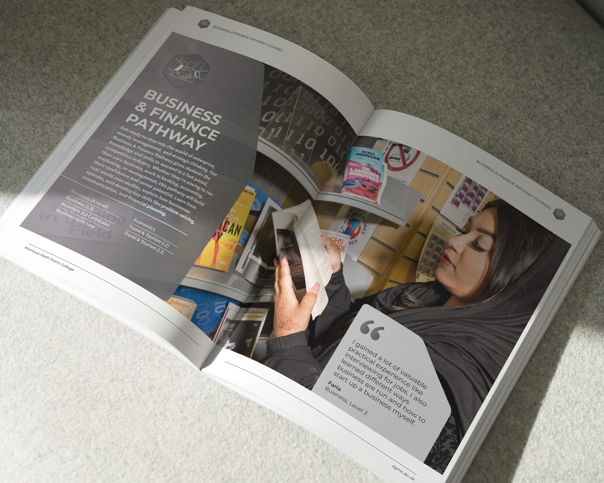
A prospectus is only effective if parents can quickly find what they need – and design plays a major role in structuring content so it feels logical rather than overwhelming.
Strong prospectuses use section flow and pacing to guide parents naturally, building from ethos and overview into curriculum, pastoral support, enrichment and practical details. Layout choices such as page breaks, consistent headers and clear chapter openers make the document feel organised.
Spacing is also a usability tool. Well-planned white space reduces visual overload and makes key messages stand out. When information is structured with care, parents are more likely to stay engaged and come away with a clear understanding of your school.
Examples of effective school prospectus design
There is no single correct style for a school prospectus, but the strongest designs always reflect purpose.
An ethos-led prospectus built around values is ideal for communicating culture and identity, using bold messaging, full-page imagery and structured storytelling.
A visually driven prospectus works well when atmosphere matters most, using strong photography and generous spacing to bring the school experience to life without overwhelming parents. For decision-making, an admissions-focused prospectus benefits from clear navigation, consistent layouts and strong signposting.
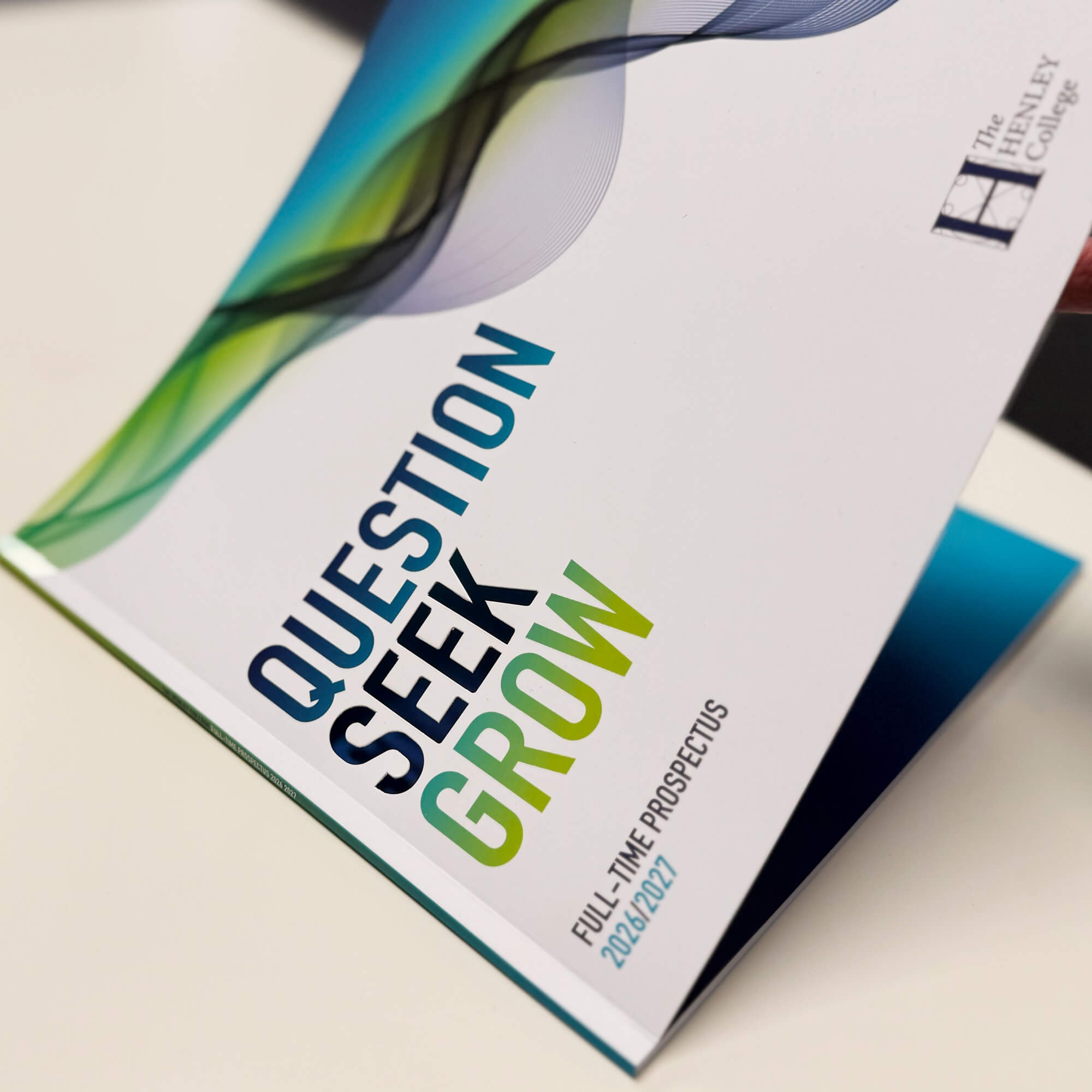
Projects we’ve delivered for institutions like The Henley College show how premium finishes such as die-cut covers can add impact, while our London Park School project demonstrates how design can unify a group identity without losing individuality.
How The Graphic Design House designs school prospectuses
We design school prospectuses with one clear aim: to create a piece that reflects your school professionally, confidently and with real clarity. We specialise in education-focused design, ensuring every prospectus feels consistent, well-structured and aligned with your brand.
Our work is always bespoke, with no templates and every design decision made with purpose. From typography and layout to photography treatment and page structure, everything is chosen to support your message, not just to look good.
We work collaboratively with school marketing teams, leadership and key stakeholders to ensure the final prospectus feels authentic. Where helpful, we can also carry out site visits to better understand your culture.
If you would like us to help you design your school’s prospectus, please contact us.
More insights
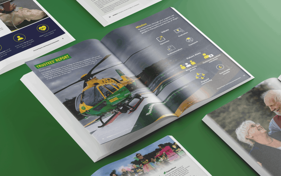
Annual report design: trends & best practices 2026
Explore annual report design trends for 2026, plus best practices that improve clarity, accessibility and stakeholder confidence.

Charity fundraising ideas: how strong branding and design drive greater impact
Discover how strong branding and strategic design turn simple fundraising ideas into powerful charity campaigns that build trust, engagement and donations.
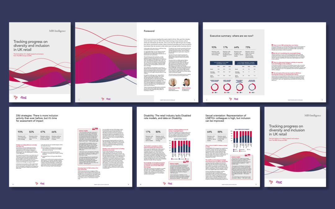
Corporate design: what it is, why it matters & how to get it right
Learn how corporate design strengthens recognition, builds trust and helps your brand perform across every touchpoint with a clear, modern visual system.
