Banner design ideas to help your brand stand out
Contents
Banner design ideas: what makes a banner work?
High impact banner design ideas
Banner design ideas that drive results
Practical design rules to apply to any banner idea
Choosing the right banner idea for your brand
Follow us
Banner design ideas only work when they’re built to get your message out fast. Whether your banner is competing in a busy social feed, sitting on a homepage or printed for an event, it only has seconds to grab attention and make its message clear.
The best designs don’t rely on decoration or trendy effects. They rely on structure: strong hierarchy, readable typography, clean spacing and a clear call to action.
In this guide, we’ll explore practical banner design approaches that help your brand stand out, stay consistent and drive real results across digital and print formats.
An effective banner is built around purpose, not decoration. Before you choose colours, imagery or layout, you need to be clear on the outcome. Are you driving awareness, promoting an offer or pushing for conversion?
What separates high-performing banners from forgettable ones is structure. Strong banners:
- Communicate one core message
- Guide the eye through a clear visual hierarchy
- Use contrast to improve legibility
- Make the next action obvious
They also respect how people actually view them. Most banners are seen briefly, often while scrolling or walking past. If the key message is buried in small text or surrounded by clutter, it will be missed.
Design should support the speed of understanding. When someone glances at your banner, they should instantly know what it’s about and what to do next.
Minimal typography-led banner ideas
Sometimes the strongest design choice is restraint. Typography-led banners remove visual noise and put the message front and centre.
This style relies on bold headlines, confident spacing and clear hierarchy. The headline does the heavy lifting, so it needs to be direct and easy to read. Supporting copy should sit beneath it in a smaller size, with enough space to avoid crowding.
Contrast is critical when it comes to these banners. Dark text on a light background, for example, improves readability and impact. Brand colours can be introduced strategically, often to highlight the call to action (CTA) or key detail.
This approach works particularly well for:
- Sales announcements
- New product launches
- Limited-time offers
- Important updates
The simplicity makes the message harder to ignore. It also adapts well across digital and print formats, as the structure remains strong even when resized.
Image-first banner design ideas
For brands driven by lifestyle, experience or visual appeal, an image-first banner can be more effective than a text-heavy design.
The key is choosing a single, strong focal image. It should communicate mood or context instantly and leave enough negative space for text placement. Overly busy images make banners difficult to read and dilute the message.
Subtle overlays or gradients can improve legibility, but they need to be handled carefully. The aim is to enhance clarity, not dull the image. A soft dark gradient behind text is often enough.
Copy should be kept concise – a short headline paired with one supporting line is usually sufficient. The image should create interest, while the text clarifies the offer or action.
A common structure includes:
- Full-width background image
- Short, punchy headline
- Minimal supporting copy
- Clearly defined CTA
This format performs well for event promotions, campaign launches and product showcases.
Promotional & CTA-driven banner ideas
If your objective is conversion, your banner should prioritise the offer, as promotional banners work best when the value is immediately visible.
The headline should highlight the benefit or incentive. If it’s a discount, the percentage or saving should be prominent. If it’s a service, focus on the outcome rather than the feature.
Hierarchy is essential in leading the eye naturally from headline to supporting detail to CTA. The CTA itself needs to stand out visually through colour contrast, button styling or positioning.
Effective CTA language is clear and direct:
- Shop now
- Book today
- Get a quote
- View the range
Urgency cues can strengthen impact when they’re factual rather than dramatic. Specific dates, limited availability or seasonal framing create momentum without sounding forced.
For example:
- Ends Sunday
- Limited spaces available
- Early bird pricing
- Sale ends 10pm
Promotional banners should feel focused. In other words, avoid adding secondary messages that compete with the main offer and crowd the banner.
Social & digital banner ideas
Social banners and online ads are viewed in fast-scrolling environments, often on mobile screens. In other words, designing for digital means designing for speed.
Social cover banners tend to reinforce brand positioning rather than promote specific offers. They should include:
- A concise tagline
- Consistent brand colours
- A clean layout with minimal clutter
Campaign banners for paid ads or posts need a stronger impact. Larger type, shorter messaging and high contrast can improve performance in crowded feeds.
Split layouts are particularly effective online. Placing text on one side and imagery on the other creates instant structure and avoids visual overload.
Modular templates can also improve consistency. By developing a flexible banner system where imagery, headlines or offers can be swapped out, you can maintain recognition while testing different variations.
It’s important to double-check your banner’s mobile visibility. Important text should not sit too close to the edges and small details should be avoided.

Print & physical banner design ideas
Physical banners face a different challenge: distance. Whether used at exhibitions, in retail windows or at events, they are often viewed from several metres away.
That changes design priorities and readability becomes more important than detail.
Exhibition banners should communicate who you are and what you do in seconds. Large typography, strong brand colours and minimal wording help achieve this. Attendees scanning a busy event space won’t stop to read paragraphs.
Retail and storefront banners need to capture attention quickly and communicate offers clearly. If the promotion isn’t legible from across the street, it’s unlikely to perform.
Event signage should prioritise direction and clarity. It needs to answer practical questions quickly and reduce confusion.
For any physical banner, focus on:
- Large, legible fonts
- Minimal copy
- High-contrast colours
- Strong logo placement
- One clear focal message
When designing printed banners, scale and resolution matter. Thin fonts and low-contrast colour combinations that look fine on screen can fail once enlarged.
The Graphic Design House can support you with your banner design for print, ensuring layouts are built for clarity, brand consistency and real-world viewing conditions. Final artwork can then be supplied to your chosen print partner for production and installation.

Practical design rules to apply to any banner idea
Certain principles apply regardless of format or objective.
- One message per banner: Resist the urge to stack multiple offers or ideas into one space. A single, focused message is easier to process and more likely to drive action.
- Establish hierarchy within three seconds: Your headline should be the first thing seen, followed by supporting detail and then the CTA. If the eye doesn’t know where to land, engagement drops.
- Prioritise colour contrast: Strong contrast between text and background improves readability across screens and in print. Style should never compromise clarity.
- Make the CTA clear: Use direct, action-led language and ensure it stands out visually from surrounding elements.
- Design for mobile and scale: Check that text remains legible on small screens and from a distance where relevant.
Adhering to these rules ensures your banners are focused and functional.

More insights
Annual report design: trends & best practices 2026
Explore annual report design trends for 2026, plus best practices that improve clarity, accessibility and stakeholder confidence.
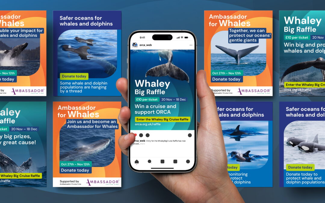
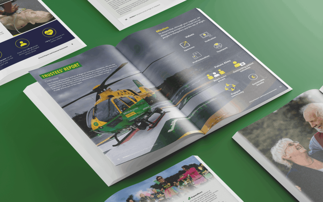
Charity fundraising ideas: how strong branding and design drive greater impact
Discover how strong branding and strategic design turn simple fundraising ideas into powerful charity campaigns that build trust, engagement and donations.
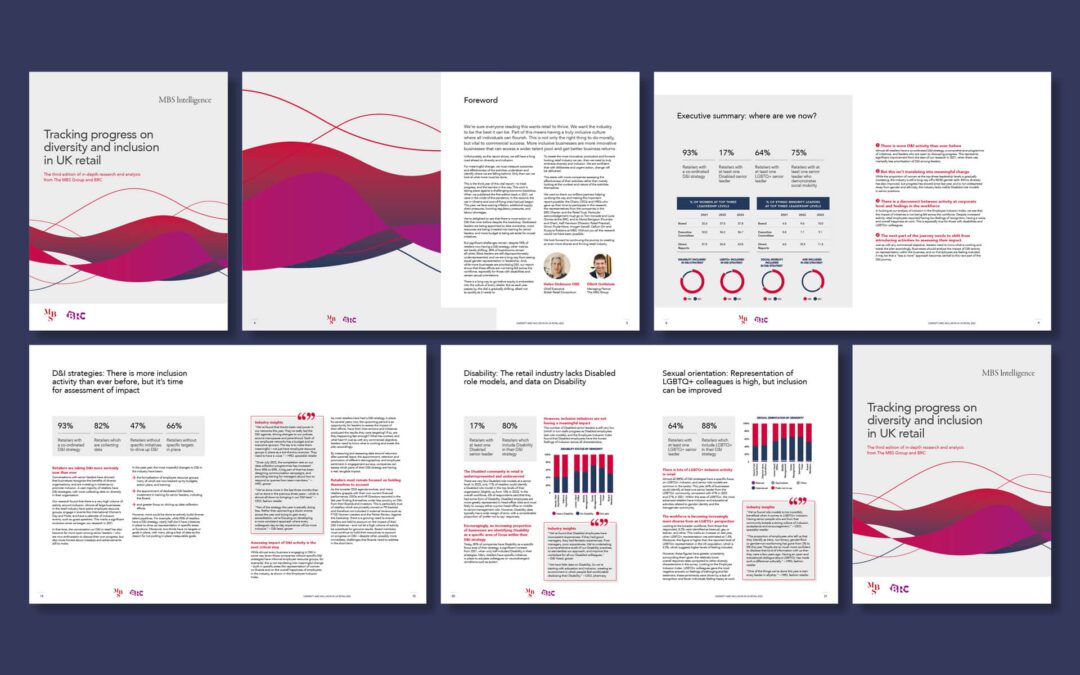
Corporate design: what it is, why it matters & how to get it right
Learn how corporate design strengthens recognition, builds trust and helps your brand perform across every touchpoint with a clear, modern visual system.