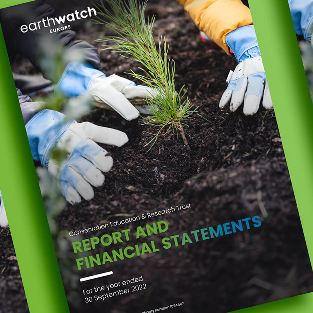
Earthwatch Europe
The brief
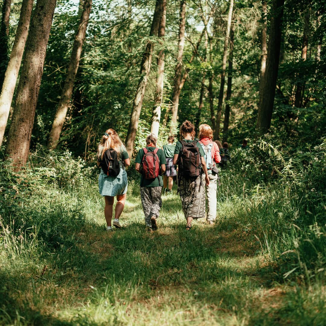
Earthwatch Europe is part of a global organisation dedicated to environmental conservation through collaborative science and community engagement. The organisation connects people with scientists to conduct environmental research, with a focus on safeguarding habitats, conserving biodiversity, and promoting sustainable use of natural resources. Their projects empower participants to contribute directly to research and action that supports the planet.
Earthwatch Europe required an annual report that could communicate the impact of its work to a broad audience. The report needed to clearly present the outcomes of their projects, demonstrate tangible results, and encourage stakeholders and participants to engage with the organisation. It also needed to work effectively across digital platforms while adhering to Earthwatch’s existing brand guidelines.
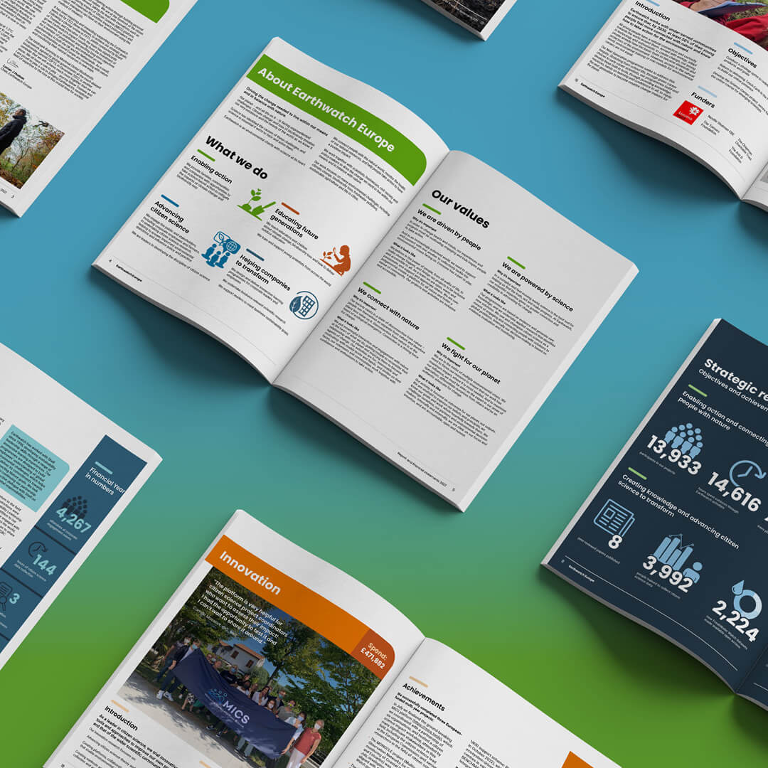
The challenge was to design a report that not only adhered to Earthwatch’s established brand identity but also pushed creative boundaries, making the content more relatable and impactful through the use of engaging visuals, interactive elements, and personalized narratives.

“The team paid careful attention to our brief and feedback, was responsive and flexible, and showed hard work and creative flair…We’re really pleased with the end result, which showcases our work to supporters in a clear and visually compelling way.”
Amy Crosweller
Director of Fundraising & Communications
Earthwatch Europe
Our approach
Digital first format
Project highlights
Visual storytelling
Organic design aesthetics
Results
The final Annual Report was a visually engaging, digitally optimised publication that clearly communicated Earthwatch Europe’s impact. The combination of immersive imagery, structured content, and project-specific infographics made the report both informative and easy to navigate. It effectively supported the organisation’s mission, encouraging stakeholder engagement and participation in projects. The report also provided reusable design elements suitable for social media and other digital communications, helping Earthwatch reach a wider audience while maintaining a consistent brand identity.
We will continue to support Earthwatch Europe by applying the report’s design elements across future print and digital materials. This ensures consistency in branding and engagement while providing opportunities to further enhance communication of the organisation’s projects and environmental mission.
Ready to turn your data into a compelling story?
Our work in action
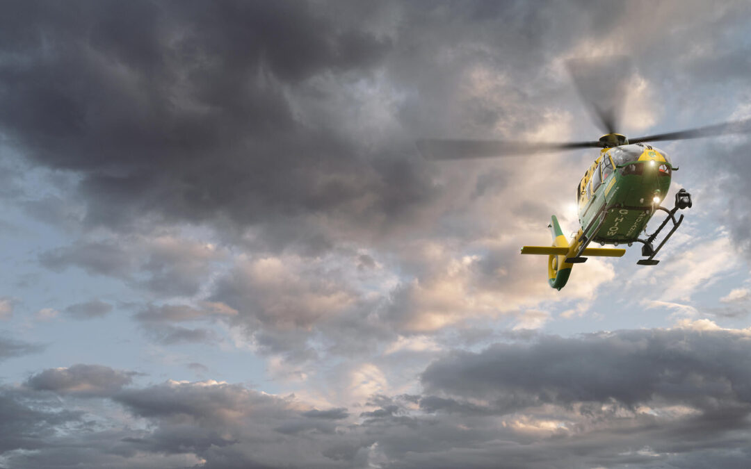
Hampshire & Isle of Wight Air Ambulance
We partner with Hampshire & Isle of Wight Air Ambulance to deliver clear, human-focused design that strengthens fundraising, outreach and education, helping them inspire life-saving action across every channel.
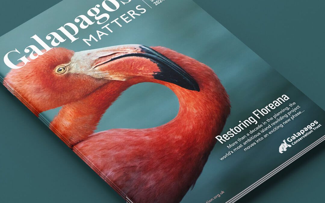
Galapagos Matters
We redesigned Galapagos Matters magazine for GCT, modernising layout, masthead, and imagery to boost engagement, and conservation impact.
Turning Complex Data into Clear, Compelling Design
From data-led reports to environmental campaigns that inspire action, we help organisations like Earthwatch turn complex information into stories that connect.
If you’re ready to bring clarity, creativity, and impact to your next publication, let’s collaborate to make it happen.