Galapagos Matters
A bold new look for conservation impact
The brief
Galapagos Conservation Trust (GCT) is the only UK-registered charity dedicated exclusively to the conservation and sustainable development of the Galapagos Archipelago. Since 1995, the Trust has supported local scientists, NGOs, and community groups, partnering with Ecuadorian authorities to protect the unique wildlife of the islands and advocating for environmental change in the UK and beyond.
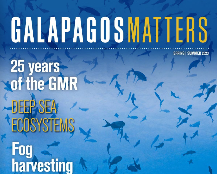
Galapagos Matters is a key communication tool for GCT, engaging supporters, sharing conservation updates, and inspiring action. After more than a decade with the same design, the Trust approached The Graphic Design House to refresh their 28-page magazine. The brief was clear: modernize the appearance, enhance readability, and increase appeal to both existing and new readers.


Our approach
From understanding the Galapagos Conservation Trust’s goals to refreshing every page of Galapagos Matters, we focused on creating a magazine that engages, informs, and inspires. Hover over the flip tiles below to explore each step of our design process.
Masthead refresh
Structured grid layout
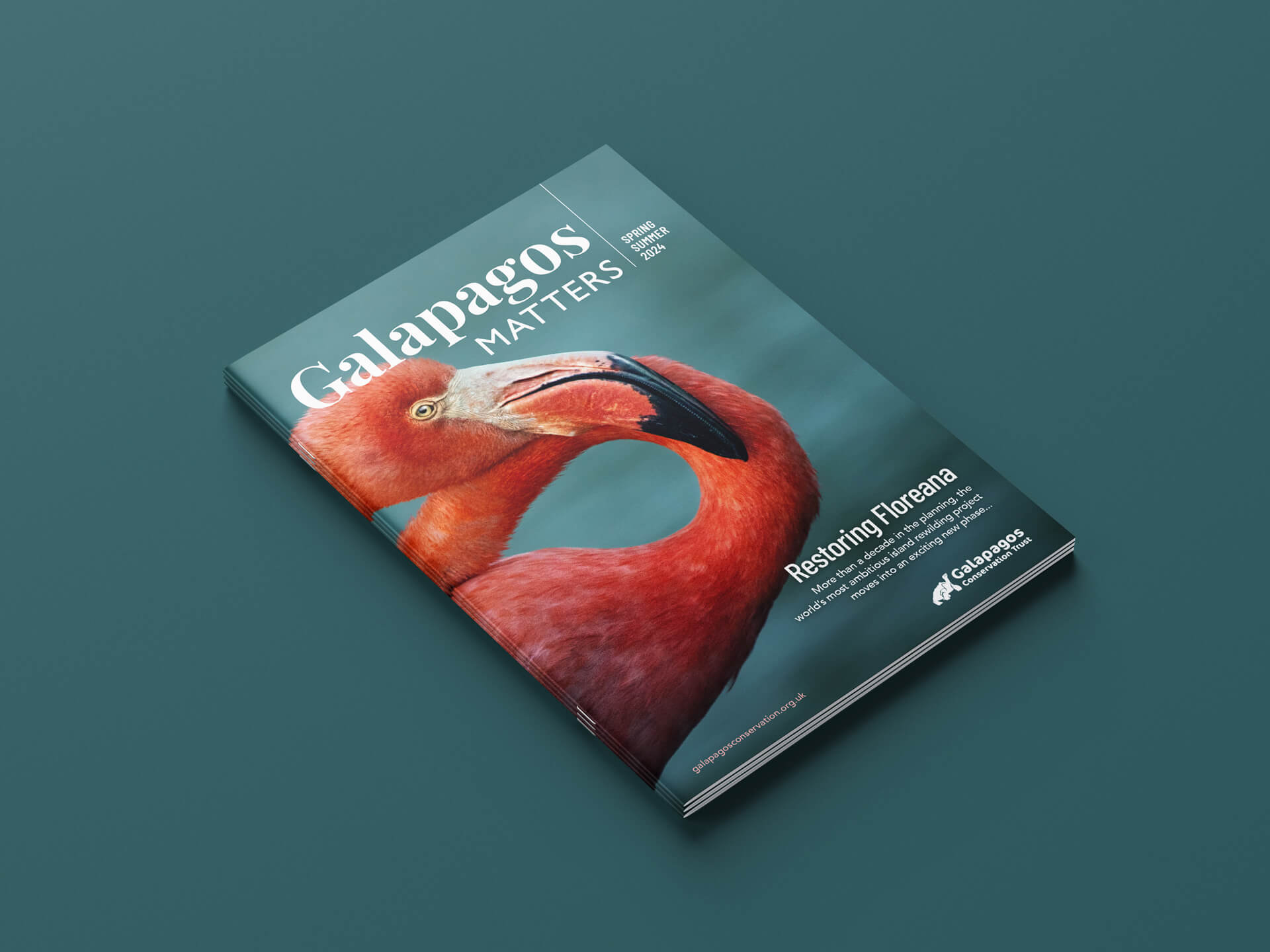
Dynamic cover design
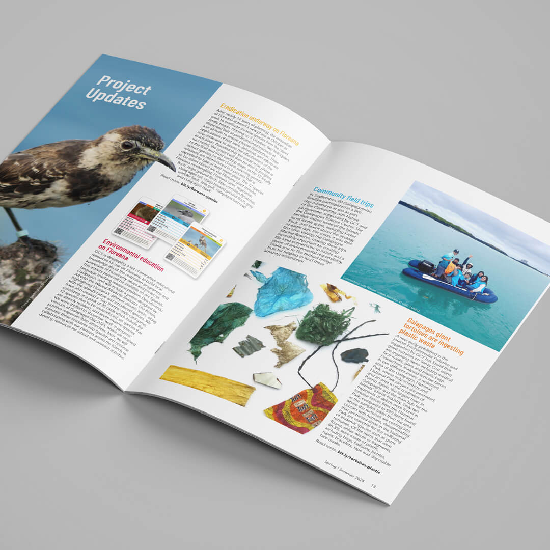
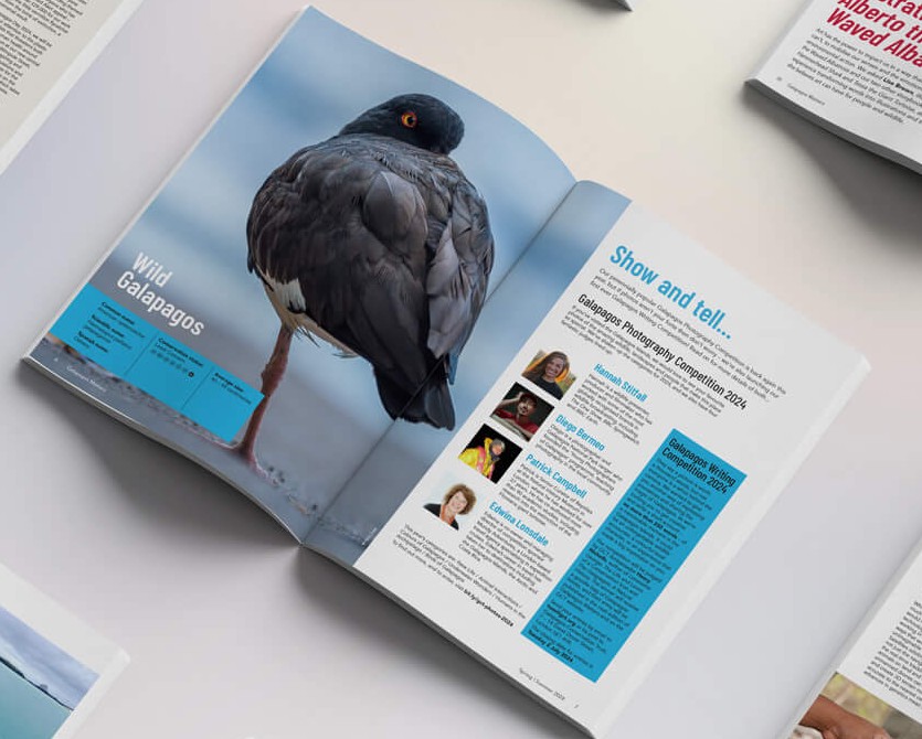
Cut-out imagery
“The Graphic Design House are great to work with – flexible, efficient and quick to respond to any query – and they did a fantastic job on the recent re-design of our members’ magazine. Amy understood straight away what we were trying to achieve, and she came up with a range of creative concepts which we were able to quickly refine. The whole process was smooth and stress-free, and we’re delighted with the end result.”
Tom O’Hara
Communications Manager
Galapagos Conservation Trust

Results & next steps
The redesigned Galapagos Matters magazine now presents a cleaner, more structured, and visually engaging reading experience. The refreshed masthead, bold covers, and gridded layout enhance both aesthetics and readability. Cut-out imagery adds dynamism to feature spreads, making the magazine more lively and engaging. Overall, the redesign aligns with GCT’s brand while reinvigorating the publication for existing supporters and new audiences alike.
Building on the success of the redesign, we will continue collaborating with GCT to explore ways to enhance the magazine’s digital presence and integrate complementary multimedia content, helping the Trust reach an even wider audience.
Does your publication need a refresh?
Our work in action
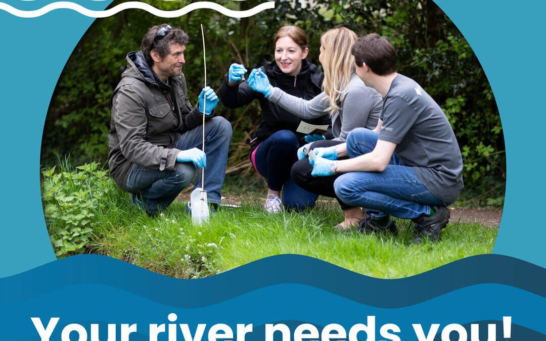
Great UK WaterBlitz: Campaign Report
We designed a visually engaging report for Earthwatch Europe’s Great UK WaterBlitz campaign, effectively communicating complex water quality data to a broad audience.
Bring your story to life
From magazines that engage supporters to campaigns that inspire action, we help conservation organisations communicate with impact through thoughtful, story-driven design.
If you’re ready to refresh your communications and reach your audience with clarity and creativity, let’s talk.