
Gascoyne Estates
The client
Gascoyne Estates is a land and property business focused on creating lasting social and commercial value for the communities it serves. With an emphasis on stewardship, sustainability and long-term thinking, the organisation aims to support vibrant places, protect the environment and operate as an efficient, profitable business.
The Graphic Design House had previously supported Gascoyne Estates with marketing materials, before being asked to help refresh their campaign creative for the year ahead.
The brief
Towards the end of 2025, Gascoyne Estates approached us to refresh the design of their 2026 campaign, supporting events across Hatfield Park and Cranbourne.
The work needed to evolve the existing campaign style, maintaining recognisable elements such as hand-drawn illustration and bold colour, while improving structure, clarity and consistency across both print and digital assets.


Our approach
We structured the refresh around retaining what already worked, then introducing a clearer design framework that could flex across multiple events, formats and asset sizes.
Evolving the existing look
We developed the previous year’s campaign design by retaining the hand-drawn illustration style and bold colours, while refining the overall hierarchy. This ensured the refreshed creative felt familiar, but clearer and more consistent in application.
Colour & concept development
Working within established brand guidelines for colour and typography, we explored a selection of supporting colours to broaden creative possibilities. From this, two concept routes were developed, each designed around a consistent grid system before one direction was selected for refinement.
Building a clear template system
Using a clean, structured grid, we introduced a template approach that could be rolled out across the campaign. This provided a reliable framework for layout and messaging, helping maintain clarity and cohesion across multiple outputs.
Architectural influence
The selected concept centred around a strong hero image with layered typography, supported by subtle overlapping illustrations that added depth without reducing clarity or white space. The final direction drew inspiration from Hatfield Park’s elegant rounded arches, reflected in the central graphic shape and logo to create a stronger visual link to its setting.

Results
Our work in action

Portsmouth Historic Dockyard
Surprising visitors at every turn, Portsmouth Historic Dockyard turns history into unforgettable experiences.

Jacksons Lane
A streamlined What’s On Guide for Jacksons Lane, simplifying format and layout to support flexible, brand-led seasonal programming.
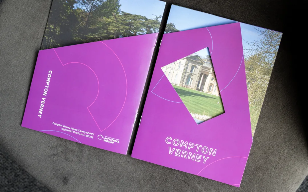
Compton Verney
Visitor brochure design for Compton Verney, combining a distinctive die-cut cover with accessible information and a flexible, reusable format.
Refresh your campaign
without starting over
If your organisation runs multiple events or seasonal campaigns and needs creative that stays recognisable while working harder across every format, we can help. From concept development to reusable templates, we evolve existing design styles into structured systems that flex across print, web and social — keeping your communications consistent, efficient and easy to roll out.
Let’s build a campaign system that’s ready for the year ahead.