National Badminton League
The client
Launched by Badminton England in 2014, the National Badminton League (NBL) was created to modernise how elite badminton is presented in the UK. As the country’s first professional, team-based league, it introduced a faster match format and secured national broadcast coverage, signalling clear ambition to reach new audiences.
However, the league faced challenges in clearly communicating its purpose and relevance within an increasingly competitive sports and entertainment landscape. This rebrand project was positioned as a strategic reset, an opportunity to sharpen the NBL’s proposition and establish a more compelling, contemporary identity to support growth, fandom and future sustainability.
The brief
The relaunch of the NBL needed to be bold, dynamic and high energy, attracting new audiences, venues and platforms. The league set out to feel digitally led, community-driven and unapologetically modern.
This ambition was defined by a new mission — to deliver a high-energy, high-impact league that grows the profile of badminton in England through thrilling competition, dynamic presentation and digital-first storytelling — and a clear vision to redefine the badminton experience by showcasing elite competition in an energetic, modern and bold new format.
Our role was to translate this ambition into a clear and distinctive brand system that could communicate energy, credibility and relevance across both physical and digital touchpoints.


Our approach
We structured the project into four clear stages, from concept development through to asset delivery.
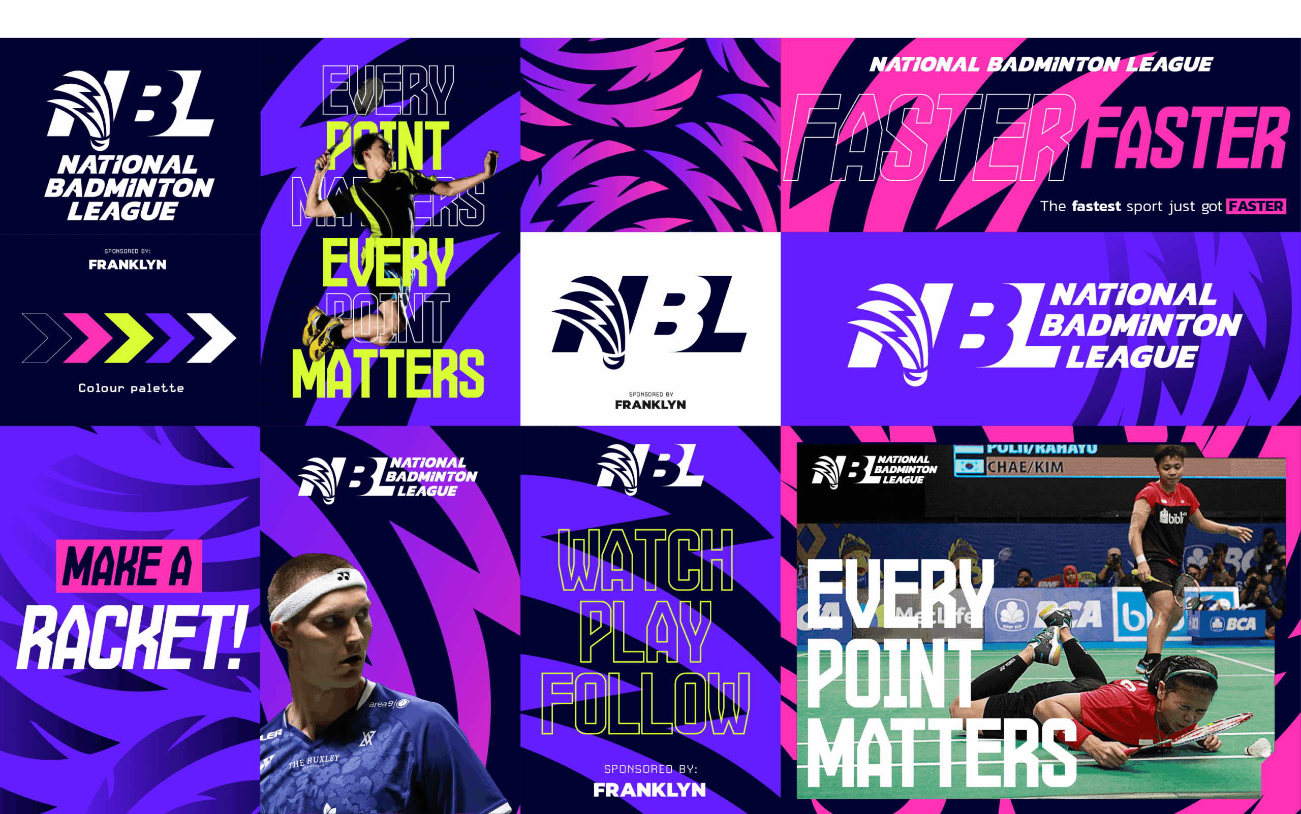
Creative direction
Typography & logo
Typography & logo
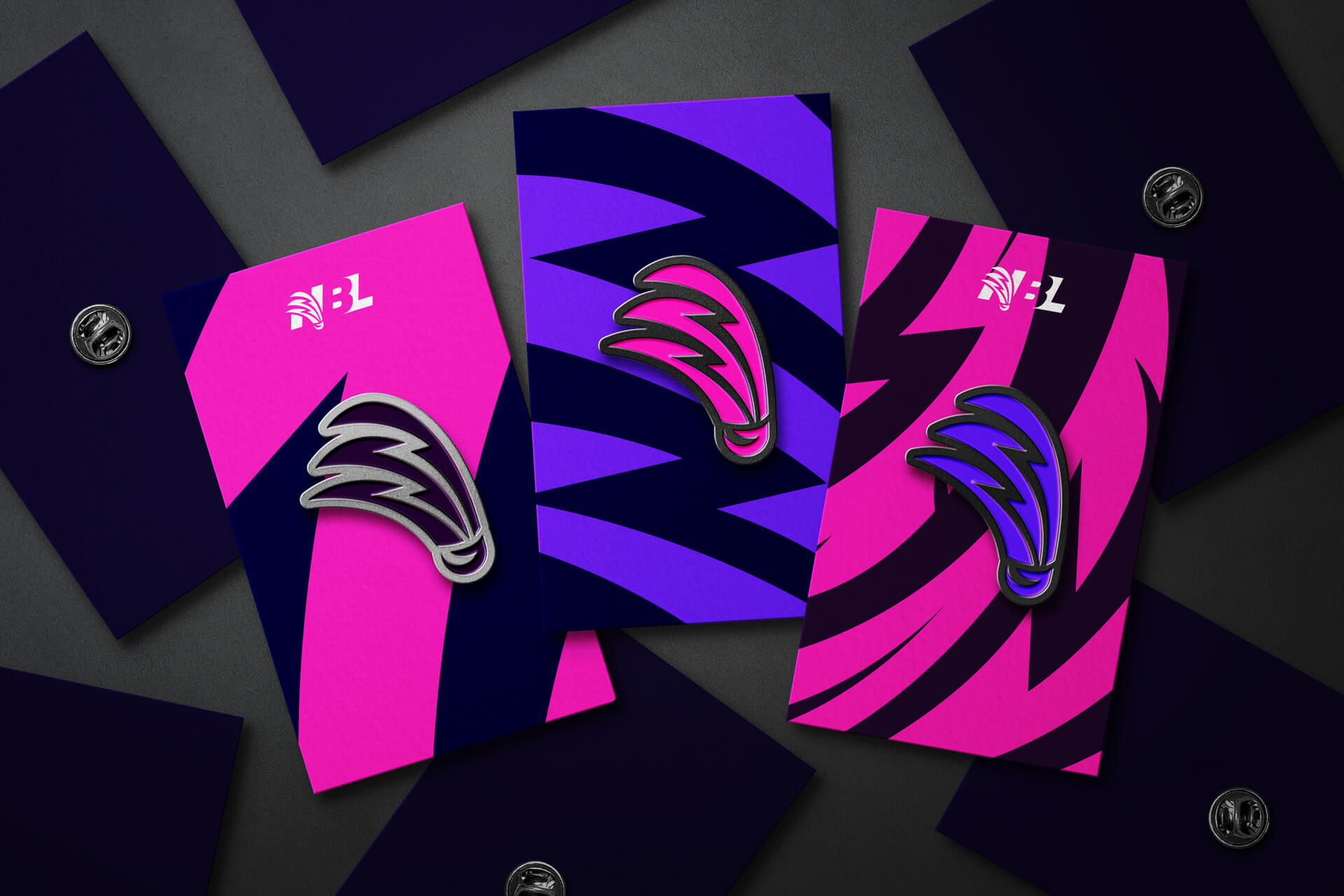
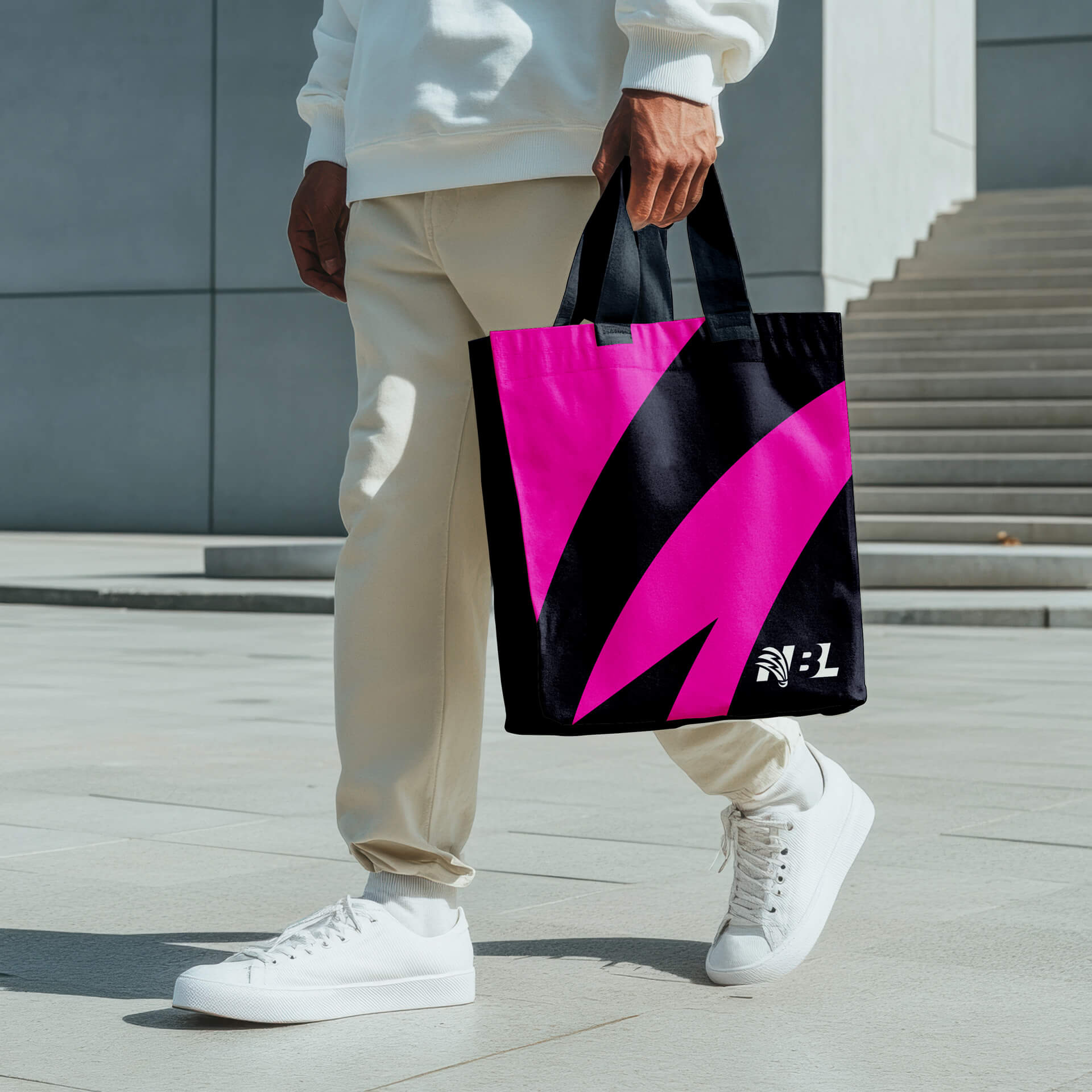
Graphic system
Colour & digital first thinking


Results & next steps
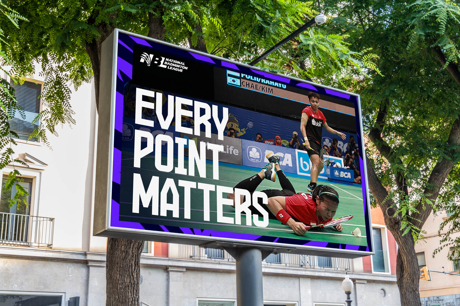
The rebrand delivered a bold, high-energy and contemporary identity designed to reflect the NBL’s ambition to redefine the badminton experience in England. Through a flexible visual system, vibrant colour palette and confident typography, the brand was built to support dynamic presentation, digital-first storytelling and consistent communication across platforms.
With a clear brand framework in place, the NBL is now equipped with the tools needed to showcase elite competition in a modern, unapologetically bold format. The identity provides a strong foundation for future content, venues and community engagement, enabling the league to grow its profile, build recognition and connect more effectively with players, fans and clubs alike.
Our work in action
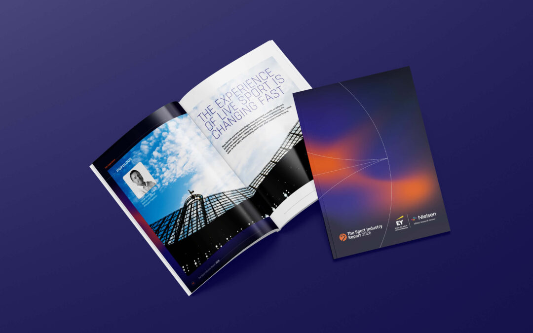
Sport Industry Group
A new design concept for the 2026 Sport Industry Report, aligning print and digital formats with bold layouts, gradients and data clarity.
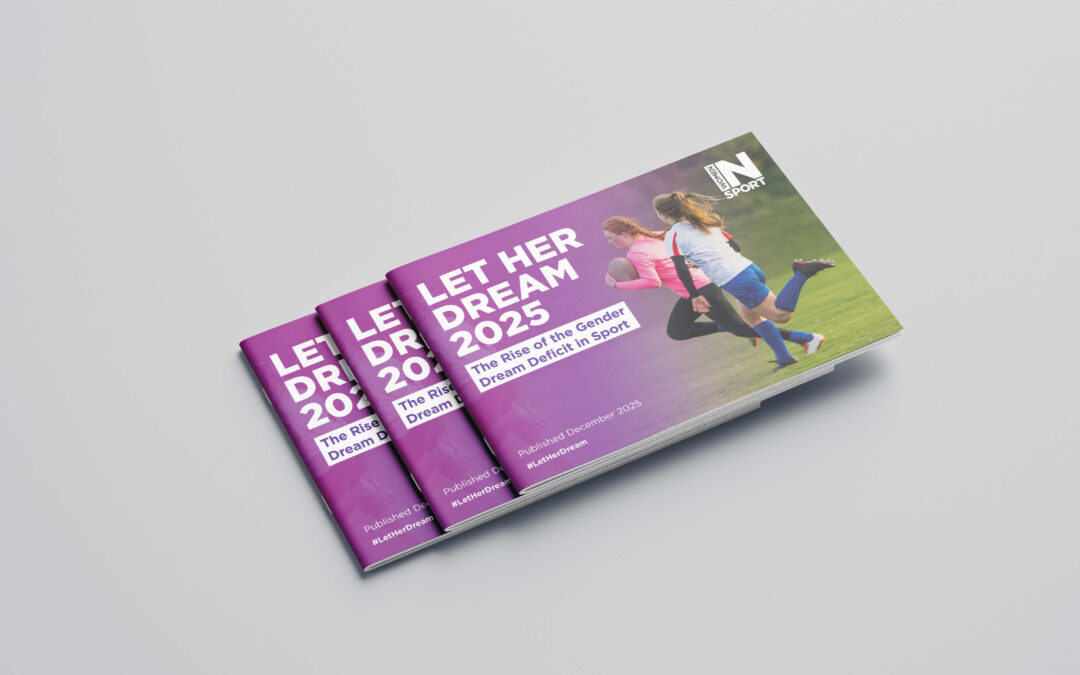
Women in Sport
Designing a clear, engaging research report for Women in Sport, translating complex data into accessible, brand-led storytelling.
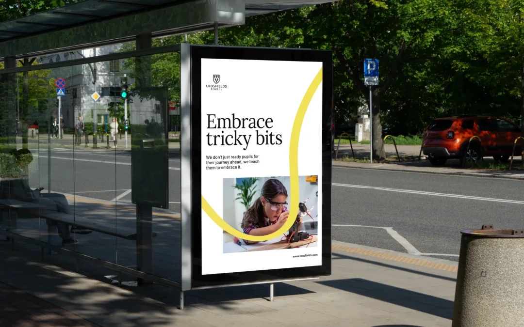
Crosfields School
A strategic rebrand for Crosfields School, uniting message and design around a confident promise to “Embrace every journey.”
Change how your brand shows up
If your organisation is navigating growth, change or a need to reconnect with new audiences, we can help you clarify your proposition and bring it to life through a bold, modern brand system. From strategic rebrands to digital-first identities, campaigns and publications, we create work that builds energy, credibility and long-term relevance.