The marriage of copy and design
Contents
The power of visuals
The key to effective messaging
The difference between journalism and advertising
The four key principles for effective communication
How copy and design work together
Practical tips
Real-life examples of effective visual communication
Addressing common pitfalls
Our examples
What’s next
Follow us
Copy and design are a match made in heaven – when they work in harmony, they create content that captures attention, engages the audience, and drives positive action.
In today’s digital world, where first impressions are crucial, the interaction between copywriting and design is more important than ever. So how do these elements complement each other? why does integrating them properly really matter? And what are some good examples that show the kind of magic that happens when you get it right? Here are some practical tips, real-life examples, and clear steps to help you create relevant content that truly shines.

The power of visuals
Visuals grab attention first. A stunning design can stop someone in their tracks. But without the right words, even the most beautiful design can fall flat. That’s where copy comes in—it gives visuals context, meaning, and direction.
The key to effective messaging
Copywriting isn’t just about filling up space with words. It’s about telling a story, conveying a message, and persuading the reader. When paired with strong visuals, copy takes the message to the next level. Take an infographic, for example. The visuals might appealingly present data, but the copy explains why that data matters. Or think of a powerful image – the right headline and text can deepen the emotional connection and tell the story behind the picture.
The difference between journalism and advertising
In journalism, words often stand alone. For instance, a newspaper headline like “Big Freeze Hits Britain” can be self-explanatory. In advertising, words and images work together to create a more engaging message. An image of a frozen road with a headline like “A Perfect Day” for a car advertisement creates a contrast that grabs attention and conveys a deeper message.
Four key principles for effective communication
- Anchoring: Images Intrigue, Words Explain – A captivating image, like a chip resembling a match dipped in ketchup, paired with a simple headline like “Fiery Fries,” makes the message clear and memorable. The ambiguity of the image draws you in, and the text anchors the meaning.
- Convergence: Words Suggest, Images Explain – Consider Apple’s campaign with the headline, “There are some ideas we want every company to copy,” accompanied by an image of solar panels. The intriguing headline and explanatory image work together to highlight Apple’s commitment to sustainable energy.
- Partial Divergence: Blending Similarities and Differences – In Ichnusa beer’s ad, images of Sardinian life paired with captions like “our sushi” or “our loft apartments” create a partial divergence. This interplay of similarities and differences emphasizes the brand’s authentic identity against more mainstream trends.
- Opposites: Contradicting Words and Images – The famous Volkswagen Beetle ad with the headline “Lemon” is a prime example. The contradiction between the headline and the image is resolved by the body copy, which explains the rigorous quality control behind the car’s production. This opposition grabs attention and reinforces the brand’s commitment to quality.
Understanding the relationship between words and images is crucial for effective communication. Whether you’re doing design for print or digital, applying these principles can make your message more engaging and relevant. With practice, you can master the art of combining words and images to create impactful content that resonates with your audience.

How copy and design work together
- Complementary Roles – Copy and design are two sides of the same coin. Design attracts the audience; copy engages them. Together, they create a cohesive narrative that’s more powerful than either element alone.
- Enhanced Readability – A well-designed layout makes the copy more inviting and easier to read. Good use of white space, typography, and color schemes can enhance the text. Meanwhile, concise and impactful copy ensures the design is purposeful.
- Brand Consistency – When the tone of the copy matches the style of the design, it strengthens the brand’s identity. Consistent language and visuals make the content instantly recognizable to your audience.
- Emotional Connection – Both copy and design can evoke emotions. When aligned, they create a deeper emotional connection. A heartfelt story with emotive imagery leaves a lasting impression.
Practical tips
- Collaborative Planning – Get copywriters and designers working together from the start of your next project. This collaboration ensures a shared vision and creates content that flows seamlessly.
- Consistent Feedback – Keep communication open. Regular feedback helps align both elements and ensures they complement each other.
- User-Centric Approach – Always think about the audience. Deliver a message that resonates by understanding their preferences and behaviour.
- Flexibility and Adaptation – Be open to tweaking both copy and design. Flexibility ensures the final content is cohesive and impactful.

Real-life examples of effective visual communication
Nike’s Just Do It Campaign
Nike’s “Just Do It” campaign is a prime example of the magic that happens when there is real synergy between copy and design. Nike launched the “Just Do It” campaign with a clear purpose: to reposition their brand in the late 1980s and rise above competitors like Reebok. This campaign wasn’t just about standing out; it was about creating a message that resonated deeply with consumers. Nike captured the essence of determination and excellence, not just in sports but in life. The bold, simple slogan paired with powerful visuals of of athlete icons like Michael Jordan, Serena Williams, and Tiger Woods who embodied the “Just Do It” ethos in action created a compelling narrative that resonates deeply with the audience. Nike’s unwavering commitment to “Just Do It” over the years is remarkable. They’ve seamlessly integrated it into various contexts while preserving its essence. That’s the mark of a brand that knows how to evolve.

Apple Product Launches
Apple’s product launches are known for their clean design and concise copy. Each element is meticulously crafted to highlight the product’s features and benefits, creating a seamless and engaging experience for the viewer. Strong leadership, clear design philosophy, meticulous attention to detail, well-defined brand guidelines, and a keen ear for customer feedback are the pillars of this consistency. Apple’s products and ads are known for their clean, minimalist designs. Their campaigns focus on product features and benefits, using simple visuals and messaging to highlight unique selling points and evoke emotions. Their ads often tell a compelling story that resonates with audiences, focusing on human experiences and the emotions their products evoke. This storytelling approach creates a deep emotional connection with consumers.
Apple’s campaigns are a testament to their innovative and effective marketing strategy. Here are some standout examples:
- “1984” Commercial (1984): Directed by Ridley Scott, this ad introduced the Macintosh and is considered one of the greatest commercials of all time.
- “Think Different” Campaign (1997): Celebrating innovators like Einstein and Gandhi, this campaign positioned Apple as a champion of creativity.
- iPod Silhouette Campaign (2003): Striking visuals of black silhouettes dancing with white iPods made the product iconic.
- “Get a Mac” Campaign (2006–2009): Featuring John Hodgman as PC and Justin Long as Mac, this witty series positioned Apple as the cool, superior alternative.
- iPhone Introduction (2007): The iPhone’s sleek design and innovative features set a new standard for smartphones.
- “Shot on iPhone” Campaign (2015): Showcasing stunning user-generated photos and videos, this campaign highlighted the iPhone’s powerful camera.

Airbnb’s Rebranding
When Airbnb rebranded, they focused on creating a unified message through both copy and design. Their “Belong Anywhere” campaign combined stunning visuals with heartfelt copy to convey a sense of community and belonging, significantly boosting their brand perception. Founded in 2008, Airbnb has transformed from a small startup to a global powerhouse in the sharing economy, with over 2 million listings in more than 191 countries. The company’s rebranding efforts, in collaboration with DesignStudio, aimed to align their global advertising strategy and establish a strong, cohesive brand identity.

Charity: Water Fundraising campaigns
Charity: Water’s campaigns are a masterclass in combining emotional storytelling with powerful visuals. Their “The Spring” campaign is particularly notable, using compelling narratives of people gaining access to clean water, supported by striking images of communities and water projects. This campaign focuses on the human impact of their work, showing the direct benefits of donations in real people’s lives. The visuals are not only beautiful but also serve to underline the transformative effect of clean water. The copy is heartfelt and motivational, encouraging viewers to join a movement rather than just donate money. This synergy between words and visuals helps Charity: Water build a strong emotional connection with their audience, driving engagement and long-term support.

Slack
Slack’s marketing materials blend straightforward, benefit-focused copy with clean, modern design, making complex information easily digestible and engaging. Their campaigns often feature a mix of informative text, visually appealing charts, and user-friendly graphics that highlight the platform’s capabilities. For example, Slack’s case studies and blog posts use real-world examples to demonstrate how businesses can improve communication and productivity with their tool. The design elements are clean and professional, ensuring that the focus remains on the content’s utility and relevance. By maintaining a consistent tone and visual style across all their materials, Slack effectively communicates their brand message of efficiency and collaboration. This approach not only educates potential users but also reinforces Slack’s brand identity as an indispensable business tool.
Addressing common pitfalls
- Inconsistent Messaging – Ensure that the tone and style of the copy match the visual elements. Misalignment can confuse the audience and weaken the message.
- Overloading with Information – Avoid cramming too much information into one piece. Prioritise key messages and use white space to make the content more readable and engaging.
- Neglecting Mobile Optimisation – With the rise of mobile browsing, ensure your design and copy are optimized for smaller screens. Test readability and visual appeal across different devices.
- Ignoring Audience Feedback – Regularly gather and act on audience feedback to improve both copy and design. Understanding your audience’s preferences can help tailor your content more effectively.

Our examples
Celebrating Pompey’s Legacy: A Timeless Tribute
Creating a limited edition coffee table book that captured the essence of the club’s legacy required a careful balance between design and copy. Our goal was to produce a book that would be both impactful and timeless, spanning 424 pages filled with rich history and personal stories.
The cover design was a crucial element. We chose an illustration of the club’s iconic Frogmore Road entrance, combining historical architecture with symbolic elements like seagulls to evoke the coastal location. This blend of illustration and photography created an emotive and celebratory cover that perfectly set the tone for the content within.
Managing the layout was another significant challenge. We implemented a grid system to maintain balance between the extensive text and vivid images, ensuring each element had space to breathe. By introducing a visual timeline and colorized crests, we made navigation intuitive and engaging.
The book’s swift sell-out and widespread acclaim reflected the successful integration of design and copy, resonating deeply with fans and validating our thoughtful approach.
UnEXPECTed Experiences
The “Unexpected Experiences” campaign for the National Museum of the Royal Navy and Portsmouth Historic Dockyard exemplifies the powerful synergy between design and copy. By crafting a compelling narrative that played on the element of surprise, the copy intrigued potential visitors, inviting them to explore beyond their expectations. This narrative was visually reinforced through eye-catching design elements that blended historical motifs with modern aesthetics, creating a vibrant and engaging visual language. The consistent design style ensured brand recognition across various platforms, while the evocative copy enticed audiences to delve deeper. This harmonious blend not only captured attention but also sustained interest over time, granting the campaign remarkable longevity. The tangible success of this marriage between design and copy was evident in the significant uptick in ticket sales, demonstrating how thoughtful integration of these elements can drive engagement and achieve concrete results.

What’s next
- Start by fostering collaboration between your copywriting and design teams.
- Regularly review and refine your content to ensure both elements are working in harmony.
- Consider conducting workshops or training sessions to emphasize the importance of collaboration and integrated thinking
If you want to embrace this partnership and watch your content come to life in ways that truly resonate with your audience, feel free to say hello. We’re always up for a new challenge!
More insights
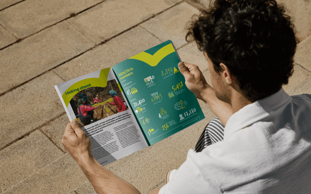
Impact report design that turns data into meaningful brand stories
Learn how impact report design transforms ESG data into clear, engaging brand stories by improving clarity, trust and stakeholder engagement.
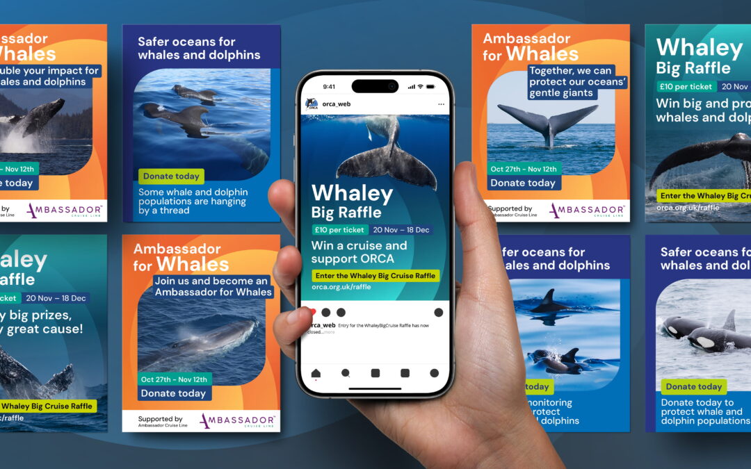
Charity fundraising ideas: how strong branding and design drive greater impact
Discover how strong branding and strategic design turn simple fundraising ideas into powerful charity campaigns that build trust, engagement and donations.
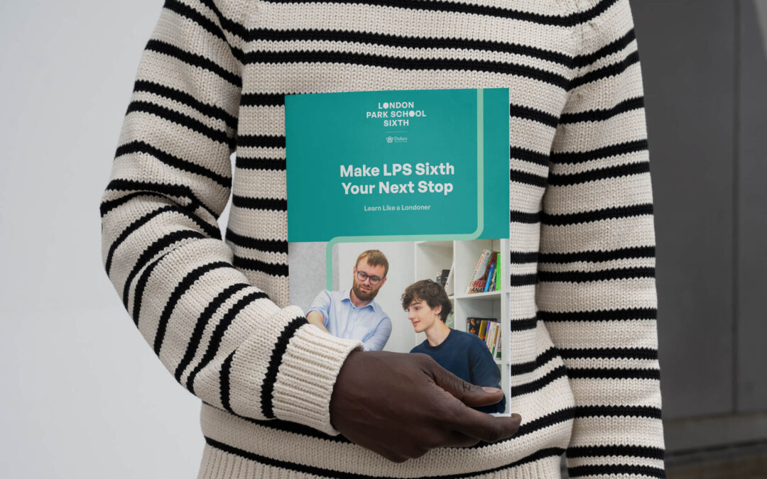
School prospectus design that reflects your identity
Strategic school prospectus design that builds trust, reflects your ethos and guides parents with clarity, structure and strong visual identity.