Williams
trade counters across England
Client Overview
Williams & Co is an award-winning plumbing and heating company that caters exclusively to trade users. As one of the fastest-growing independent merchants in the UK, Williams & Co operates over 50 branches and fulfilment centres across the country and runs a comprehensive e-commerce site. Known for its dedication to quality and service, Williams & Co sought to solidify its brand presence to align with its ambitious growth and market position.
The Opportunity
As Williams & Co continues to grow, it is essential to create a unified brand image that can withstand the challenges of expansion while maintaining the company’s core values. A consistent and professional brand identity not only improves brand recognition but also reinforces the company’s reputation in a competitive market.
Williams & Co recognised the need to bring consistency and clarity to its brand assets to reflect its professional image and ambitious ethos more accurately. The company aimed to enhance its brand identity across all platforms, ensuring a cohesive and confident presence that could support its rapid expansion and resonate with its trade-only customer base.
“Working with TGDH as a partner for design, print and mail fulfilment means we have one team who look after us from start to finish for some of our bigger campaigns. Not only does this create efficiencies, it means we have a partner who ‘gets us’ and what we need.”
Alex Peacock
Senior Marketing Manager
Williams & Co
Our Approach
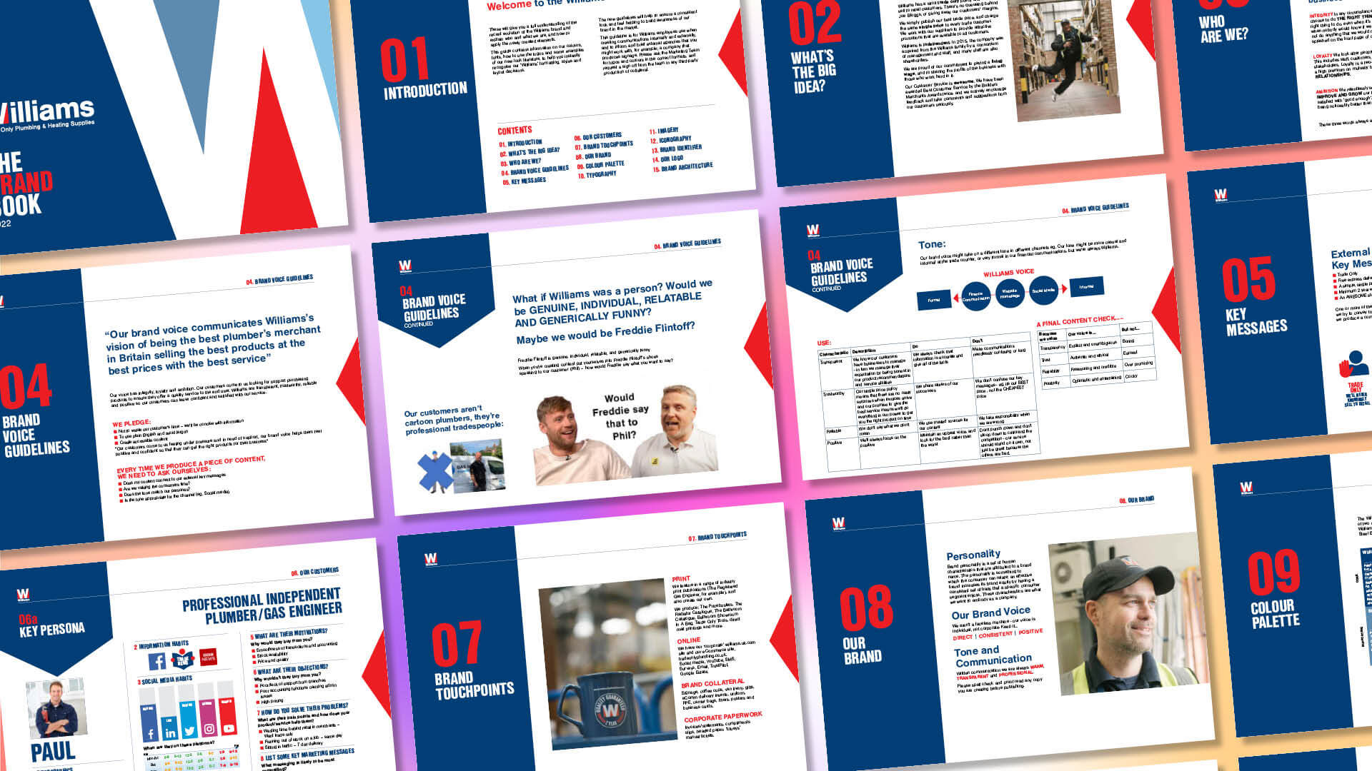
Comprehensive Rebranding Initiative: The team at The Graphic Design House began by conducting a thorough assessment of Williams & Co’s existing brand elements. This led to a comprehensive rebranding initiative designed to deliver a stronger, more professional, and confident brand image. Our work encompassed the development of a new visual identity, including a cohesive logo, typography, and colour palette that accurately reflected the company’s values and vision.
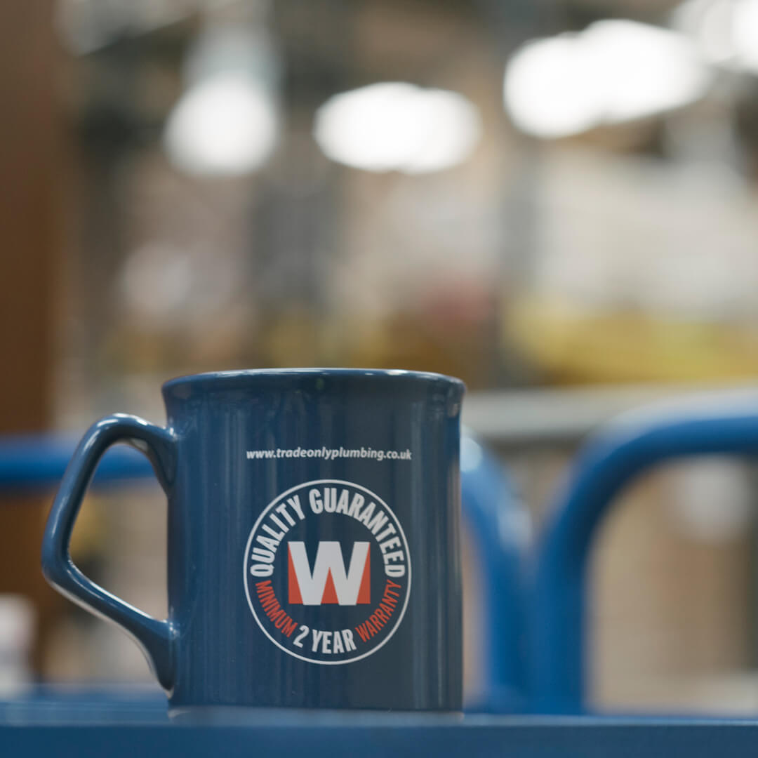
Updated Logo: The original Williams logo featured a prominent ‘W’ monogram, but the emphasis on the words ‘trade only’ overshadowed the company name. We repositioned the company name to the forefront, creating a clearer hierarchy of information while retaining the important strapline. This adjustment enhanced brand recognition and recall, resulting in a more confident and cohesive identity that better reflects the company’s professional image.
Refined Colour Palette: The initial colour palette of blue and red often led to a dark purple tinge in print, which appeared outdated and uninviting. We refined the blue to a more vibrant shade using the RAL colour-matching system, ensuring a consistent and modern appearance across all materials. By introducing additional complementary blues, we provided greater creative flexibility and achieved a more sophisticated brand look, enhancing the visual impact of both print and digital assets.
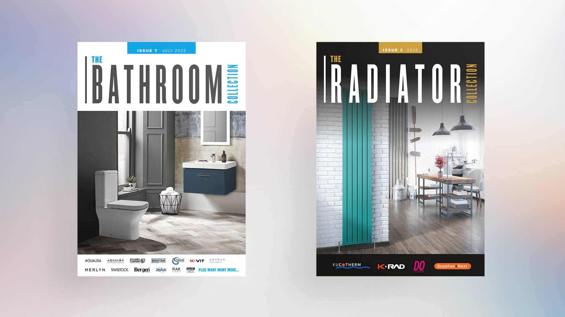
Catalogue Design: The flagship PriceBusters catalogue is essential for Williams & Co’s customers, but the small text made some sections difficult to read. We addressed this issue by slightly increasing the page size, improving readability without significantly affecting the budget. This adjustment eliminated the need for larger branch-based reference copies.
A broader range of icons was introduced and the cover design was standardised, streamlining navigation and providing a uniform look. This approach allowed us to offer an agile service capable of handling last-minute changes and quick turnarounds efficiently.
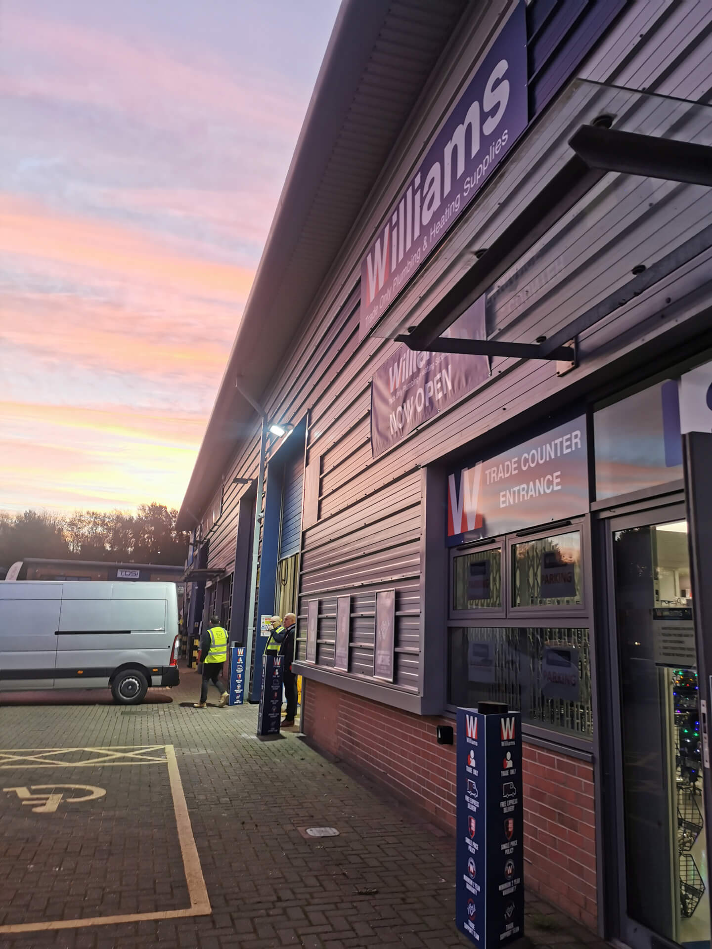
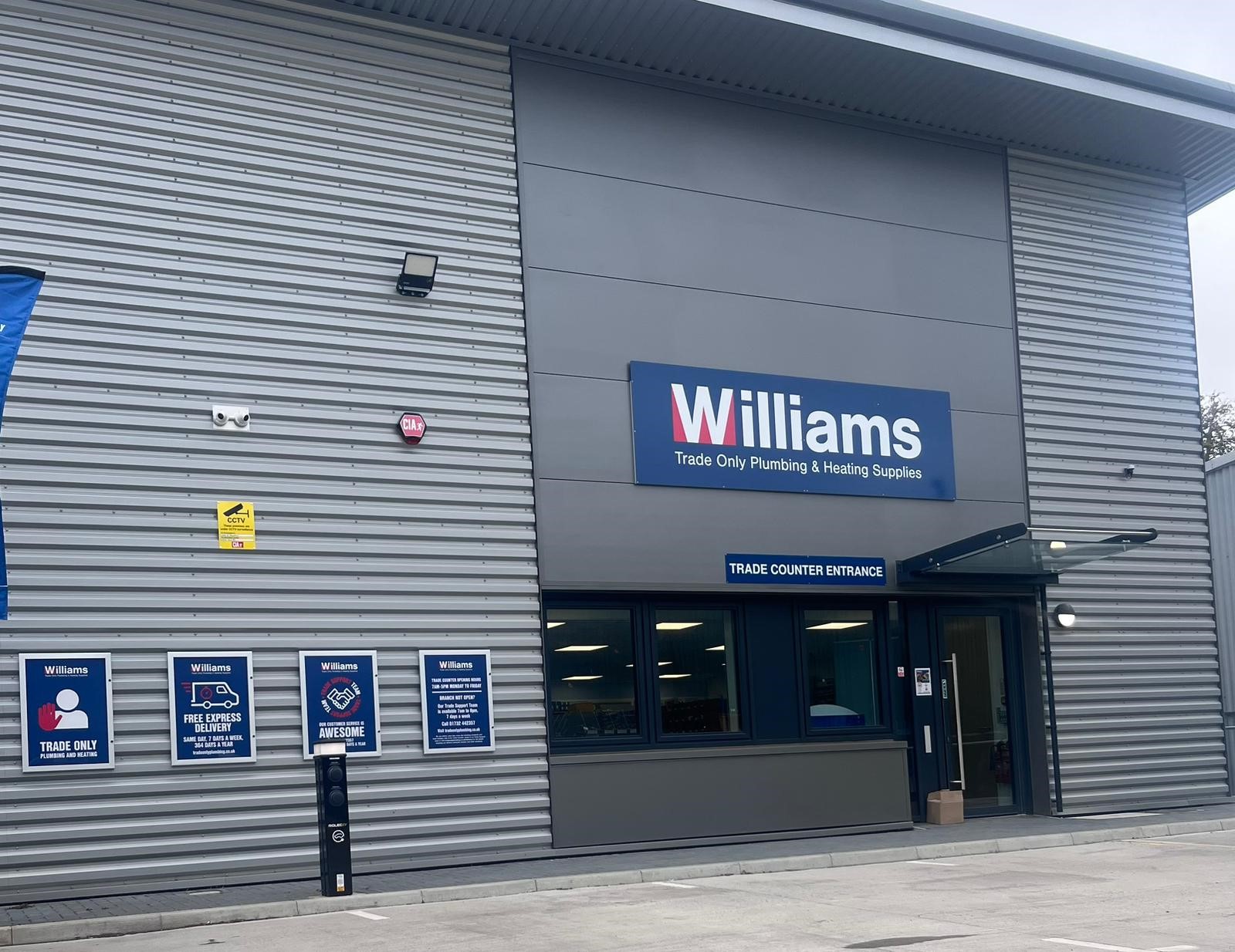
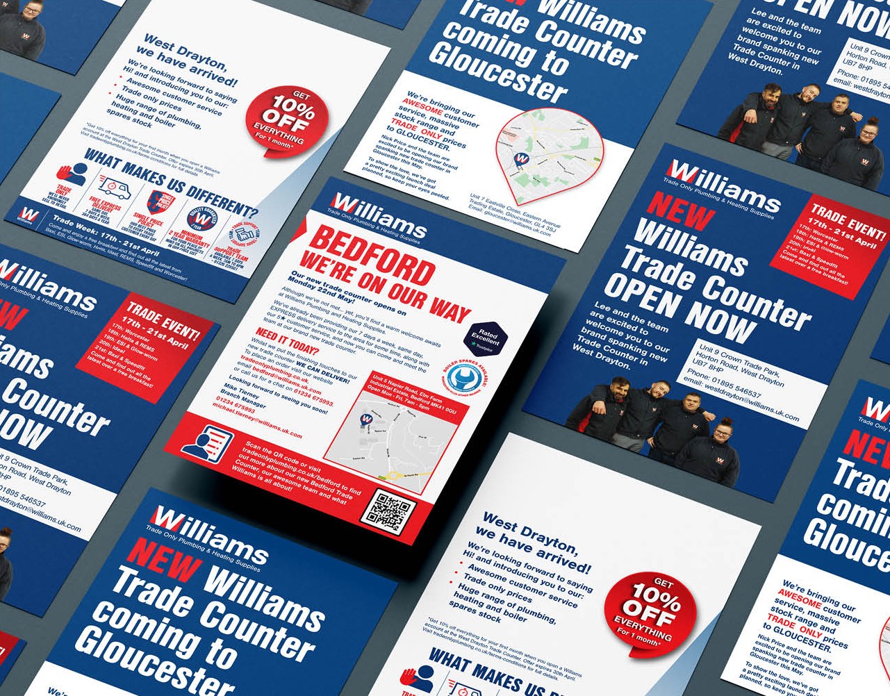
Standardised Marketing Collateral: To support Williams & Co’s ambitious expansion plans, we standardised their printed and digital marketing materials, simplifying the rollout process and ensuring consistency across new branches. This included designing a comprehensive suite of point-of-sale signage for the new locations. By streamlining these materials, we made the branding process more cost-effective and cohesive, reinforcing the company’s professional image and operational efficiency across all platforms.
Results
The rebranding initiative for Williams & Co successfully delivered a stronger, more professional brand identity that aligned with the company’s ambitious growth and ethos. The updated logo and refined colour palette significantly improved brand recognition and visual impact across all platforms. The standardised marketing collateral streamlined the expansion process, making it easier to maintain consistency across new branches and digital platforms. By focusing on creating a unified brand presence, we ensured that Williams & Co’s identity could support its rapid growth while maintaining a strong connection with its customer base. The updated logo, refined colour palette, and standardised marketing collateral provided a solid foundation for the company’s continued success.
Next Steps
Following the successful rebranding and standardisation efforts, the next steps involve continuing to support Williams & Co as they expand further. We will work closely with them to ensure that their brand identity remains consistent and adaptable, supporting their growth while maintaining the high standards that their customers expect.
Our Work in Action
Aderans Trendco
Aderans Trendco’s luxury brochure combines fashion-forward design with accessibility, showcasing their aftercare range through impactful visuals and clarity.
Coffin Mew Rebrand
Coffin Mew’s bold rebrand by The Graphic Design House positioned them as an innovative, forward-thinking law firm, embracing change.
HMWT: Wildlife Matters Magazine
Designed a vibrant, engaging Wildlife Matters magazine, captivating readers and promoting conservation efforts.