Bute House School
The client
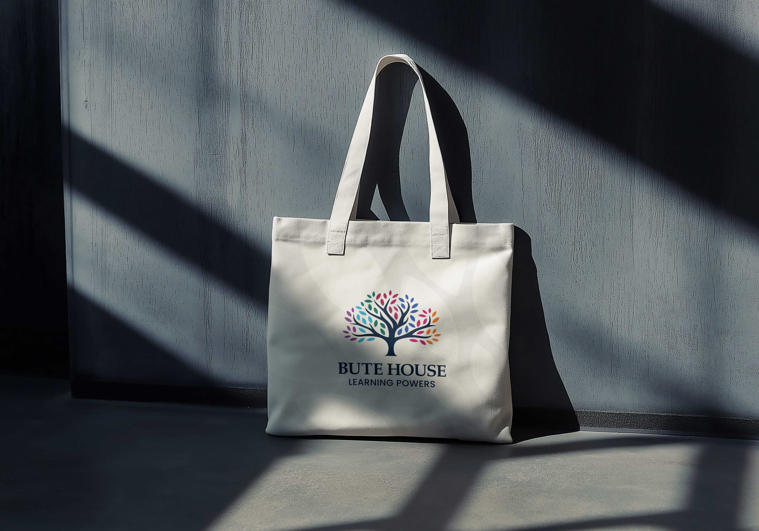
Bute House Preparatory School is an educational organisation with heritage, community and care at its core. Its identity has long been centred around a distinctive tree motif symbolising growth, learning and foundations.
Over time, the existing logo became difficult to use across modern communications, particularly in smaller digital formats. This project focused on evolving the identity in a way that retained recognition, honoured the school’s heritage, and introduced greater clarity, flexibility and confidence for future use.
The brief
The brief was clear: this was not a full rebrand, but a considered evolution of the existing visual identity. The refreshed logo and wider brand system needed to feel unmistakably like Bute House, with staff, parents and pupils able to immediately connect with it and feel proud.
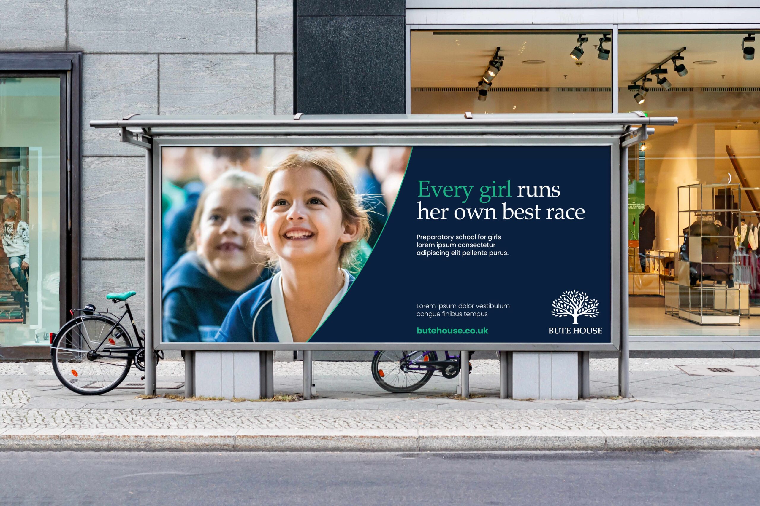
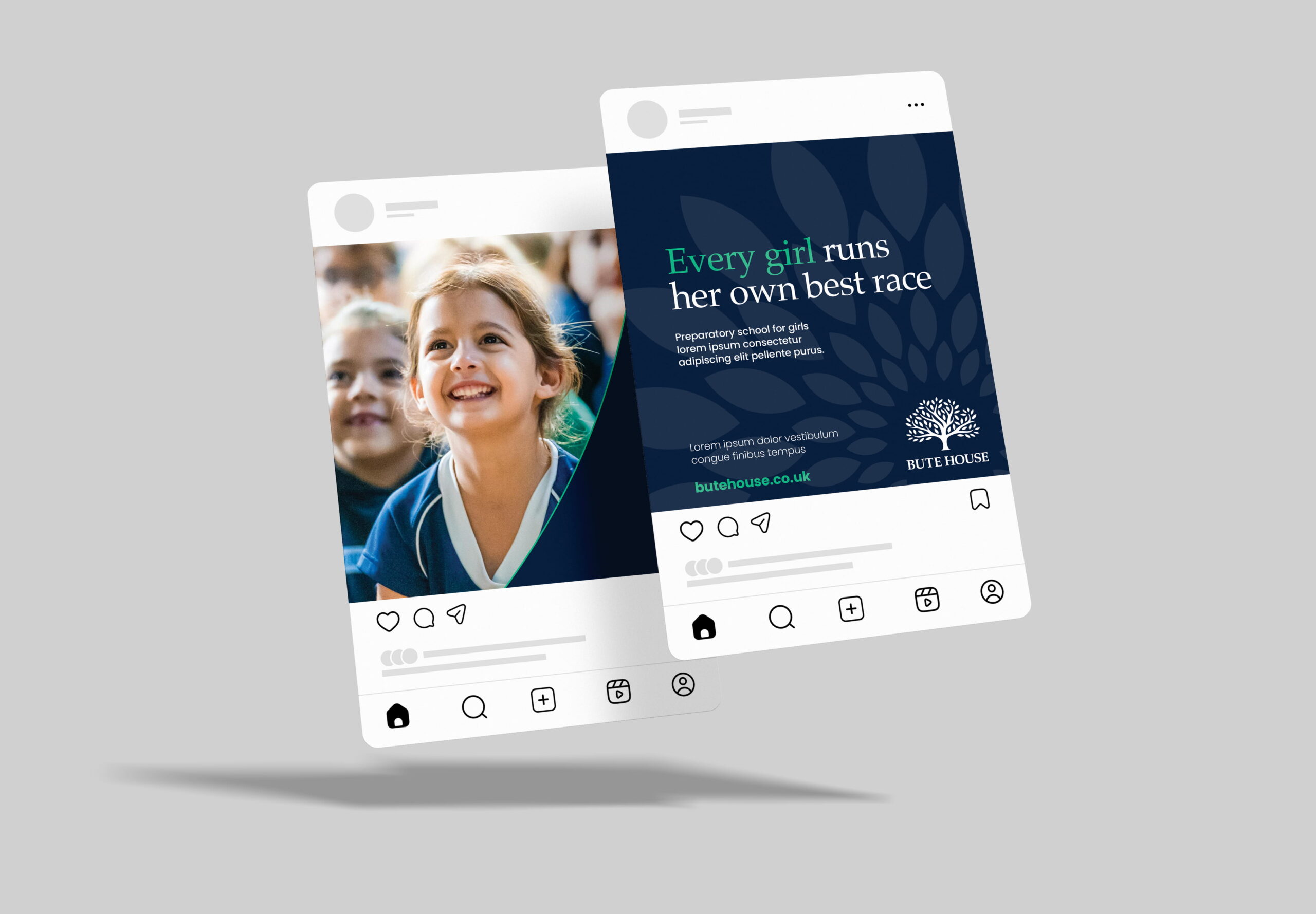
The work needed to improve clarity and consistency across key applications including digital platforms, social media, presentations and admissions materials, while keeping the warmth and meaning of the original identity intact.


Our approach
We started with a brand review to understand how the identity was working in real-world use, then developed a refreshed system that retained what people recognised while strengthening clarity and consistency across modern communications.
Refining the tree
Building a flexible visual language
Typography & colour
Asset rollout
“The brand refresh process with The Graphic Design House was smooth, collaborative, and genuinely enjoyable from start to finish. We greatly appreciated the open flow of communication. They listened to us, entertained our ideas, and offered professional design guidance throughout. The result is a brand that feels true to our history and identity as a school, while being cleaner, more consistent, and reflective of the modern life of Bute House today”
Isabella Gilmour
Marketing & Communications Manager
Bute House

Results
The refreshed identity honours Bute House’ heritage while strengthening clarity, flexibility and confidence for the future. By evolving rather than reinventing, the result remains recognisable and rooted in the school’s values, with a robust brand system designed to work across modern communications and support long-term consistency.
Our work in action
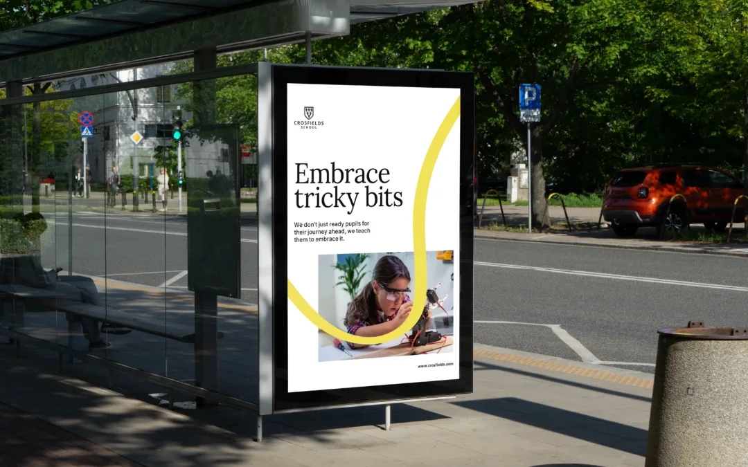
Crosfields School
A strategic rebrand for Crosfields School, uniting message and design around a confident promise to “Embrace every journey.”
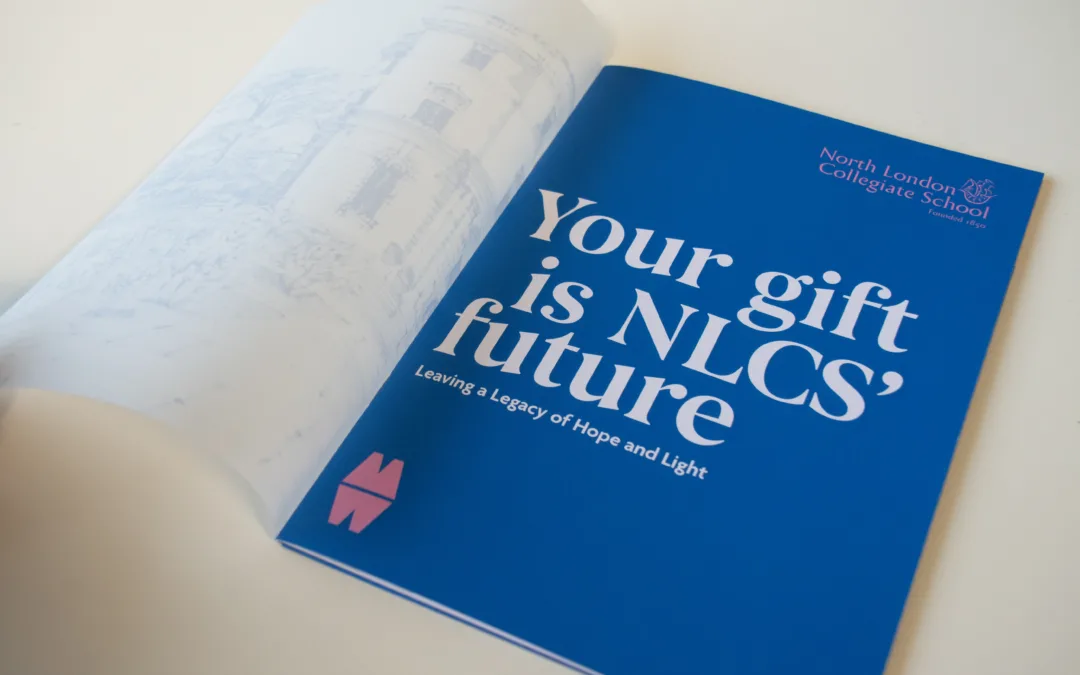
North London Collegiate School
Creative and digital support for North London Collegiate School, from magazine design to campaign materials connecting students, alumni and supporters.
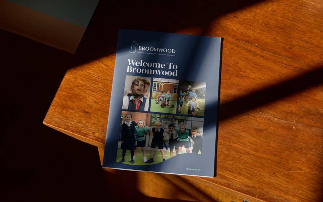
Broomwood Prospectus
A confident prospectus for Broomwood School, bringing its rebrand to life in print with clear storytelling, warmth and distinctive design.
Evolve your identity without
losing what matters
If your organisation has a trusted identity that isn’t quite working across today’s communications, we can help you refine it with care. From logo development and brand guidelines to templates, admissions materials and digital assets, we build flexible systems that keep recognition strong while improving consistency across every touchpoint.
Let’s shape a brand your community feels proud of, now and into the future.