Hurst Foundation
The client
The Hurst Foundation is the alumni and community engagement arm of Hurstpierpoint College, supporting lifelong relationships between the College and its former pupils, staff, parents and the wider community. Through events, communications, networking and philanthropy, the Foundation plays a central role in maintaining and strengthening these connections.
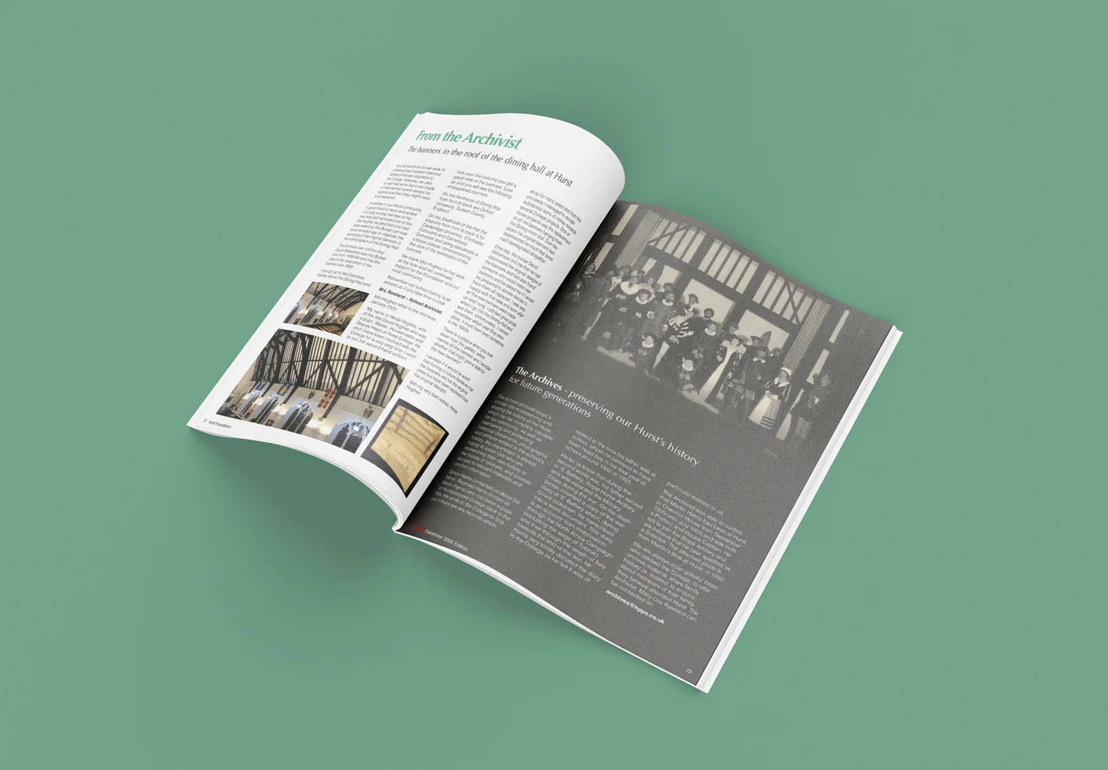
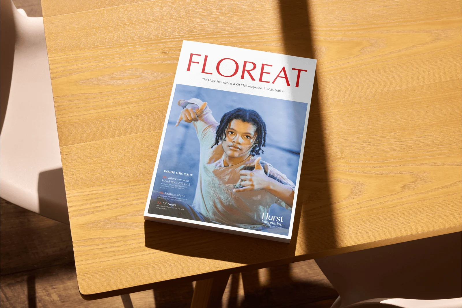
Its annual magazine is a key touchpoint within this relationship, acting as both a record of the community and a platform for the Foundation’s voice.
The brief
The brief was to refresh the design of the annual magazine so it better reflected both the audience and the ambition of the Hurst Foundation. While remaining accessible and familiar to an established readership, the publication needed to feel more engaging, more contemporary and more confident.
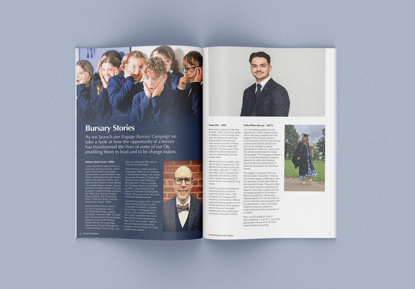
The existing magazine was content-rich but had begun to feel dated and structurally flat. The challenge was to modernise the publication without alienating loyal readers, while creating a flexible editorial system capable of evolving, particularly as giving and philanthropy become a more prominent part of the Foundation’s work.


Our approach
We reimagined the magazine as an editorial experience, focusing on pace, hierarchy and design clarity to create a publication that rewards time spent with it.
An editorial-first mindset
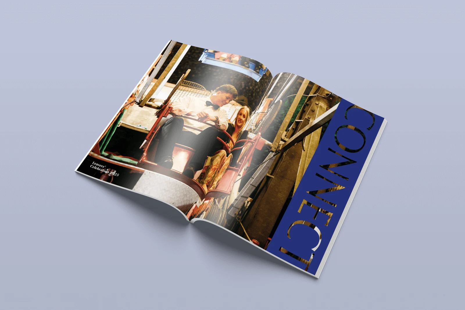
Concept-led design, each year
Structure, pace and hierarchy
Defining the publication


Results
The refreshed magazine feels modern, engaging and assured, reflecting the pride, warmth and ambition of the Hurst Foundation community. The new editorial system balances tradition with progression, providing a flexible framework that can evolve alongside the Foundation’s priorities.
Most importantly, the publication now feels rewarding to return to, a magazine designed to be picked up, revisited and enjoyed, reinforcing the Foundation’s role at the heart of Hurstpierpoint College’s extended community.
Our work in action
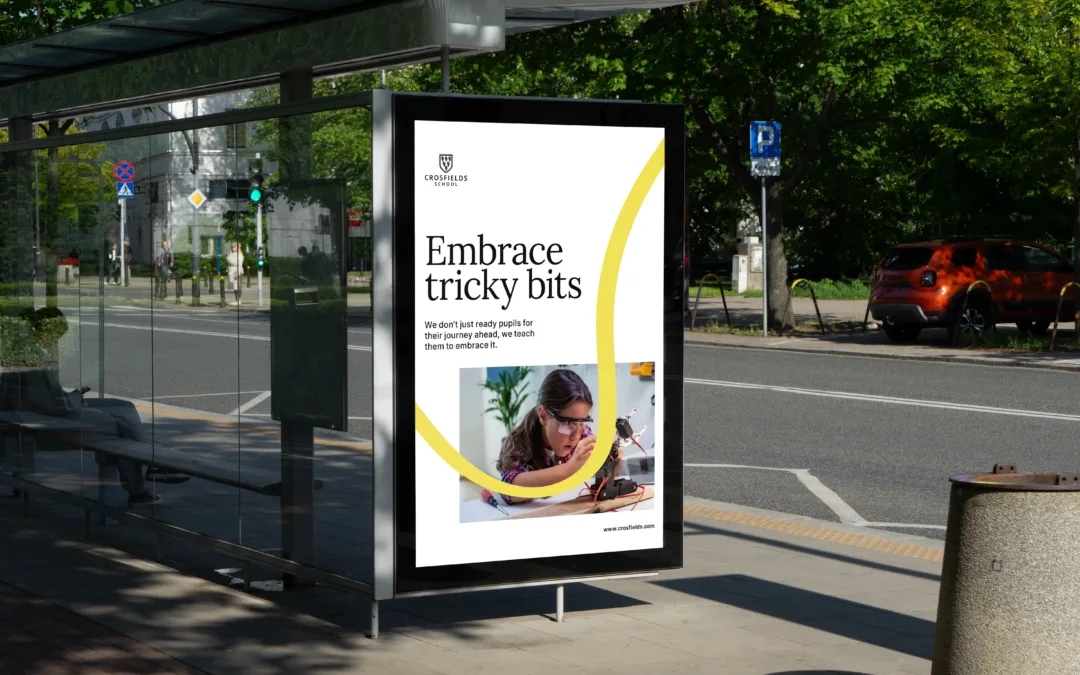
Crosfields School
A strategic rebrand for Crosfields School, uniting message and design around a confident promise to “Embrace every journey.”
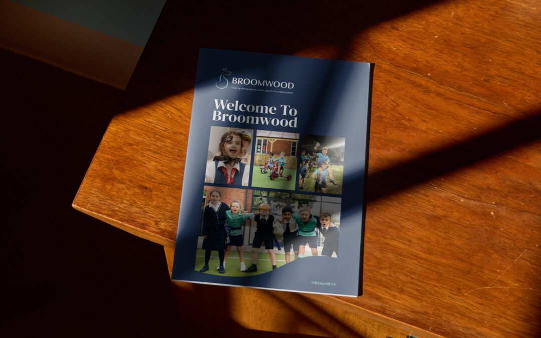
Broomwood Prospectus
A confident prospectus for Broomwood School, bringing its rebrand to life in print with clear storytelling, warmth and distinctive design.
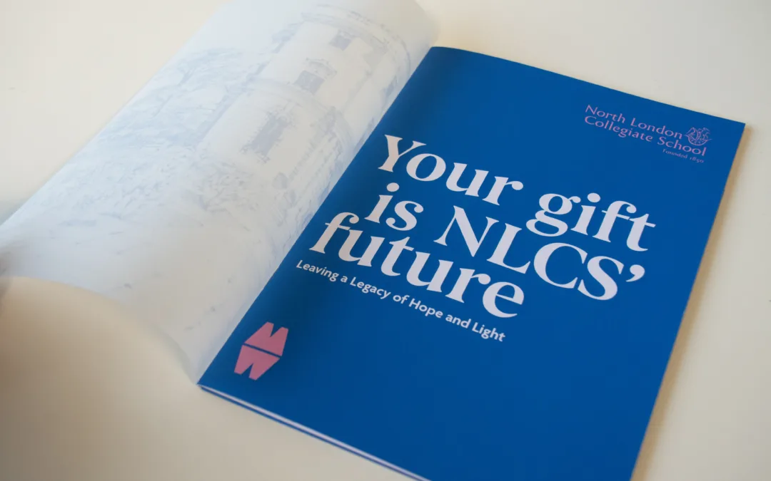
North London Collegiate School
Creative and digital support for North London Collegiate School, from magazine design to campaign materials connecting students, alumni and supporters.
Give your community a publication
it values
If your organisation uses print or digital publications to connect with an established audience, we can help you refresh them with purpose. From alumni magazines and community reports to wider editorial platforms, we design publications that feel engaging, considered and confident, balancing familiarity with progression.
Let’s create something your readers want to return to.