Alleyn’s School prospectus & admissions guide
The client
Alleyn’s School required a new Senior School prospectus, and admissions guide to reflect updated branding, revised key messaging and the addition of Alleyn’s Oakfield within the wider school group. The project also needed to establish a visual direction that could be developed across future prospectus materials for the Junior School and Oakfield publications.
The brief
The existing prospectus had not been fully updated in around four years and was based on a previous version of the Alleyn’s brand. The new publication needed to support updated messaging, provide clearer admissions information for parents and work across both print and digital formats. Alongside visual impact, the project also needed to balance practicality, sustainability and cost-effectiveness, while creating a prospectus with a longer shelf life than the annually updated admissions materials.


Our approach
We developed a prospectus system that balanced premium print production, practical functionality and sustainability considerations, while creating a visual direction that could support future publications across the wider Alleyn’s schools’ group.

One family, three schools

Selecting the right stock

Waste-conscious format

Binding with longevity

Print finishing with purpose

Results & next steps
Our work in action
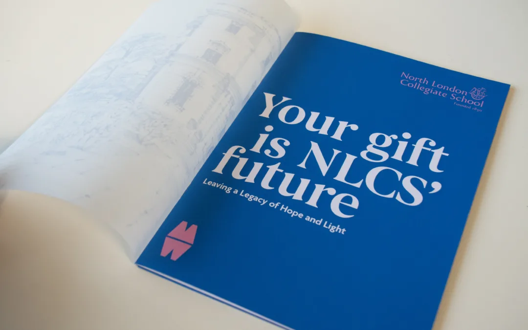
North London Collegiate School
Creative and digital support for North London Collegiate School, from magazine design to campaign materials connecting students, alumni and supporters.
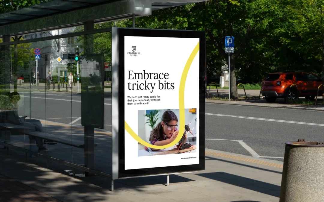
Crosfields School
A strategic rebrand for Crosfields School, uniting message and design around a confident promise to “Embrace every journey.”
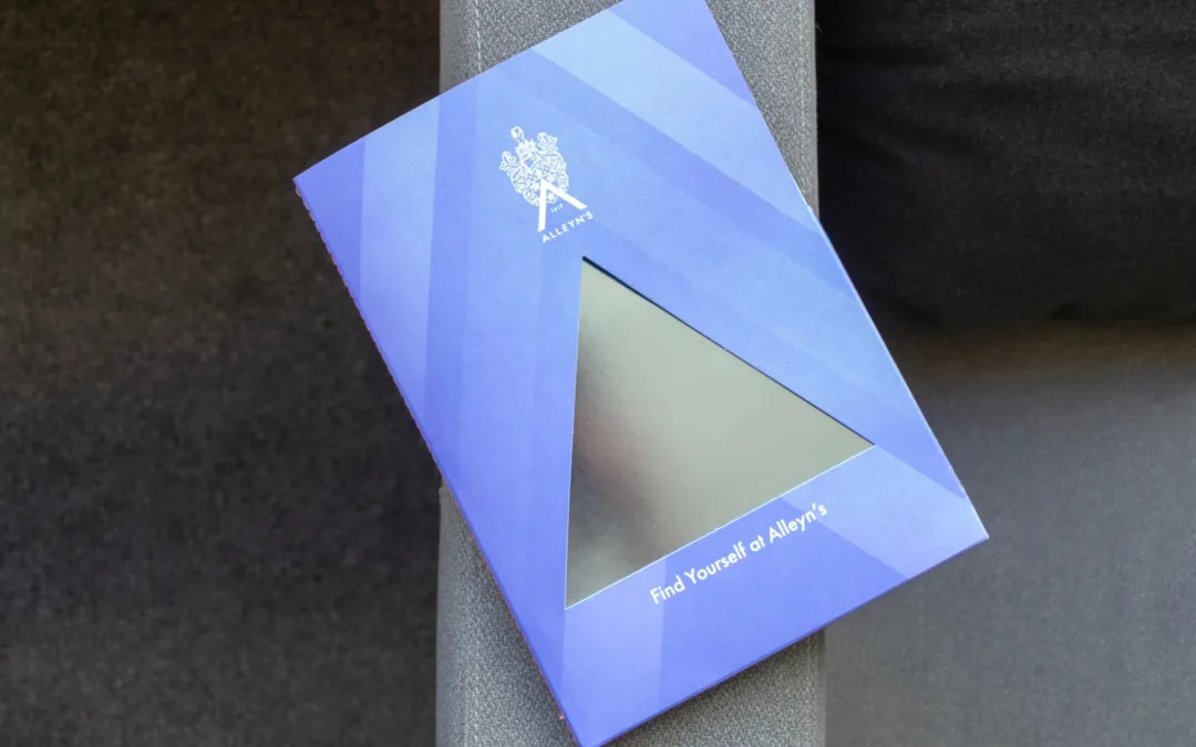
Alleyn’s School
See how we support Alleyn’s School with prospectus design, editorial magazines and admissions publications that bring its brand to life.
Create a prospectus that leaves a lasting impression
If your prospectus plays a key role in attracting prospective families and supporting admissions conversations, we can help. From developing clear content structures and distinctive visual identities to selecting the right print finishes and production techniques, we create prospectuses that feel engaging, premium and built around the parent journey.
Let’s create a prospectus that reflects your school at its very best.