Broomwood School Prospectus
The client
Broomwood School is an independent school with a distinctive educational model, offering co-educational learning in the early years before transitioning to tailored single-sex education with ongoing collaboration.
The brief
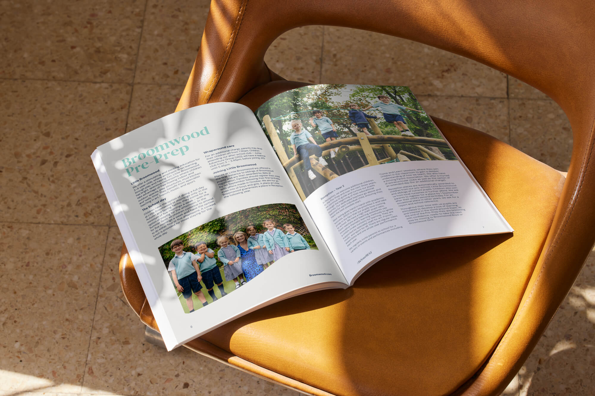
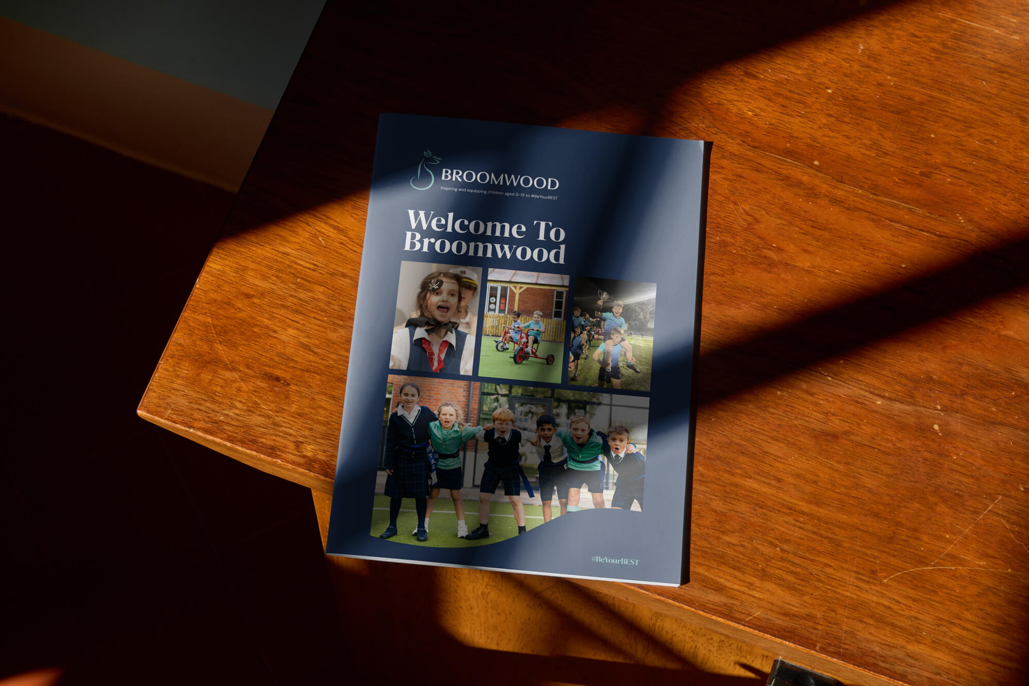
Following the rebrand, Broomwood asked us to design a new prospectus that would translate the refreshed identity into print. The prospectus needed to reflect the confidence of the new brand, clearly communicate the school’s educational model, and appeal to prospective families at a critical decision-making stage.
More than an informational document, the prospectus needed to feel trustworthy, aspirational and engaging, something parents would want to pick up, keep and return to.


Our approach
We focused on expressing the new brand clearly and confidently in print, using structure, tone and visual clarity to support understanding, pride and long-term value.

Bringing the brand into print
Explaining a distinctive model
Clear and confident
Designing for longevity


Results
The finished prospectus brings Broomwood’s rebrand to life in a tangible, parent-facing format. By aligning print design closely with the new brand identity, the publication strengthens recognition, builds trust and clearly communicates the school’s point of view.
Most importantly, it presents Broomwood as a school with confidence, clarity and ambition, supporting families at a key moment in their decision-making journey.
Our work in action
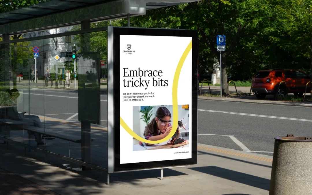
Crosfields School
A strategic rebrand for Crosfields School, uniting message and design around a confident promise to “Embrace every journey.”
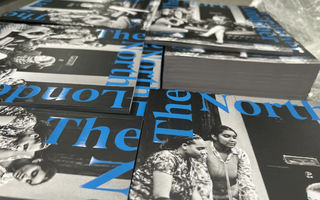
NLCS: North Londoner
The first North Londoner under NLCS’s new brand, a bold, modern magazine celebrating achievement, heritage and community spirit.
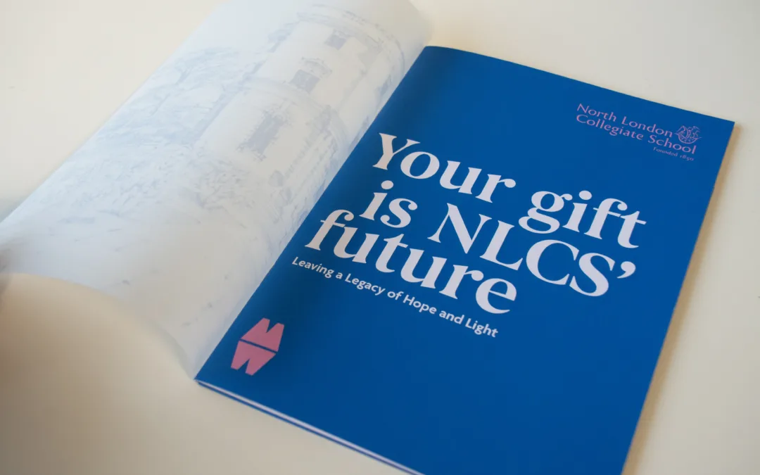
North London Collegiate School
Creative and digital support for North London Collegiate School, from magazine design to campaign materials connecting students, alumni and supporters.
Bring your brand to life in print
If your organisation has invested in a new brand and needs it to work in the real world, we can help. From prospectuses and admissions materials to wider brand assets, we translate strategic identity into clear, confident design that supports understanding, builds trust and speaks directly to your audience.
Let’s turn your brand thinking into something people want to pick up and keep.