Types of impact reports every organisation should know
Contents
Why knowing your report type matters before you start
ESG reports
CSR reports
Charity & non-profit impact reports
B-corp impact reports
Combined annual reports
CSRD & mandatory sustainability reports
How design differs across each report type
How we approach impact report design
Not sure which type of report you need?
Follow us
An impact report means different things to different organisations. For some, it’s a data-heavy document designed for investors and regulators. For others, it’s a donor-focused charity publication built around stories, outcomes and trust.
Many organisations struggle to find the right approach to present complex data in a way that feels both credible and engaging across different audiences.
At The Graphic Design House, we create impact reports that balance credibility, usability and brand consistency, helping organisations communicate complex information clearly and confidently.
Why knowing your report type matters before you start
Not all impact reports have the same goal or audience. Some are social impact reports, while others are aimed at donors, investors or regulators.
When the wrong structure or visual style is used in a report, it shows. Stakeholders can tell when a document hasn’t been designed with their needs in mind and an investor-focused ESG report that feels overly promotional loses authority.
The type of impact report you’re producing should shape everything from layout and navigation to typography, imagery and data hierarchy. Design decisions need to support how audiences consume information, not compete with it.
Understanding the differences early creates a stronger foundation for both the content and the design process.
The main types of impact reports explained
ESG reports
The primary audience for ESG reports tends to include investors, regulators, analysts and ratings agencies, all looking for clear, comparable information backed by recognised frameworks such as GRI, SASB, TCFD and Corporate Sustainability Reporting Directive (CSRD).
These reports are often data-heavy and technically detailed, creating the design challenge of balancing compliance with usability. Readers need to navigate large volumes of information quickly, which means strong visual hierarchy, consistent iconography across pillars and carefully structured charts and tables all become critical.
A well-designed ESG report doesn’t simplify the data. It makes it easier to understand.
CSR reports
Corporate social responsibility (CSR) reports tend to focus more heavily on people, communities and social value. They often showcase initiatives around employee wellbeing, volunteering, inclusion, education partnerships and local community investment.
These reports typically target a broader audience than ESG reports. Employees, local stakeholders, prospective recruits and media audiences all engage with CSR content differently, so the tone tends to feel more accessible and narrative-led.
The biggest CSR report design challenge is avoiding the appearance of self-congratulation and providing corporate transparency instead. Human-centred photography, authentic case studies and well-judged infographics help bring these stories to life without turning the report into a PR brochure.
Good CSR reporting feels credible because it combines storytelling with measurable outcomes.
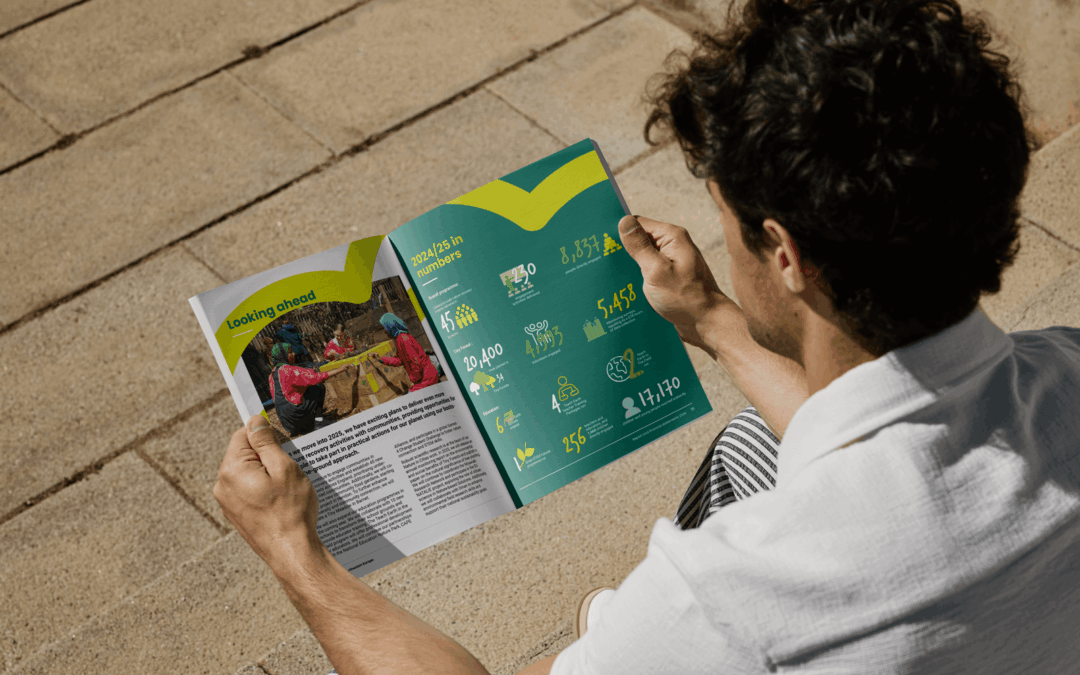
Charity and non-profit impact reports
For charities and non-profits, impact reporting is about trust. Donors, grant providers and supporters want to understand where funds have gone, who has benefited and what outcomes have been achieved.
These reports often combine financial summaries with human stories, campaign highlights and beneficiary data. Emotional connection matters, but so does transparency.
The strongest reports pair warm, mission-led visuals with clear financial breakdowns and accessible impact metrics. Readers should be able to move naturally between emotional storytelling and evidence-based reporting without friction.
Our work with ORCA shows how we used design to achieve just that.

B Corp impact reports
B Corp impact reports are typically structured around the five pillars of the B Impact Assessment, a free online tool to help you measure your company’s social and environmental impact. The pillars are: Governance, Workers, Community, Environment and Customers.
These reports are aimed at purpose-driven audiences, including consumers, prospective partners, employees and investors who care about ethical business practices and measurable accountability.
Because the framework itself is highly structured, the challenge with B Corp reports is transforming a scoring system into something that still feels aligned with your personality and brand identity.
Effective B Corp impact report design combines strong typographic systems, clear score presentation and narrative storytelling to create a report that feels purposeful rather than procedural.
The goal is to communicate progress without losing individuality.
Combined annual impact reports
Many organisations, particularly charities and social enterprises, consolidate multiple reporting functions into a single annual publication.
These reports often combine financial performance, operational updates, impact data, strategic messaging and storytelling into one document designed for multiple audiences.
That creates a more complex structural challenge. Investors may look for financial accountability, while supporters focus on outcomes and beneficiaries.
The success of an annual impact report often comes down to organisation and pacing. Strong sectioning, intuitive navigation and carefully planned content hierarchy help readers move through the document without becoming overwhelmed.
This is where thoughtful annual report design becomes especially valuable. A cohesive visual system allows different types of information to sit comfortably within the same publication.
CSRD and mandatory sustainability reports
The CSRD is reshaping sustainability reporting across Europe. Many large EU-regulated businesses are now required to publish sustainability reports aligned to European Sustainability Reporting Standards.
These reports can easily exceed 300 pages, bringing significant complexity from both compliance and design perspectives.
Unlike brand-led publications, CSRD reports need to support digital machine readability and accessibility requirements alongside traditional document design principles.
That makes clear navigation, structured layouts and data visualisation more important than ever. In many cases, design becomes less about decoration and more about helping readers interpret large volumes of regulated information efficiently.
How design differs across each report type
Although every impact report shares the same broad goal of communicating value and accountability, the design approach varies significantly depending on the audience and purpose.
- ESG report design: Tends to prioritise structure, consistency and dense data presentation. Grid systems, framework-referenced icons and disciplined chart styling help readers navigate complex information.
- CSR report design: Leans more into human storytelling. Photography, pull quotes and case-study layouts create warmth and relatability while still supporting measurable outcomes.
- Charity impact report design: Often combines emotionally engaging narratives with transparent financial information and accessible impact statistics. The visual tone needs to feel human without sacrificing credibility.
- B Corp report design: Usually sits somewhere in the middle: brand-forward, mission-led and visually distinctive, but still grounded in measurable scoring frameworks and accountability.
Across every format, the strongest reports make information easier to understand. That’s where our cross-sector experience becomes valuable. We understand how to adapt the design system to the report, rather than forcing every report into the same template.

How we approach impact report design
Every project starts with clarity. At The Graphic Design House, before we begin designing, we work with clients to understand the type of report being produced, the audience it needs to serve and the objectives behind it.
From there, we structure the content into a clear narrative flow that supports both readability and engagement. Some reports need stronger data hierarchy and compliance-focused layouts. Others need more space for storytelling, photography and human impact.
We then develop a visual system tailored to both the brand and the reporting format, balancing typography, charts, imagery and white space to improve navigation and understanding.
Finally, we deliver reports optimised for both print and digital formats, ensuring the finished publication works wherever it’s being read.
Whether you’re producing your first charity impact report or overhauling an existing ESG publication, we design reports that communicate with clarity and purpose.
Not sure which type of report you need? Let’s talk
For many organisations, the hardest part of impact reporting is knowing where to start. Some teams struggle to understand audience expectations and format choices, while others have existing reports that no longer reflect their brand, mission or ambitions.
Sometimes the issue isn’t the content itself, but how the information is presented. Even valuable data loses impact when audiences struggle to interpret it.
Whether you’re consolidating multiple reports into one annual publication or looking to create a more engaging sustainability report design, the right structure and design approach can completely change how your report is received.
Reach out to us and let’s design an impact report that reflects who you are and what you stand for.
More insights
Impact report design that turns data into meaningful brand stories
Learn how impact report design transforms ESG data into clear, engaging brand stories by improving clarity, trust and stakeholder engagement.
Impact report vs annual report: what’s the difference?
Not sure whether you need an impact report or an annual report? Explore the differences, benefits and design considerations for both.

School prospectus design that reflects your identity
Strategic school prospectus design that builds trust, reflects your ethos and guides parents with clarity, structure and strong visual identity.