Crosfields school
The client
Crosfields School is a community-rooted, progressive school with a deeply nurturing culture. When they approached us, they were not looking for a cosmetic refresh. They wanted clarity, of message, personality and direction.
While the school had enormous strengths, its visual and verbal identity lacked consistency. Our role was to define and articulate a brand that felt as boundless as the pupils it supports.
The brief
Following an initial brand review, it became clear that Crosfields needed a more cohesive and confident system. Variations in colour palette, inconsistent typography and fragmented messaging were diluting the school’s character.
The task was to distil the school’s strengths into a clear strategic foundation and create a unified brand system that expressed its joy, curiosity and fearless growth — visually and verbally.


Our approach
We began with strategy, shaping a unifying promise before translating it into a confident visual and verbal identity designed for long-term consistency and flexibility.
Defining the promise
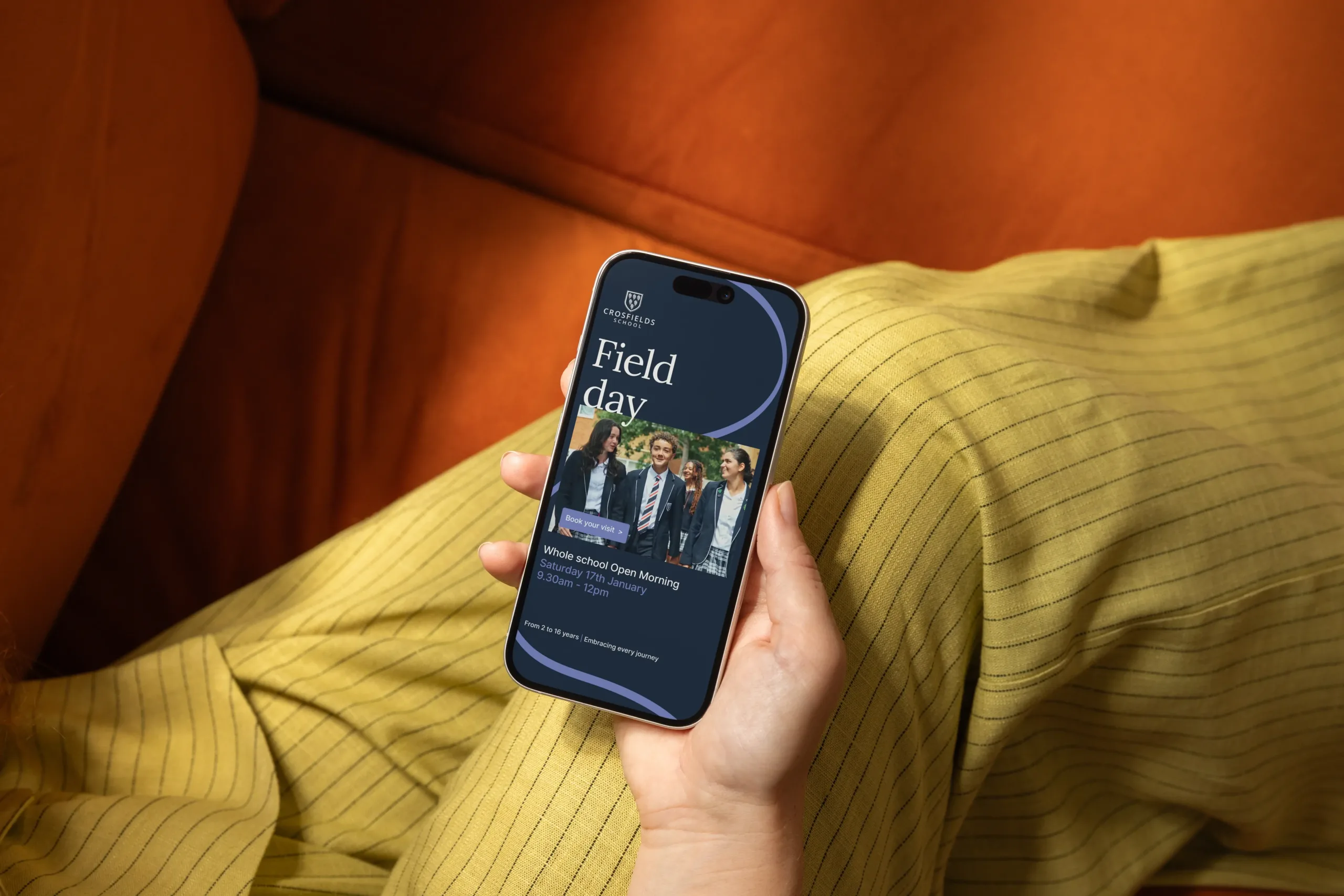
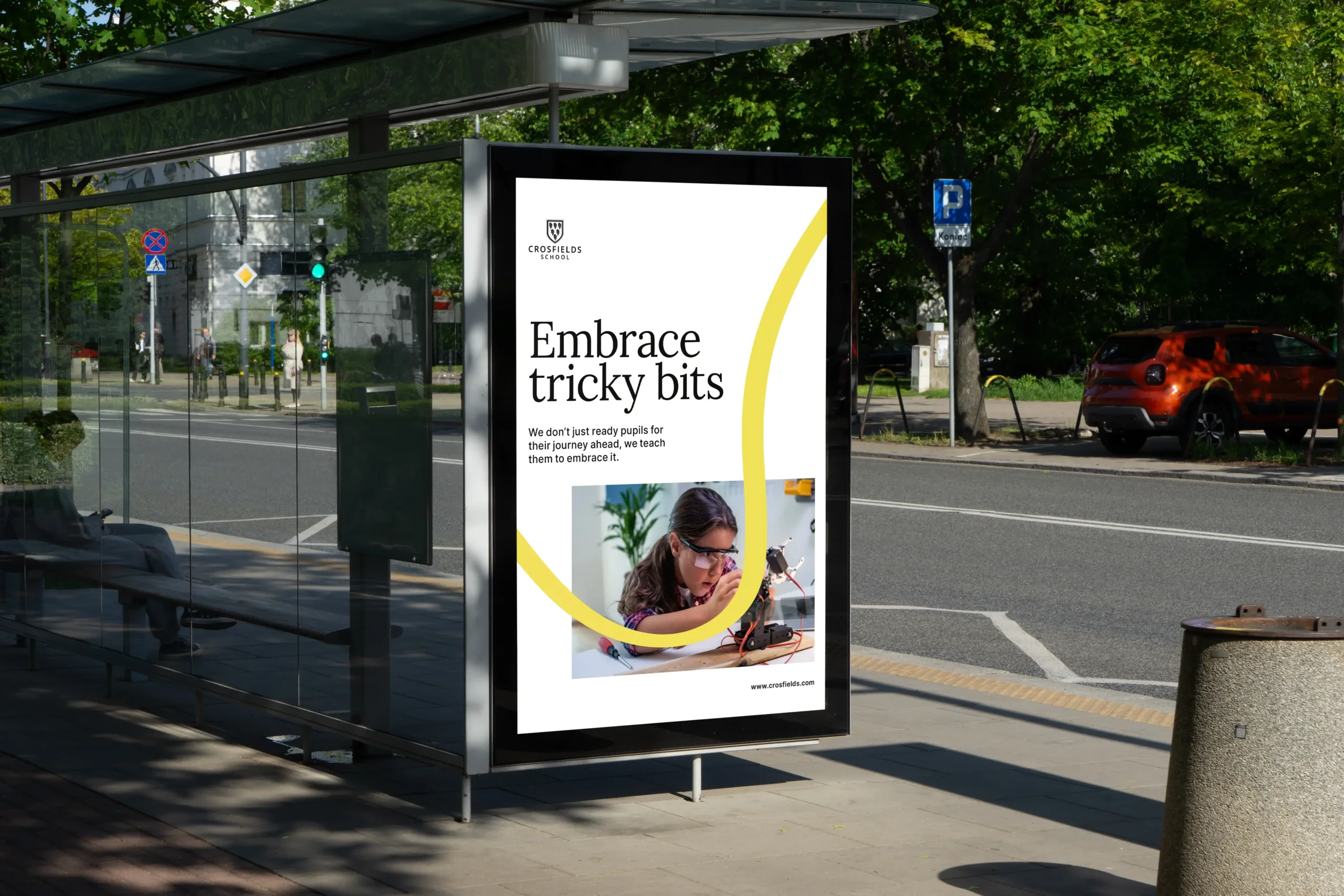
Expressing movement
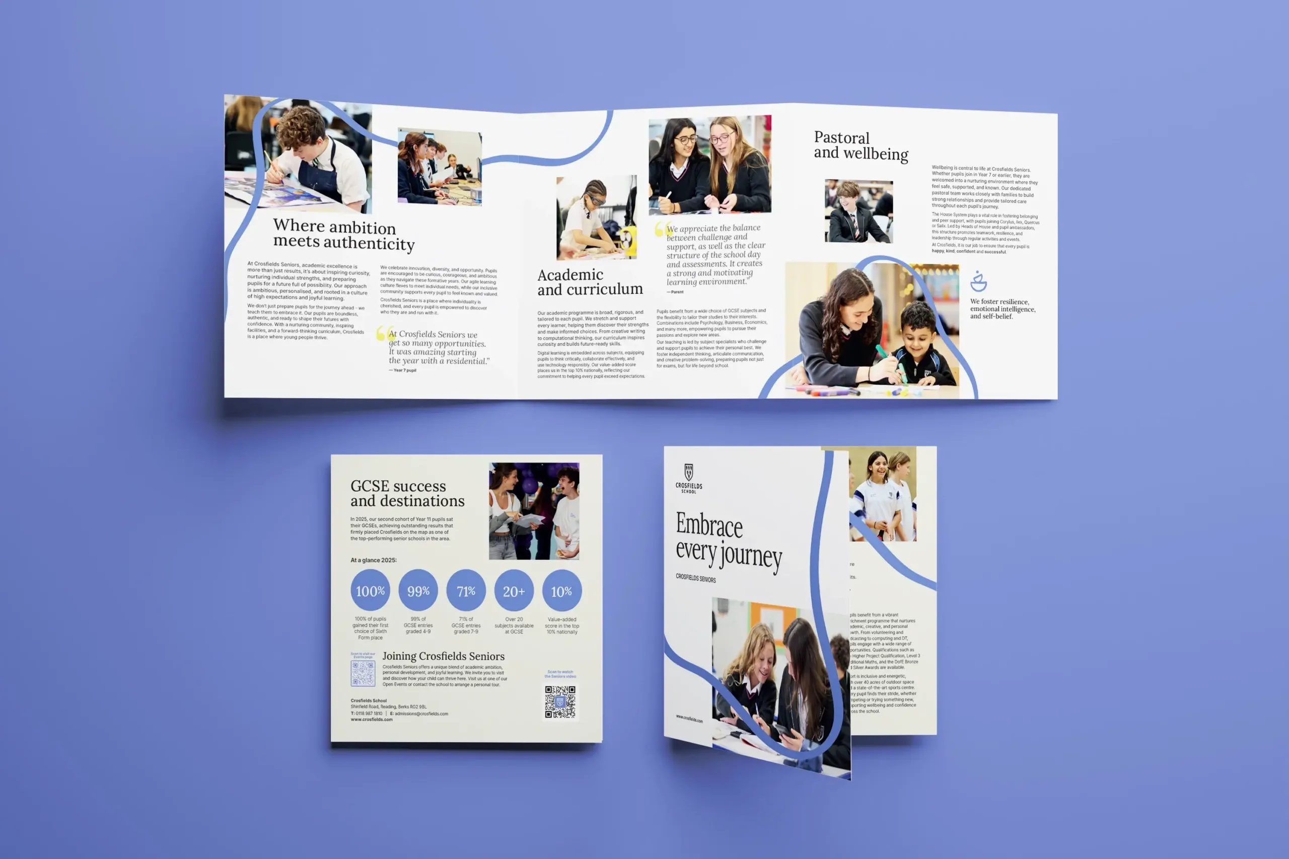
Refining the visual system
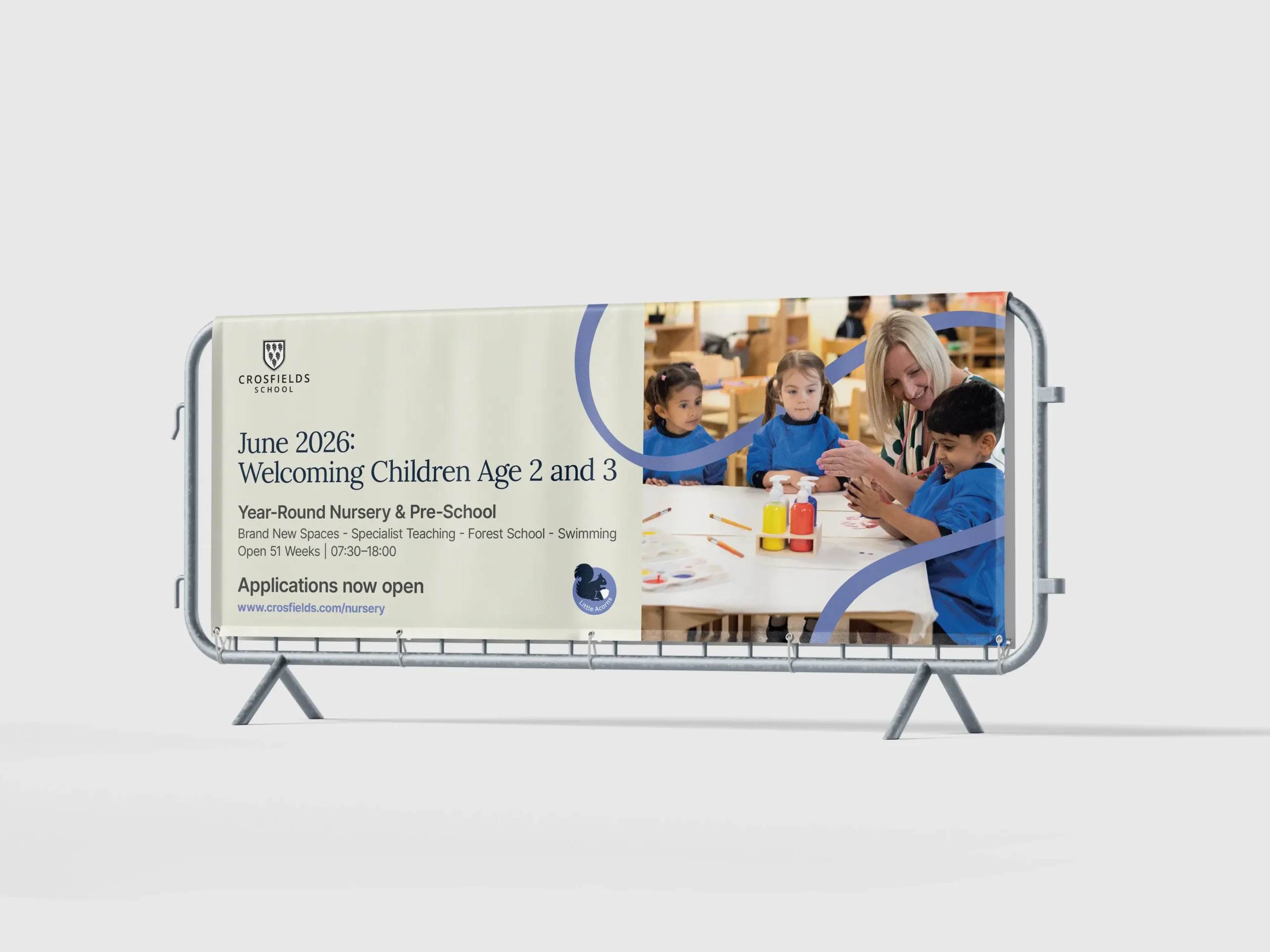
Building for rollout & longevity

Results
Crosfields now has a unified and modern brand system, a clear promise in Embrace every journey, and a confident visual and verbal framework that reflects its values. The refreshed identity balances warmth and ambition, tradition and forward-thinking, providing a flexible foundation that supports the school’s continued growth.
Most importantly, the brand now clearly expresses what has always defined Crosfields, a community that is kind and rooted, fearless and curious, ambitious and unbound.
Our work in action
Hurst Foundation
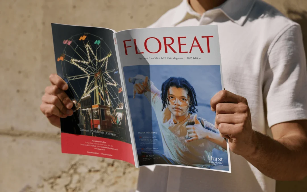
A refreshed annual magazine for The Hurst Foundation, delivering a confident, editorial-led design that engages alumni and community.
Broomwood Prospectus
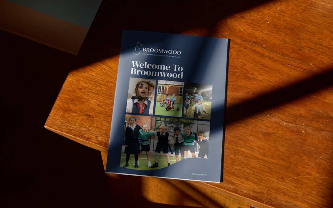
A confident prospectus for Broomwood School, bringing its rebrand to life in print with clear storytelling, warmth and distinctive design.
North London Collegiate School
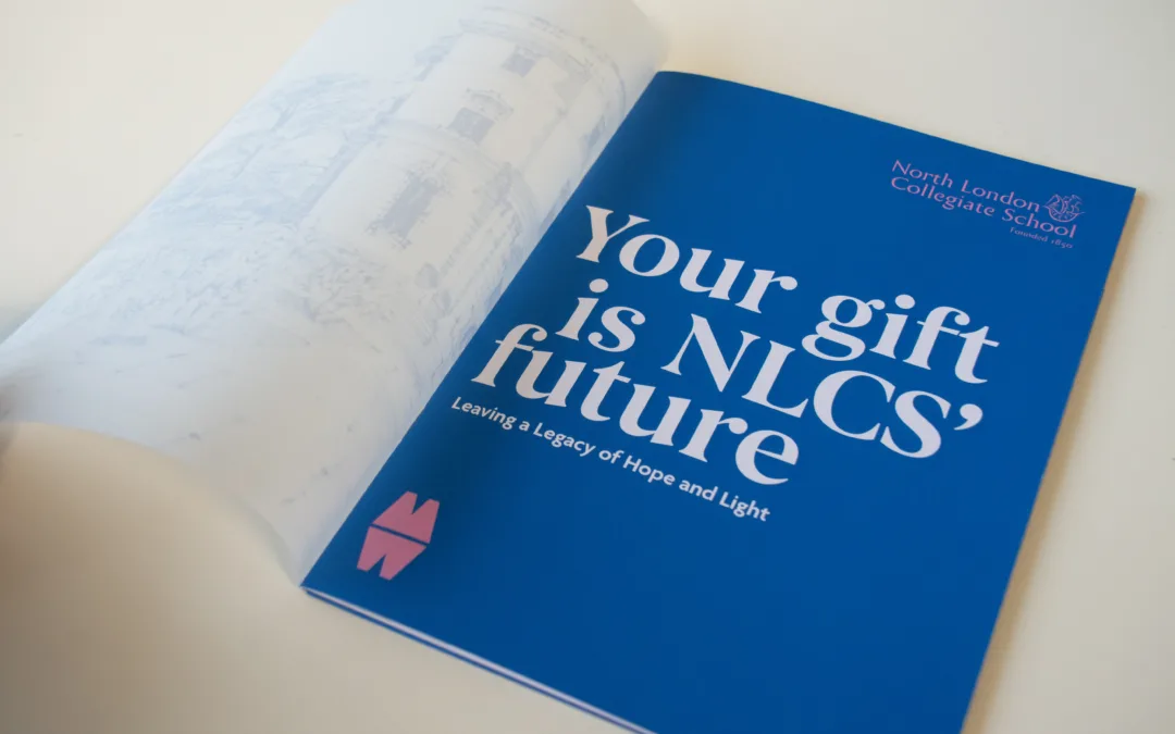
Creative and digital support for North London Collegiate School, from magazine design to campaign materials connecting students, alumni and supporters.
Build a brand with direction
If your school’s identity feels fragmented or inconsistent, we can help you define a clear promise and translate it into a confident visual and verbal system. From strategy and tone of voice to guidelines and rollout across key materials, we create brands that feel unified, expressive and built for growth.
Let’s shape an identity that reflects who you are, and where you’re going.