Circomedia
A fresh look for a bold, inclusive performing arts brand
The brief
Circomedia is a renowned centre for contemporary circus and physical theatre based in Bristol, offering everything from BTECs to Master’s degrees, public workshops, and a packed programme of live performances.
Despite its bold, creative output, the Circomedia brand hadn’t been meaningfully updated in over a decade. The organisation needed a brand refresh that would better reflect its dynamic community and forward-looking ethos, while creating consistency across communications. The new identity also had to come to life in a redesigned prospectus, the first major piece of collateral to showcase the updated brand to future students across the world.


Our approach
How we approached the project from understanding the client right through to the campaign execution. Hover your mouse over the flip tiles below to learn more.
Discovery session
Vibrant colour palette
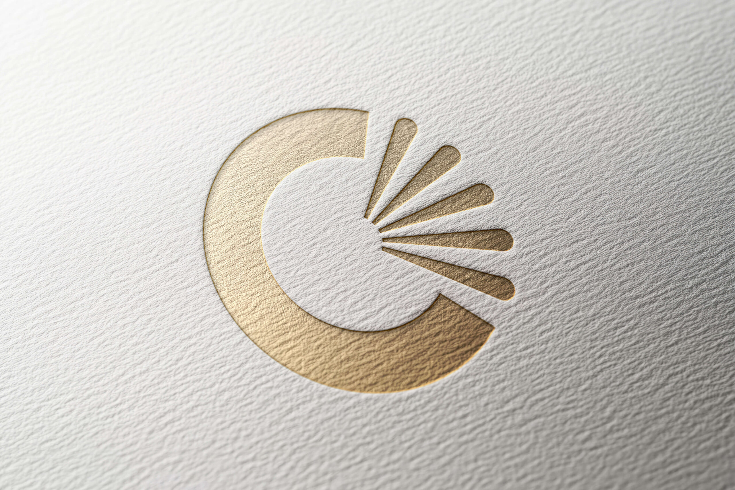
Logo evolution
Consistent typography
“I personally go back to TGDH time and time again because I trust that their team want the best for their clients and genuinely understand the needs of arts organisations and charities. TGDH always go out of their way to provide creative solutions that work for everyone – from large venues to small charities with limited resources and big ambitions”
Lizzy Hayes
Marketing and Communications Manager
Circomedia

Results & next steps
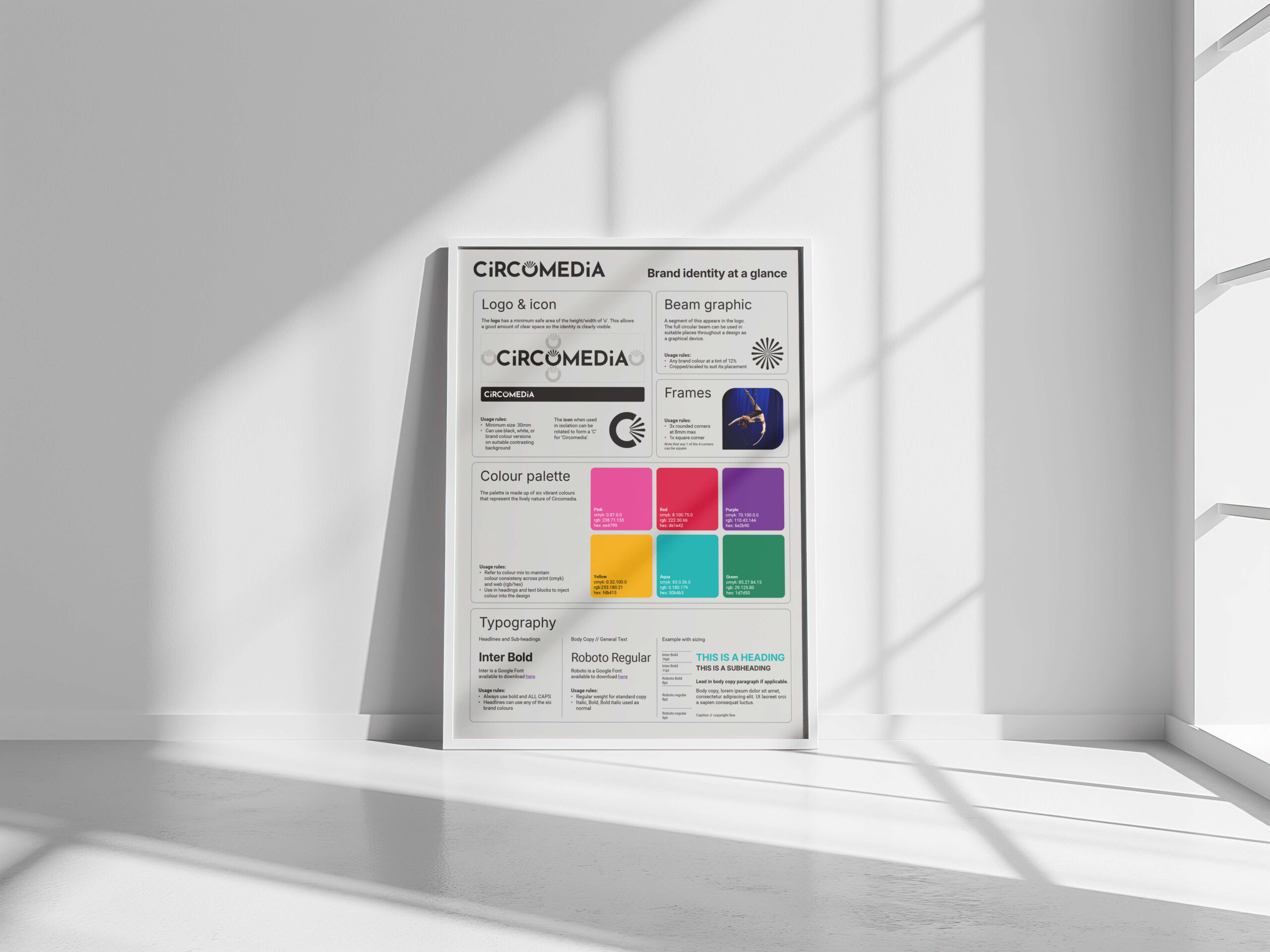
The rebrand brought Circomedia’s visual identity firmly into the present, modern, confident, and uniquely theirs. With a refreshed logo, a versatile colour system, and a clear type hierarchy, the new look is vibrant, consistent, and future-proof.
We also created a concise brand guideline sheet to help the team maintain consistency across all channels going forward.
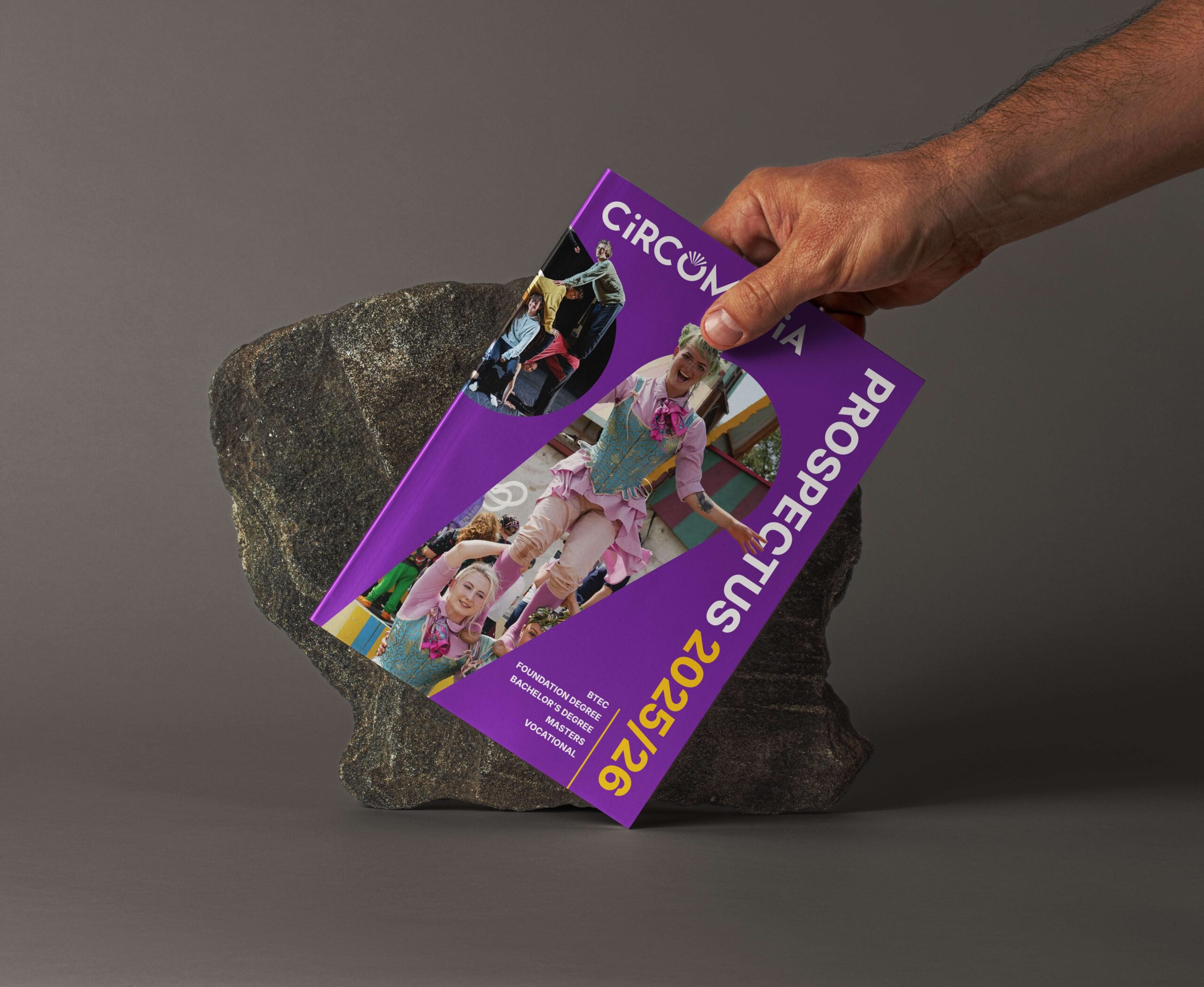
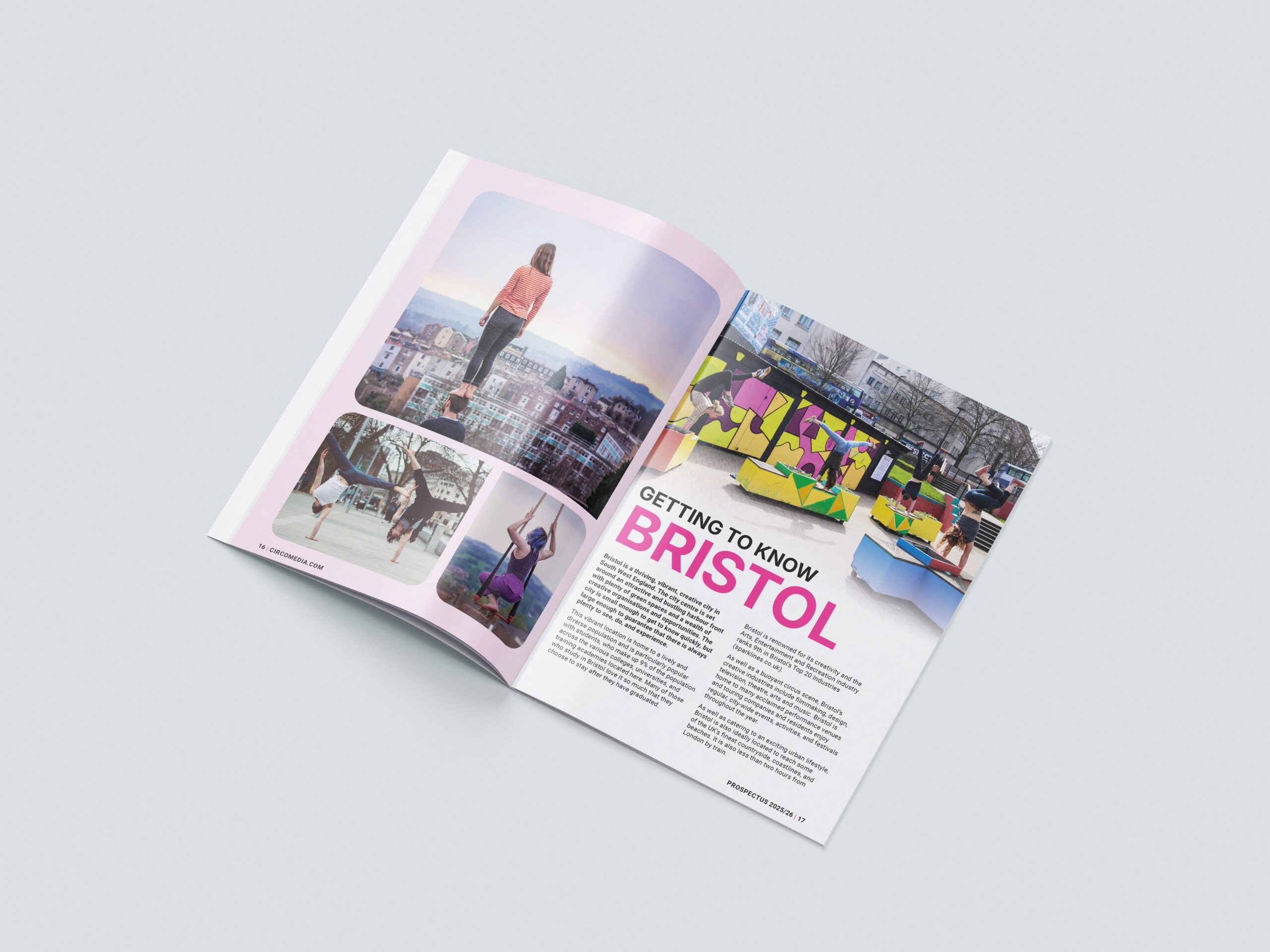
The new brand was brought to life in a redesigned prospectus, visually engaging, full of energy, and a perfect reflection of the creative opportunities Circomedia offers. It’s become a standout piece of comms that connects powerfully with future students.
Circomedia now has the tools to express who they are, clearly, consistently, and confidently. The refreshed brand is already making an impact, and there’s plenty of room to build on this solid foundation in future campaigns, materials, and digital assets.
Our work in action
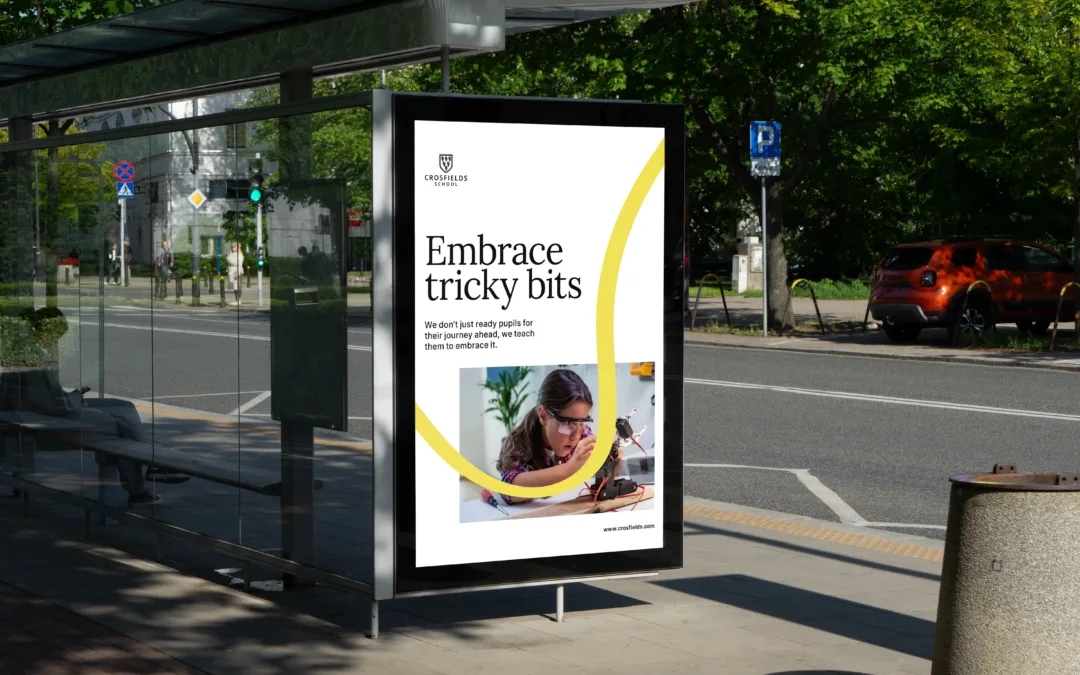
Crosfields School
A strategic rebrand for Crosfields School, uniting message and design around a confident promise to “Embrace every journey.”
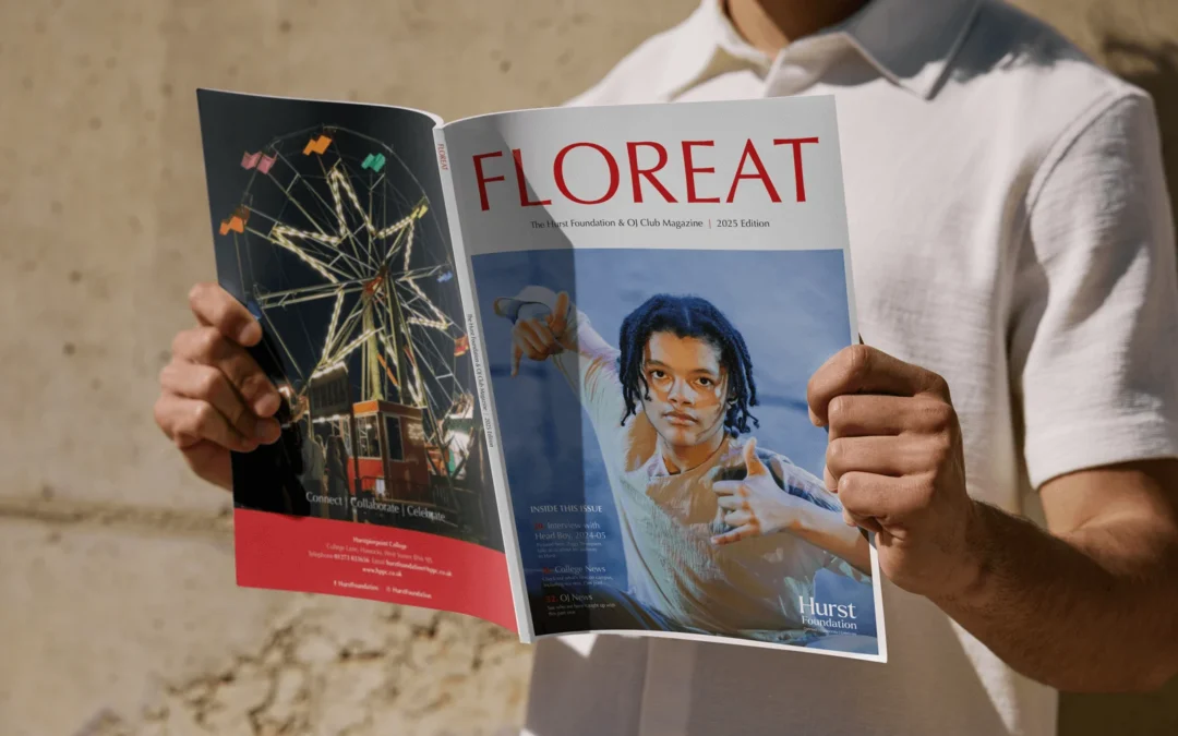
Hurst Foundation
A refreshed annual magazine for The Hurst Foundation, delivering a confident, editorial-led design that engages alumni and community.
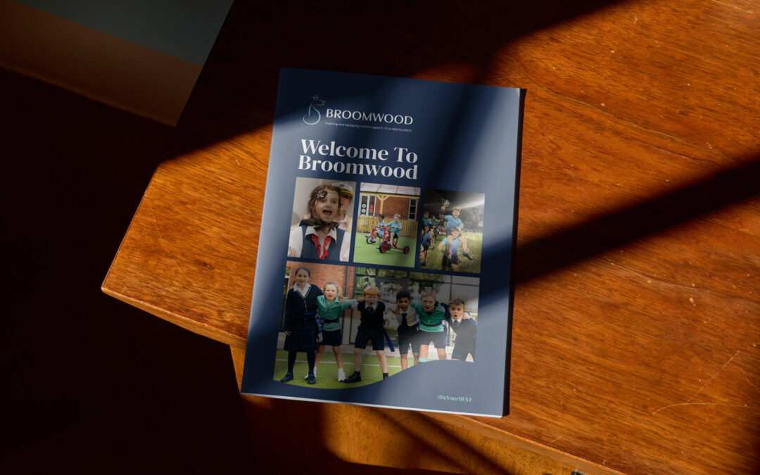
Broomwood Prospectus
A confident prospectus for Broomwood School, bringing its rebrand to life in print with clear storytelling, warmth and distinctive design.
Give your brand the spotlight
it deserves
If your organisation is ready to show its personality, values, and energy through design that’s fresh, bold, and consistent, we can help. From full identity refreshes to prospectuses and campaigns, we craft visuals that engage, inspire, and make your brand unmistakably yours.
Let’s bring your story to life with design that stands out.